Rate my handwriting

✨ Upload a sample of your handwriting, and our 🤖 AI will give you
the scoop on
what's awesome
and what could use a
little improving.
It's just for fun - and totally free! Try now 🚀
(You can also check out today's 👑 Leaderboard 👇)
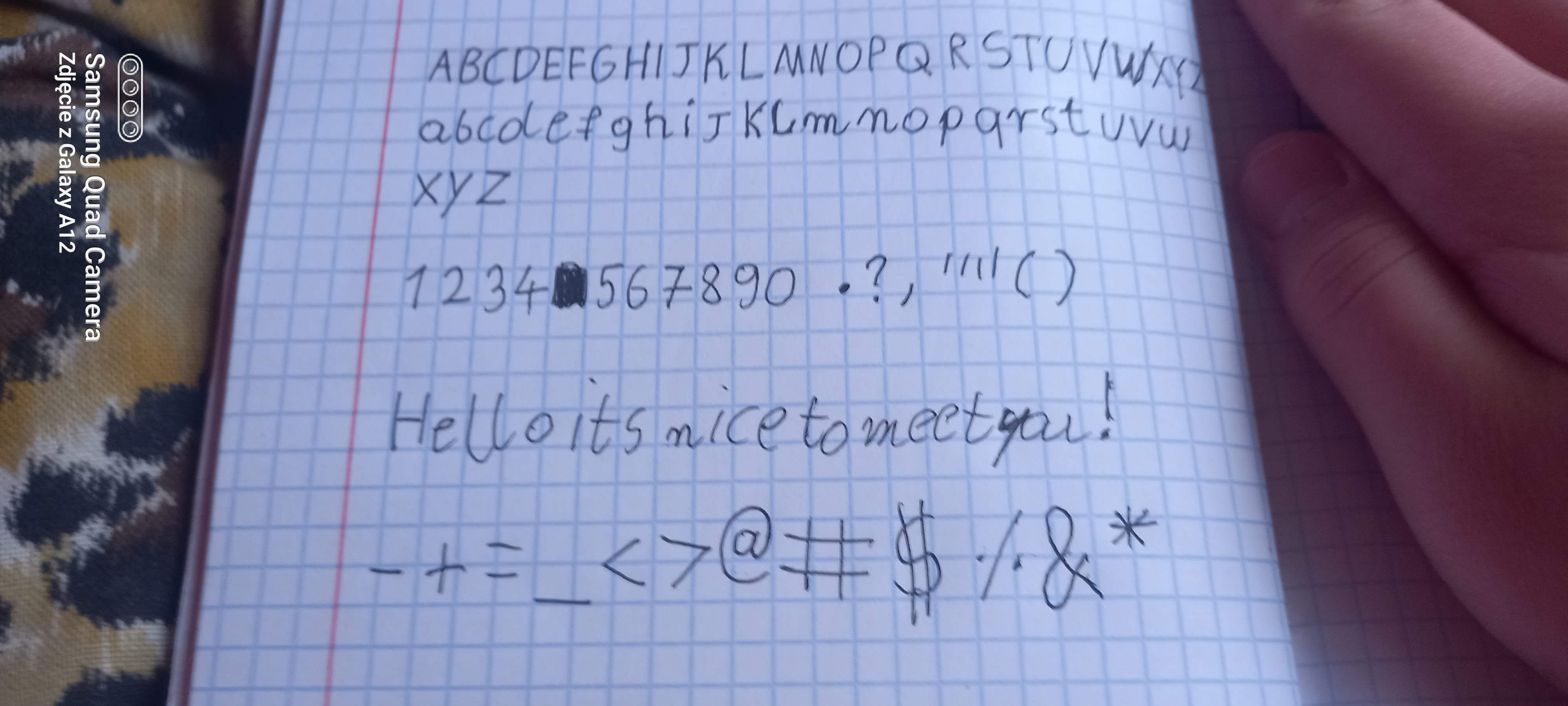
The Architect's Italic
The handwriting is legible and well-formed, suggesting a meticulous and orderly personality. Developing a more fluid style would enhance its expressiveness.
The handwriting exhibits a print-like style with carefully formed, upright letters. The upper and lower case alphabets are clearly differentiated and the numerals are distinct. The handwriting is relatively neat, but lacks a sense of flow and speed. Note how the words "Hello its nice to meet you!" are well-spaced, and uniformly sized. There's a consistent baseline and even pressure applied throughout the sample.
This style suggests a personality that values clarity, precision, and order. The writer likely pays attention to detail and prefers a structured approach. There's a deliberate and methodical quality to the handwriting that may indicate a thoughtful and considered nature. The legibility points to a desire to be understood and communicate effectively.
To enhance the handwriting, consider practicing cursive writing to develop a smoother flow. Experiment with varying the pressure to add depth and character to the strokes. Try focusing on connecting letters more fluidly while maintaining legibility. Remember, practice makes perfect!
Legibility
Expressiveness
Consistency
Overall
Leaderboard for Sunday, 02 November 2025
| 1 | The Cartographer |
74
|
| 2 | The Optimist's Italic |
73
|
| 3 | The Studious Scholar |
73
|
| 4 | The Precise Environmentalist |
72
|
| 5 | The Budding Linguist |
72
|
| 6 | The Diligent Student |
71
|
| 7 | The Inquisitive Enquirer |
71
|
| 8 | The Mathematical Mind |
70
|
| 9 | The Curious Calligrapher |
68
|
| 10 | The Considerate Script |
68
|
| 11 | The Pragmatic Hand |
68
|
| 12 | The Geographer's Hand |
68
|
| 13 | The Environmentalist's Cursive |
67
|
| 14 | The Methodical Muser |
66
|
| 15 | The Chemical Penman |
66
|
| 16 | The Budding Chemist |
66
|
| 17 | The Loopy Luminary |
65
|
| 18 | The Resilient Hand |
64
|
| 19 | The Considerate Correspondent |
64
|
| 20 | The Curious Questioner |
64
|
| 21 | The Practical Processor |
64
|
| 22 | The Methodical Mind |
63
|
| 23 | The Architect's Italic |
62
|
| 24 | The Pragmatic Pen |
62
|
| 25 | The Curious Calligrapher |
62
|
| 26 | The Regal Hand |
61
|
| 27 | The Diwali Narrator |
61
|
| 28 | The Graceful Loopist |
61
|
| 29 | The Analyst |
60
|
| 30 | The Environmentalist's Italic |
60
|