Rate my handwriting

✨ Upload a sample of your handwriting, and our 🤖 AI will give you
the scoop on
what's awesome
and what could use a
little improving.
It's just for fun - and totally free! Try now 🚀
(You can also check out today's 👑 Leaderboard 👇)
The Optimistic Calligrapher
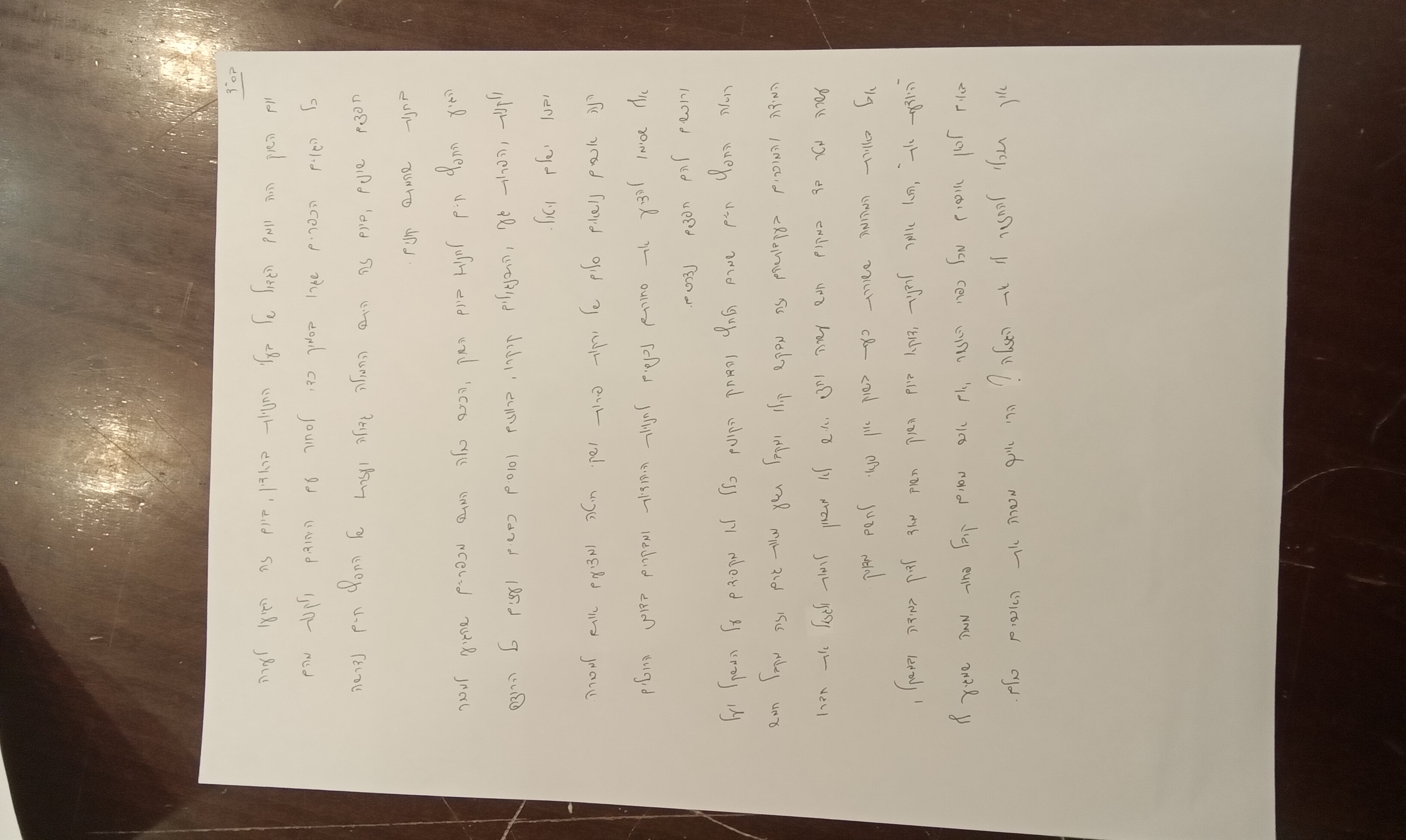
The handwriting suggests a creative and independent personality with an optimistic outlook, although consistency in letter sizing and spacing could be improved for enhanced legibility. It suggests someone energetic and expressive.
The handwriting exhibits a distinct style, characterized by rounded forms and a rightward slant. There is a notable variation in letter size and spacing. Words like "החיים" and "שלום" show consistency in the formation of certain characters, while others display a more carefree execution. Overall, the writing possesses a unique and somewhat irregular rhythm. The upward slant indicates an energetic personality. Some letters appear crowded together, while others have ample space around them. The loops in letters such as למד and קוף are generous and flowing.
This handwriting suggests a personality that is both creative and independent. The rounded forms and upward slant indicate optimism and enthusiasm. The variations in letter size and spacing might reflect adaptability and a willingness to embrace spontaneity. The individual likely possesses a strong sense of self and is not afraid to express their individuality through their writing. There is a sense of energy and a dynamic approach to life. A warm and sociable person who enjoys connecting with others and expressing themselves freely.
To enhance legibility, focusing on consistent letter sizing and spacing would be beneficial. Practicing the formation of certain characters, particularly those that exhibit variation, could improve clarity. Paying attention to baseline consistency would create a more visually harmonious appearance. Although the current style is unique and expressive, a few minor adjustments could enhance readability without sacrificing the handwriting's distinctive character. The loops in letters like למד and קוף could be more consistent.
Legibility
Expressiveness
Consistency
Overall
Leaderboard for Sunday, 02 November 2025
| 1 | The Cartographer |
74
|
| 2 | The Optimist's Italic |
73
|
| 3 | The Studious Scholar |
73
|
| 4 | The Budding Linguist |
72
|
| 5 | The Precise Environmentalist |
72
|
| 6 | The Precise Constitutionalist |
72
|
| 7 | The Inquisitive Enquirer |
71
|
| 8 | The Mathematical Mind |
70
|
| 9 | The Architect's Hand |
69
|
| 10 | The Geographer's Hand |
68
|
| 11 | The Curious Calligrapher |
68
|
| 12 | The Diplomat's Script |
68
|
| 13 | The Considerate Script |
68
|
| 14 | The Communal Calligrapher |
68
|
| 15 | The Serpentine Thinker |
68
|
| 16 | The Pragmatic Hand |
68
|
| 17 | The Environmentalist's Cursive |
67
|
| 18 | The Pragmatist's Script |
67
|
| 19 | The Methodical Muser |
66
|
| 20 | The Chemical Penman |
66
|
| 21 | Geometric Soul |
66
|
| 22 | The Loopy Luminary |
65
|
| 23 | The Diligent Student |
65
|
| 24 | The Curious Questioner |
64
|
| 25 | The Resilient Hand |
64
|
| 26 | The Civil Servant |
64
|
| 27 | The Diligent Student |
64
|
| 28 | The Considerate Correspondent |
64
|
| 29 | The Methodical Mind |
63
|
| 30 | The Architect's Italic |
62
|