Rate my handwriting

✨ Upload a sample of your handwriting, and our 🤖 AI will give you
the scoop on
what's awesome
and what could use a
little improving.
It's just for fun - and totally free! Try now 🚀
(You can also check out today's 👑 Leaderboard 👇)
The Ponderer's Quill
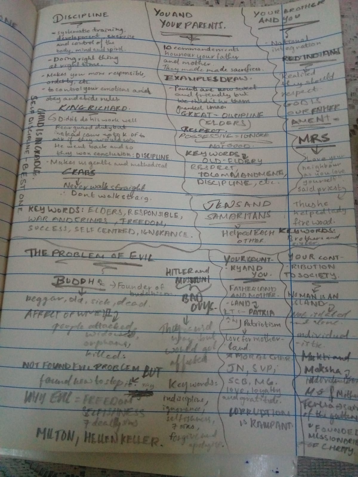
This handwriting analysis reveals a practical and organized mind with a hint of underlying adaptability, while offering tips for improving legibility and expressiveness.
The handwriting leans towards a functional, almost utilitarian style. The letterforms are generally upright, lacking much slant or flourish. There's a notable mix of upper and lowercase letters even mid-word (e.g. "BACH KEYWORDS"), and a tendency to write in block letters, particularly when emphasizing keywords such as "DISCIPLINE" and "FREEDOM". The baseline wanders, indicating a possible lack of strict adherence to rules, though the overall presentation suggests a structured mind at work.
This handwriting style suggests a personality that values clarity and directness. The emphasis on keywords and the somewhat regimented layout imply a focus on organization and a desire to categorize information effectively. The variations in letter size and the occasional slant hint at a flexible, adaptable nature, someone who can switch between precision and expressiveness as needed. A possible independent streak can be seen in the variation of letter forms.
To improve legibility, consider focusing on consistent letter sizing and maintaining a more uniform baseline. Practice connecting letters smoothly to enhance flow and rhythm. Experimenting with a slight slant could introduce a touch of personality and dynamism. Ultimately, the goal is to strike a balance between functionality and individuality, creating a handwriting style that is both clear and expressive.
Legibility
Expressiveness
Consistency
Overall
Leaderboard for Wednesday, 17 September 2025
| 61 | The Generous Appreciator |
53
|
| 62 | The Spirited Initialist |
52
|
| 63 | The Diligent Student |
52
|
| 64 | The Culinary Calligrapher |
51
|
| 65 | The Generous Soul |
51
|
| 66 | The Advocate's Script |
50
|
| 67 | The Minimalist's Marker |
50
|
| 68 | The Ponderer's Quill |
49
|
| 69 | The Pragmatic Pen |
48
|
| 70 | The Abstract Expressionist |
43
|
| 71 | The Enigmatic Dash |
29
|