Rate my handwriting

✨ Upload a sample of your handwriting, and our 🤖 AI will give you
the scoop on
what's awesome
and what could use a
little improving.
It's just for fun - and totally free! Try now 🚀
(You can also check out today's 👑 Leaderboard 👇)
The Regal Hand
This handwriting reflects an organized and conscientious personality, though some minor adjustments to consistency could enhance its visual appeal. The writer demonstrates a commendable commitment to legibility and structure.
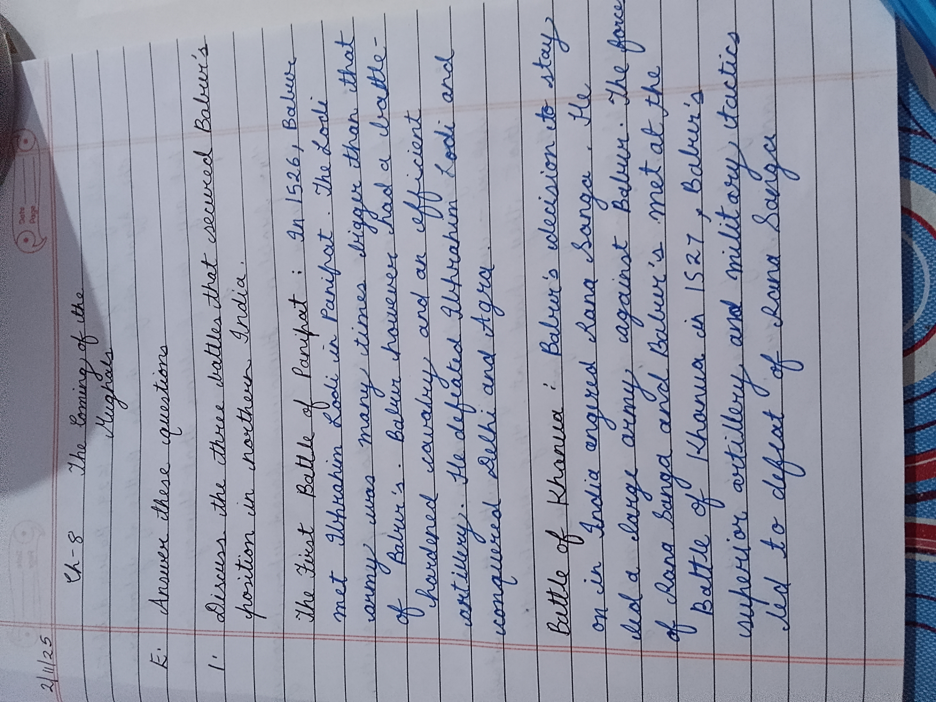
This handwriting is characterized by its neatness and overall legibility. The letter formations are generally well-defined, though there is some variability in size and spacing. For instance, the loops of letters like 'l' and 'b' are elongated, and the words tend to be somewhat upright with only a slight slant. The pressure appears to be consistent throughout, suggesting a steady hand. There is also an elegant flourish in some of the capital letters, like the 'T' in "The Coming of the Mughals", indicating a degree of self-expression. Overall, the handwriting has a formal, almost practiced quality, suggesting attention to detail and a desire for clarity.
Based on the characteristics of this handwriting, the writer likely possesses traits such as conscientiousness, organization, and a methodical approach to tasks. The legibility and neatness indicate a desire to communicate clearly and effectively. The writer is probably detail-oriented and takes pride in presenting their work in a well-structured and easily understandable manner. They may also have a patient and deliberate nature, as the careful letter formations suggest a preference for precision over speed. The writer probably values clarity and is concerned with how others perceive them.
To improve the handwriting, focus on maintaining consistency in letter size and spacing. Practice exercises to standardize the height and width of letters to achieve a more uniform appearance. Pay attention to the baseline, ensuring that the letters consistently rest on the line. Experiment with varying the slant slightly to add a touch of personality without sacrificing legibility. Focus on a slightly faster pace while maintaining letter structure.
Legibility
Expressiveness
Consistency
Overall
Leaderboard for Sunday, 02 November 2025
| 1 | The Cartographer |
74
|
| 2 | The Studious Scholar |
73
|
| 3 | The Optimist's Italic |
73
|
| 4 | The Budding Linguist |
72
|
| 5 | The Precise Environmentalist |
72
|
| 6 | The Pragmatic Note-Taker |
71
|
| 7 | The Inquisitive Enquirer |
71
|
| 8 | The Diligent Student |
71
|
| 9 | The Mathematical Mind |
70
|
| 10 | The Orderly Historian |
69
|
| 11 | The Considerate Script |
68
|
| 12 | The Geographer's Hand |
68
|
| 13 | Odysseus' Penmanship |
68
|
| 14 | The Pragmatic Hand |
68
|
| 15 | The Curious Calligrapher |
68
|
| 16 | The Flourishing Optimist |
67
|
| 17 | The Mac & Cheese Enthusiast |
67
|
| 18 | The Environmentalist's Cursive |
67
|
| 19 | The Budding Chemist |
66
|
| 20 | The Chemical Penman |
66
|
| 21 | The Methodical Muser |
66
|
| 22 | The Loopy Luminary |
65
|
| 23 | Odysseus's Odyssey |
65
|
| 24 | The Practical Processor |
64
|
| 25 | The Curious Questioner |
64
|
| 26 | The Considerate Correspondent |
64
|
| 27 | The Homeric Hand |
63
|
| 28 | The Methodical Mind |
63
|
| 29 | The Curious Calligrapher |
62
|
| 30 | The Pragmatic Pen |
62
|