Whether you’re converting typed documents or handwritten text, getting high-quality results starts with providing high-quality images. Here’s your complete guide to getting the best possible results from OCR software.
General OCR Guidelines
1. Image Resolution
Your image needs to be large enough for the software to clearly see each character. As a rule of thumb, your image should be at least 2000 pixels on its longest side (roughly equivalent to a 4 megapixel photo). Many OCR failures happen simply because the image is too small or has been compressed.
Ensure your document is sharp before uploading for handwritng to text OCR.
Solution: Use high-resolution scans or full-quality photos. Most modern phones have 12+ megapixel cameras which is more than enough - just be sure to use the original photo at full resolution. Check your image size before submitting - if it’s less than 2000 pixels wide/tall, try to get a higher quality capture. Be especially careful of images that have been shared through messaging apps like WhatsApp, as these are often automatically compressed to less than 1 megapixel, making them too small for reliable OCR.
2. Focus and Clarity
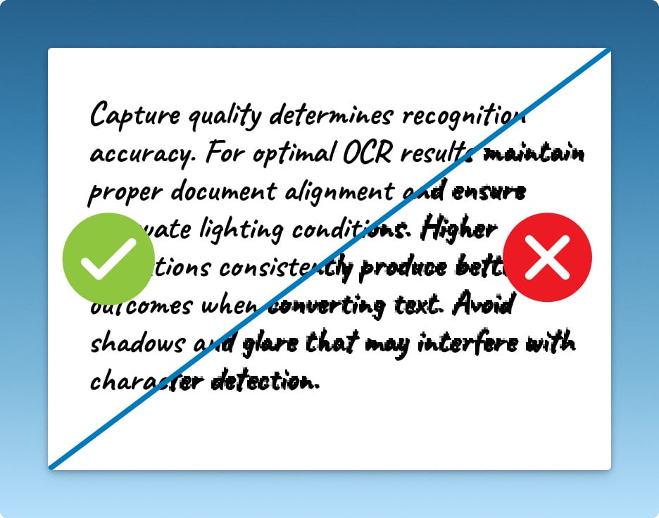
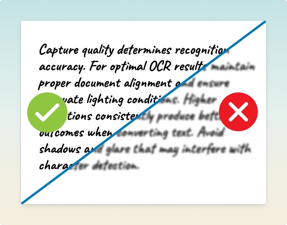
Blurry or out-of-focus images are one of the most common reasons for OCR failure. Even slight blur that might look acceptable to the human eye can make text recognition fail completely, as the software needs crisp edges to distinguish between similar characters (like ‘c’ vs ‘e’ or ‘i’ vs ‘l’). This is especially common when taking quick snapshots with a phone camera in poor lighting.
Ensure your document is in focus before starting the OCR conversion process.
Solution: Take an extra moment to ensure perfect focus. If using a phone:
- Tap the screen to focus directly on the text
- Wait for the focus box to turn green/sharp before capturing
- Keep your hands steady or, better yet, rest them on a table
- Use your phone’s timer feature to avoid camera shake when pressing the button
- In low light, keep extra still as your phone will use a slower shutter speed
- Check the image is sharp by zooming in to look at individual letters - if they’re not crystal clear to your eye, they won’t be clear to the OCR either
3. Page Orientation
While modern OCR software can often handle text at various angles, forcing it to read rotated text introduces unnecessary risk of errors. Each degree of rotation makes it slightly harder for the software to recognize characters correctly, especially with handwriting or stylized fonts. Even a seemingly minor tilt of 5-10 degrees can affect accuracy.
Solution: Take a moment to align your document properly before capturing:
- Use your phone’s grid lines to ensure text lines are perfectly horizontal
- On iPhones, use the level feature in the camera app (shown as overlapping crosses)
- Place your document on a contrasting surface so you can clearly see if it’s aligned
- For bound documents like notebooks, make sure the page lies as flat as possible
- If capturing multiple pages, maintain consistent orientation throughout
- If your document is sideways or upside down, rotate it in your phone’s image editor before submitting - don’t rely on the OCR to figure it out
- Double-check the preview image - text lines should be perfectly parallel with the edges of your screen
Remember: while the OCR might eventually figure out a tilted page, giving it properly oriented text means it can focus its efforts on accurate character recognition instead of trying to determine which way is up.
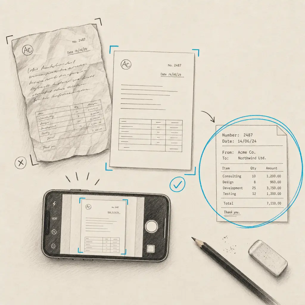
4. One Page Per Image
Trying to capture multiple pages in a single photo is a common mistake that significantly reduces OCR accuracy. When you try to fit multiple pages in one shot, several problems occur. First, each page takes up less space in the image, effectively reducing the resolution of each page to below the minimum needed for good OCR. The edges where pages meet create shadows and contrast differences that confuse the software. Pages at the edges of the frame may be distorted by camera lens effects, and different pages are often at slightly different angles. Most importantly, the software has to waste effort trying to figure out where one page ends and another begins instead of focusing on reading the text.
Solution: Always capture one full page per image:
- Take individual shots of each page
- Position your camera so the page fills most of the frame (while leaving small margins)
- Keep the camera parallel to the page to avoid perspective distortion
- Use a scanning app that guides you to capture one page at a time
- If working with small documents (like receipts), still capture them individually
- For business cards or small notes, don’t try to batch them together - give each one its own photo
Remember: Even though it might take a few extra seconds to capture separate images, this is far quicker than trying to fix poor OCR results from a crowded multi-page image. Most OCR services charge by the page anyway, so you won’t save money by cramming multiple pages into one image.
5. Complete Text Capture
Missing or cut-off text at the edges of your image creates major problems for OCR accuracy. When parts of words are cut off at the image boundaries, the software has to make guesses about what those partial letters might be, often leading to errors. In handwritten text, this is especially problematic since the software needs to see complete letter shapes to interpret them correctly. Missing letter tops or bottoms are particularly problematic with handwriting, as many letters are distinguished by their upper or lower elements - consider how ‘h’ becomes ‘n’ if you cut off the top, or how ‘g’ becomes ‘a’ if you lose the bottom loop.
Solution: Always ensure complete text capture:
- Leave a small margin (about half an inch) around all edges of the text
- Make sure you can see the complete tops of tall letters (like ‘b’, ‘d’, ‘f’, ‘h’, ‘k’, ‘l’)
- Ensure you capture the full bottom of letters that extend below the line (like ‘g’, ‘j’, ‘p’, ‘q’, ‘y’)
- For lined paper, include the full height of each text line including any ascenders and descenders
- If your document has headers or footers, make sure they’re fully visible
- Check your preview image carefully for any text that might be touching the edges
Remember: It’s always better to capture too much than too little. You can crop unnecessary margins later, but you can’t recover text that wasn’t captured in the first place.
6. Lighting
Poor lighting is often the hidden culprit behind OCR failures. Uneven illumination creates shadows and dark spots that break up text and confuse the recognition software. Overhead lighting typically casts shadows from slightly raised paper edges or wrinkles, while direct sunlight creates harsh contrasts and glare. Using your phone’s flash usually makes things worse by creating a bright spot in the center and dark corners, plus it often produces glare on glossy paper surfaces. All of these lighting problems can turn clear text into an unrecognizable mess, even if the image looks readable to human eyes.
Solution: Aim for even, diffused lighting across your whole document:
- Natural daylight near a window often works best, but avoid direct sunlight
- If using indoor lighting, position multiple light sources to eliminate shadows
- Avoid using your camera’s flash
- For glossy paper, adjust your angle to eliminate reflections
- If using a single lamp, position it at roughly 45 degrees to minimize shadows
- Watch for shadows from your hands or phone when capturing
- Check your preview image for any dark spots or glare before capturing
- For consistent results, consider investing in a small LED desk lamp with diffused light
Remember: If you can see noticeable shadows or bright spots on your document, your OCR software will struggle with those areas. Even lighting is crucial for consistent recognition across the whole page.
7. Image Adjustments and Post-Processing
Many people try to “fix” their document images before submitting them to OCR, but this can often do more harm than good. While basic adjustments can sometimes help, aggressive editing usually confuses the recognition software. The OCR engine expects to see natural variations in text and paper - over-processed images that look “cleaner” to human eyes might actually be harder for the software to interpret.
What Can Help:
- Basic rotation to correct slight misalignment
- Mild contrast adjustment if the text is very faint
- Simple cropping to remove irrelevant edges (while maintaining margins around text)
- Converting color images to grayscale if color isn’t important
What To Avoid:
- Sharpening filters (they create artificial edges that confuse OCR)
- Heavy contrast adjustments that make text too bold or thin
- Color “enhancement” that changes the natural appearance of ink or paper
- Digital zoom or artificial resolution increases
- Auto-enhance features in photo apps
- Any filters designed to make photos look better
- Converting to black and white (binary) - let the OCR software handle this
- Heavy compression to reduce file size
Solution: If you need to make adjustments:
- Make minimal changes - less is more
- Work with a copy of your original image
- Avoid multiple editing steps that can compound quality loss
- If unsure, submit the original image as captured
- Save in a format that doesn’t add compression (PNG rather than JPEG)
- Test both the original and adjusted versions if possible
- Keep adjustments subtle - if the change looks dramatic, it’s probably too much
Remember: Modern OCR software includes its own image preprocessing specifically designed for text recognition. Your photo editing app’s idea of a “better” image might not align with what the OCR engine needs for optimal results.
Special Considerations for Handwriting Recognition
Handwriting recognition requires extra attention to detail. Here are additional tips specifically for getting the best results with handwritten text:
1. Letter Formation Details
Handwriting recognition software relies heavily on seeing the complete shape and detail of each letter to make accurate interpretations. The software analyzes the specific characteristics that make each letter unique, such as the placement of dots, the way lines cross, and how loops are formed. When capturing cursive writing, it needs to understand both how letters connect and where one letter ends and another begins. Small details that humans automatically interpret can completely change letter recognition - a missing dot can turn an ‘i’ into an ‘l’, while a broken loop can transform a ‘g’ into a ‘y’.
Solution: When capturing handwritten text, pay special attention to detail clarity:
- Use sufficient lighting to ensure every mark is visible
- Check that dots and accents are clearly separated from their letters
- Make sure crossings on letters like ‘t’ and ‘f’ are distinct
- Verify that loops in letters like ‘g’, ‘y’, and ‘p’ are fully captured
- For cursive text, ensure letter connections are clear and unbroken
- Double-check that descenders (parts of letters that go below the line) aren’t faded or unclear
- Review your image at full size to confirm all fine details are sharp and visible
Remember: While humans are great at inferring missing details in handwriting, OCR software needs to see every component of each letter to make accurate interpretations.
2. Writing Style Consistency
Handwriting recognition software uses pattern recognition to understand text, and sudden changes in writing style can significantly impact its accuracy. When a document mixes different styles - switching between cursive and print, varying slant angles, or changing between neat and rushed writing - the software has to constantly readjust its interpretation patterns. This is particularly challenging because each style has its own characteristics: cursive focuses on letter connections, print relies on distinct letter shapes, and mixed styles create unpredictable combinations that the software must decipher. Even changes in writing pressure or pen thickness can affect how well the software recognizes similar letters across a document.
Solution: To maximize recognition accuracy:
- When writing new documents, maintain a consistent style throughout
- Keep a steady slant angle across your writing
- Use the same pen or writing tool for the whole document
- If capturing existing documents with multiple styles, consider splitting them into separate submissions
- For multi-author documents, group pages by writer when possible
- If mixing styles is unavoidable, ensure each style is clearly distinct and well-spaced
- When dealing with historical documents, group similar writing styles together
Remember: While humans easily adapt to style changes in handwriting, OCR software works best when it can apply consistent recognition patterns across the whole document.
3. Line Spacing and Overlap
Handwriting naturally varies in its spacing and alignment, creating challenges that rarely occur with typed text. When lines of text are too close together, descenders from one line (like the tails of ‘g’, ‘j’, ‘y’) can intersect with ascenders from the line below (like ‘b’, ‘d’, ‘h’, ‘l’). This creates confusion for the recognition software, which must determine which marks belong to which letters. Irregular line spacing compounds this problem, as the software can’t establish a consistent baseline for the text. Even slight wavering in line alignment can cause the software to misinterpret letter shapes or mistake parts of one line for another.
Solution: When capturing handwritten documents:
- If creating new documents, leave generous space between lines (roughly double the height of your letters)
- For existing documents with tight spacing, ensure your image is high resolution enough to distinguish overlapping elements
- Keep the camera perpendicular to the page to avoid distorting line spacing
- Watch for places where descenders and ascenders might touch or cross
- If using lined paper, ensure the lines themselves don’t interfere with text recognition
- Consider using a ruler or straight edge as a writing guide to maintain consistent baselines
- For documents with varying line spacing, make sure your capture includes enough context around each line
Remember: While cramped writing might save paper, it makes accurate text recognition significantly more difficult. Good spacing is crucial for reliable OCR results.
4. Paper Background
The surface you write on significantly impacts OCR accuracy. Unlike typed documents which typically use plain white paper, handwritten notes appear on a variety of surfaces, each presenting unique challenges for recognition software. Lined paper can create confusion when lines intersect with text, particularly with letters that extend below the baseline. Graph paper adds even more complexity with its grid of intersecting lines that can be mistaken for letter components. Colored paper can reduce contrast and make it harder for the software to distinguish text from background. Textured paper creates noise in the image that can interfere with letter recognition, especially when texture patterns intersect with handwriting strokes.
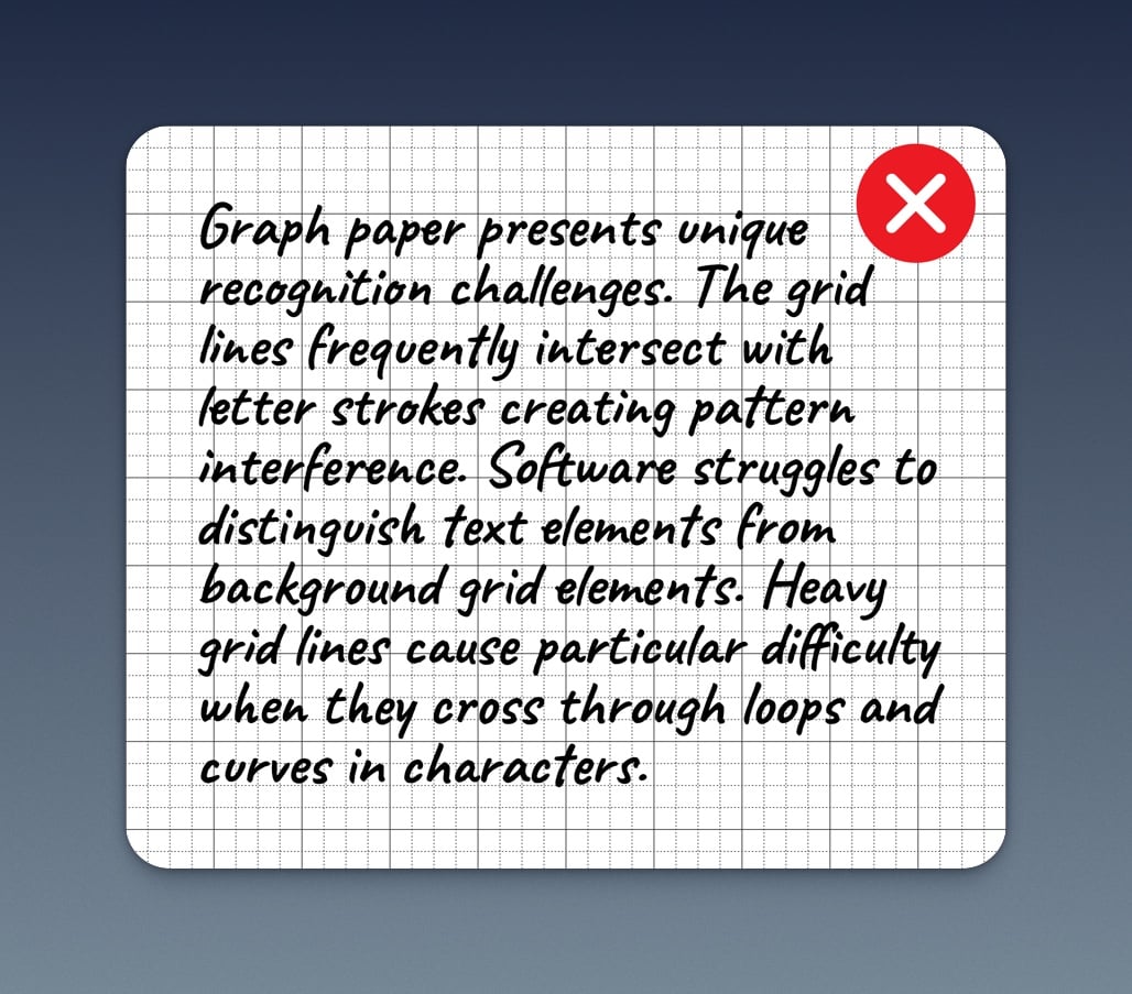
Grid paper can lead to disappointing OCR performance.
Solution: When capturing different paper types:
- For lined paper, light blue lines work best as they’re often automatically filtered out
- With graph paper, ensure your image is sharp enough to clearly distinguish text from grid lines
- For colored paper, adjust your lighting to maximize contrast between ink and paper
- When using textured paper, increase resolution to help the software distinguish texture from text
- Consider adjusting your camera’s exposure to minimize background interference
- Use consistent, even lighting to reduce shadows that might emphasize paper texture
- If possible, position the paper to minimize glare or reflection from any glossy surfaces
Remember: While humans can easily read text on any background, OCR software performs best when there’s clear contrast between the writing and a clean background. When you can’t control the paper type, focus on optimal lighting and capture quality to help the software distinguish text from background elements.
5. Ink and Writing Implements
The choice of writing tool has a dramatic impact on OCR accuracy. Each type of writing implement creates different characteristics in the text that affect how well the software can recognize letters. Pencil markings often lack sufficient contrast and can smudge easily, creating unclear letter boundaries. They also reflect light differently than ink, sometimes appearing faint in certain lighting conditions. Gel pens, while smooth to write with, can create glossy marks that catch light and cause glare spots in your image. Markers present their own challenges - thick lines can cause letters to blur together, while felt-tip markers may create uneven ink distribution that affects character recognition. Even different colors can impact success rates, as some colors create less contrast with the paper or may be harder for the software to process.
Solution: When creating documents for OCR:
- Choose medium-point ballpoint pens for their consistent, well-defined lines
- If using gel pens, ensure your lighting minimizes reflection from the glossy ink
- For markers, select fine-point options that won’t make letters too thick
- Avoid light-colored inks that won’t provide enough contrast
- If capturing pencil-written documents, adjust lighting and camera settings to maximize contrast
- Consider using black or dark blue ink for optimal results
- Test different pens on your paper type to find the best combination
Remember: The ideal writing implement creates clear, dark, consistent lines without smudging or glare. While you can’t always control what was used to write a document, understanding how different tools affect OCR can help you optimize your capture settings accordingly.
Quick Checklist Before Submitting:
- Is my image at least 2000 pixels on its longest side?
- Is every character completely clear and in focus?
- Is the page oriented correctly?
- Am I submitting just one page per image?
- Can I see complete text with margins around all edges?
- Is the lighting even across the whole page?
- Is the paper flat with minimal wrinkles?
- For handwriting: Are all letter details (dots, crosses, etc.) visible?
- For handwriting: Is the writing style consistent?
- For handwriting: Is there strong contrast between ink and paper?
Following these guidelines will significantly improve your OCR results, whether you’re working with typed or handwritten text. Remember that handwriting recognition typically requires more attention to detail, but the extra effort in capture quality leads to better results and less time spent on corrections.