Rate my handwriting

✨ Upload a sample of your handwriting, and our 🤖 AI will give you
the scoop on
what's awesome
and what could use a
little improving.
It's just for fun - and totally free! Try now 🚀
(You can also check out today's 👑 Leaderboard 👇)
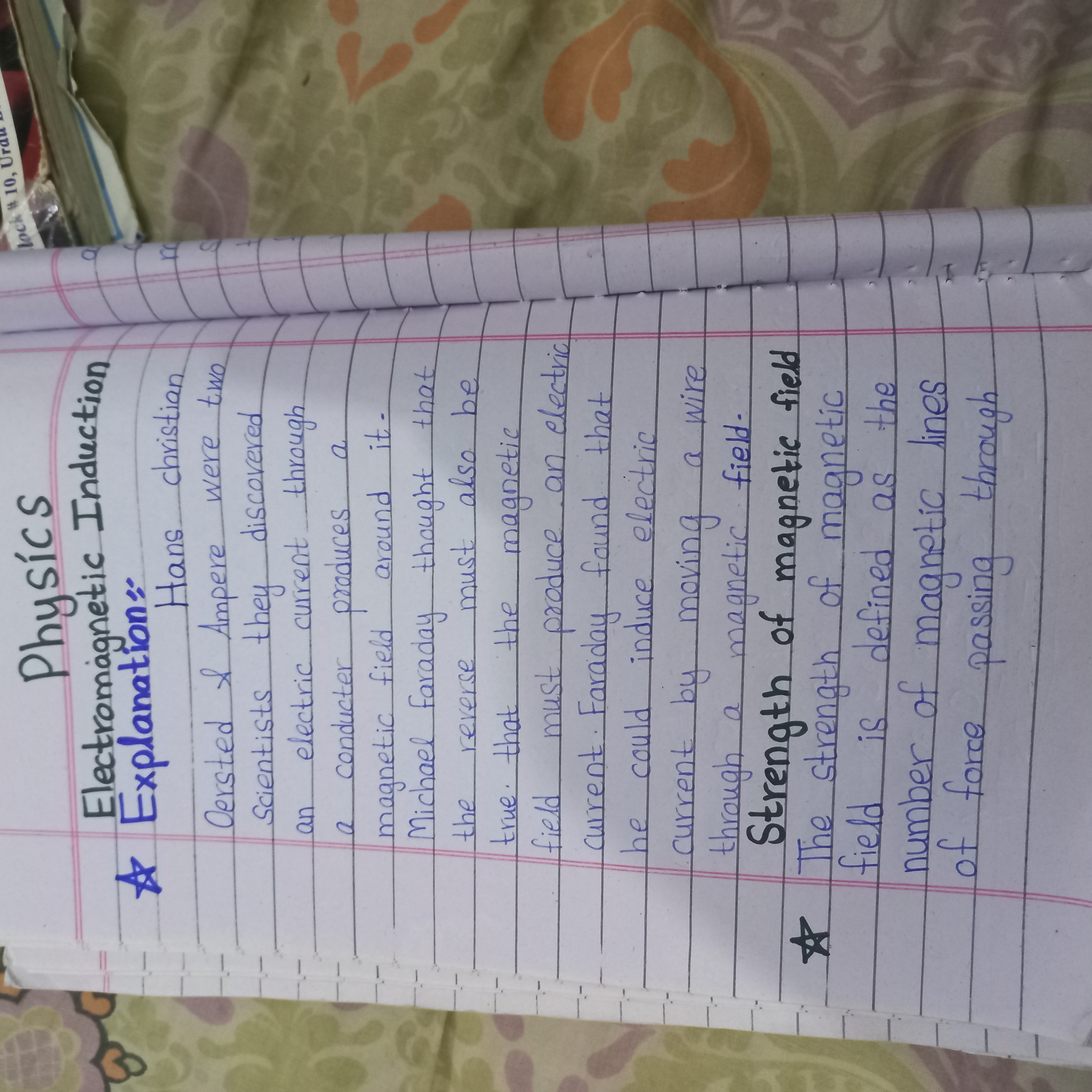
The Academician's Italic
The handwriting exhibits neatness and precision, suggesting a personality that values order and clarity, but could benefit from improved consistency in pressure and spacing for enhanced legibility and expressiveness.
The handwriting is upright and neat, suggesting a careful and deliberate approach to writing. The letter formation is generally clear, although some letters like 'r' and 'n' occasionally blend together, affecting legibility. The writing is fairly consistent in terms of size and spacing, but there's a slight variation in pressure, which gives it a somewhat uneven appearance. The words are closely spaced, with relatively little space between the lines. Overall, it is quite formal, precise and textbook-like.
This style of handwriting often indicates a personality that values order, precision, and clarity. The writer likely pays attention to detail and strives for accuracy in their work. They are methodical and well-organized, preferring structured environments to chaotic ones. They probably have a strong sense of responsibility and take pride in producing neat and presentable work.
To improve your handwriting, try focusing on consistent pressure throughout each stroke. Practice spacing the letters and words more evenly to enhance legibility. Experiment with a slightly more relaxed grip to promote fluency and reduce any stiffness in your writing. Consider varying the slant of your letters for a more expressive style. Remember, handwriting is a personal expression, so find what feels most comfortable and natural for you.
Legibility
Expressiveness
Consistency
Overall
Leaderboard for Thursday, 30 October 2025
| 31 | The Diplomat |
53
|
| 32 | The Pragmatic Planner |
53
|
| 33 | The Flowing Well |
53
|
| 34 | The Pragmatic Planner |
52
|
| 35 | The Determined Dreamer |
51
|
| 36 | The Pragmatic Planner |
49
|