Rate my handwriting

✨ Upload a sample of your handwriting, and our 🤖 AI will give you
the scoop on
what's awesome
and what could use a
little improving.
It's just for fun - and totally free! Try now 🚀
(You can also check out today's 👑 Leaderboard 👇)
The Considerate Communicator
The handwriting reflects a friendly and adaptable personality, although consistency in letter size and spacing could be improved for a more polished appearance. It indicates an approachable person who values clear communication.
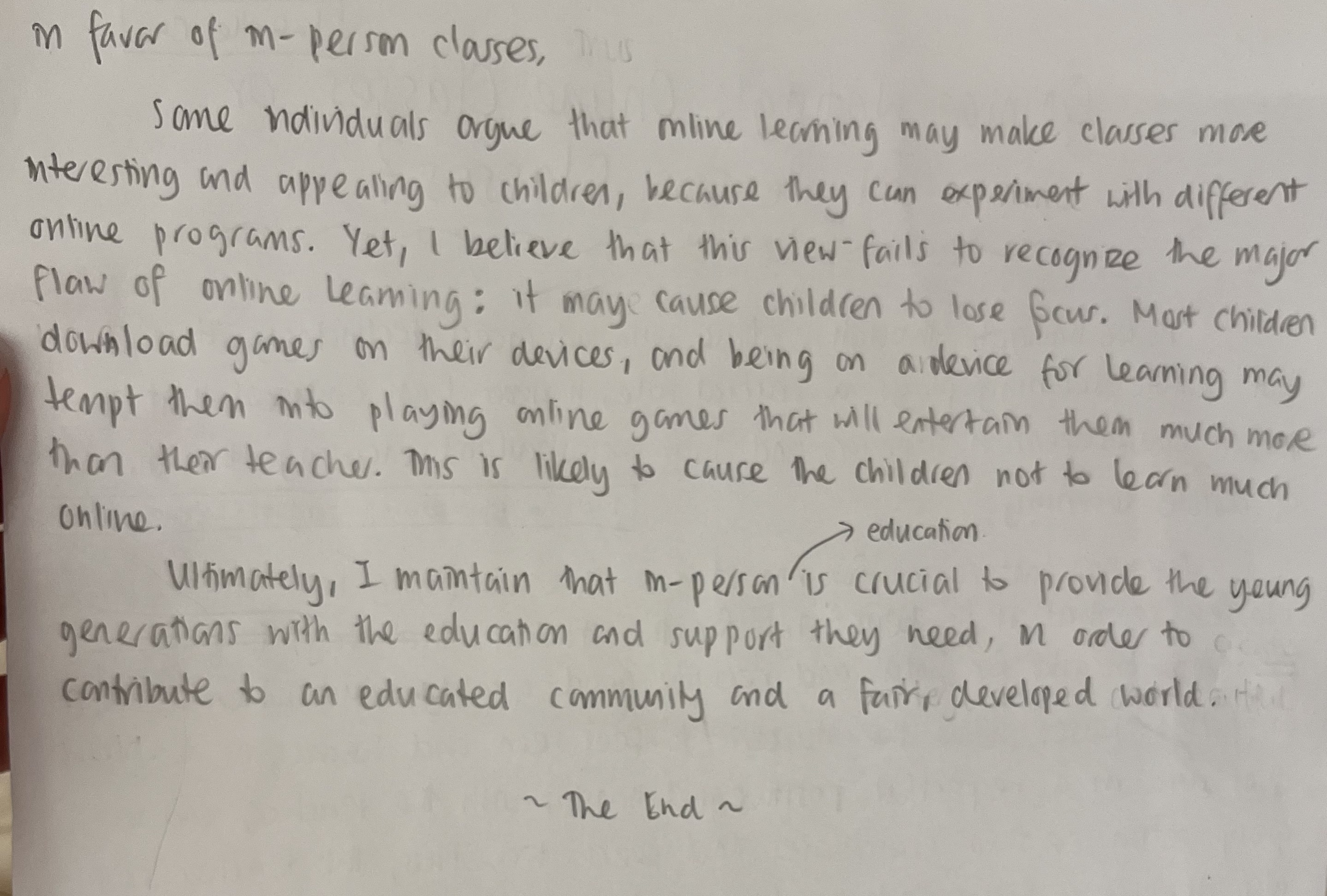
The handwriting sample exhibits a casual and flowing style, characterized by rounded letter forms and a slight rightward slant. The letter 'm' in 'm-person' shows a distinct arch, and words like 'online' are written with connected strokes, suggesting a degree of fluency. There is some inconsistency in letter size and spacing, for example, the space between the words 'developed' and 'world' is larger than the average spacing, which impacts overall neatness. The handwriting is generally legible, though some words, like 'ndividuals', could benefit from clearer letter differentiation.
This handwriting style suggests a personality that is agreeable and approachable. The rounded letter forms and rightward slant imply a friendly and sociable nature. The variability in spacing and letter size may indicate adaptability and a willingness to go with the flow. However, the lack of precise consistency also hints at a possible tendency to be less detail-oriented or structured in certain aspects of life. The individual likely values communication and connection, as evidenced by the overall legibility of the writing.
To improve handwriting, focusing on consistent letter sizing and spacing would be beneficial. Practicing letter formation, especially for letters like 'n' and 'd', can enhance clarity. Incorporating some deliberate pauses between words and paying closer attention to the baseline alignment could also lead to a more polished and refined appearance. Aiming for a more uniform slant could also improve consistency and visual appeal.
Legibility
Expressiveness
Consistency
Overall
Leaderboard for Wednesday, 29 October 2025
| 1 | The Calligrapher |
77
|
| 2 | The Economist's Italic Hand |
74
|
| 3 | The Flowing Stream |
74
|
| 4 | The Poet's Quill |
71
|
| 5 | The Elegant Scholar |
71
|
| 6 | The Energetic List-Maker |
71
|
| 7 | The Flourishing Font |
69
|
| 8 | The Mario Manifesto |
68
|
| 9 | The Logical Chemist |
66
|
| 10 | The Elegant Calligrapher |
66
|
| 11 | The Pragmatic Planner |
65
|
| 12 | The Analytical Alchemist |
65
|
| 13 | The Grid Writer |
65
|
| 14 | The Bio Notes |
64
|
| 15 | The Flowing Quill |
64
|
| 16 | The Meticulous Planner |
63
|
| 17 | The Flourishing Enigma |
63
|
| 18 | The Typist's Tale |
63
|
| 19 | The Civic Philosopher |
63
|
| 20 | Le Gribouillage Scientifique |
62
|
| 21 | The Meticulous Dreamer |
61
|
| 22 | Algorithmic Alchemist |
61
|
| 23 | The Pragmatic Pen |
61
|
| 24 | Le Calligraphe Studieux |
61
|
| 25 | The Cellular Biologist |
61
|
| 26 | The Atomic Pen |
60
|
| 27 | The Artisan's Flourish |
60
|
| 28 | The Flowing Hand |
59
|
| 29 | The Flourishing One |
59
|
| 30 | Angelic Impressions |
59
|