Rate my handwriting

✨ Upload a sample of your handwriting, and our 🤖 AI will give you
the scoop on
what's awesome
and what could use a
little improving.
It's just for fun - and totally free! Try now 🚀
(You can also check out today's 👑 Leaderboard 👇)
The Jumper
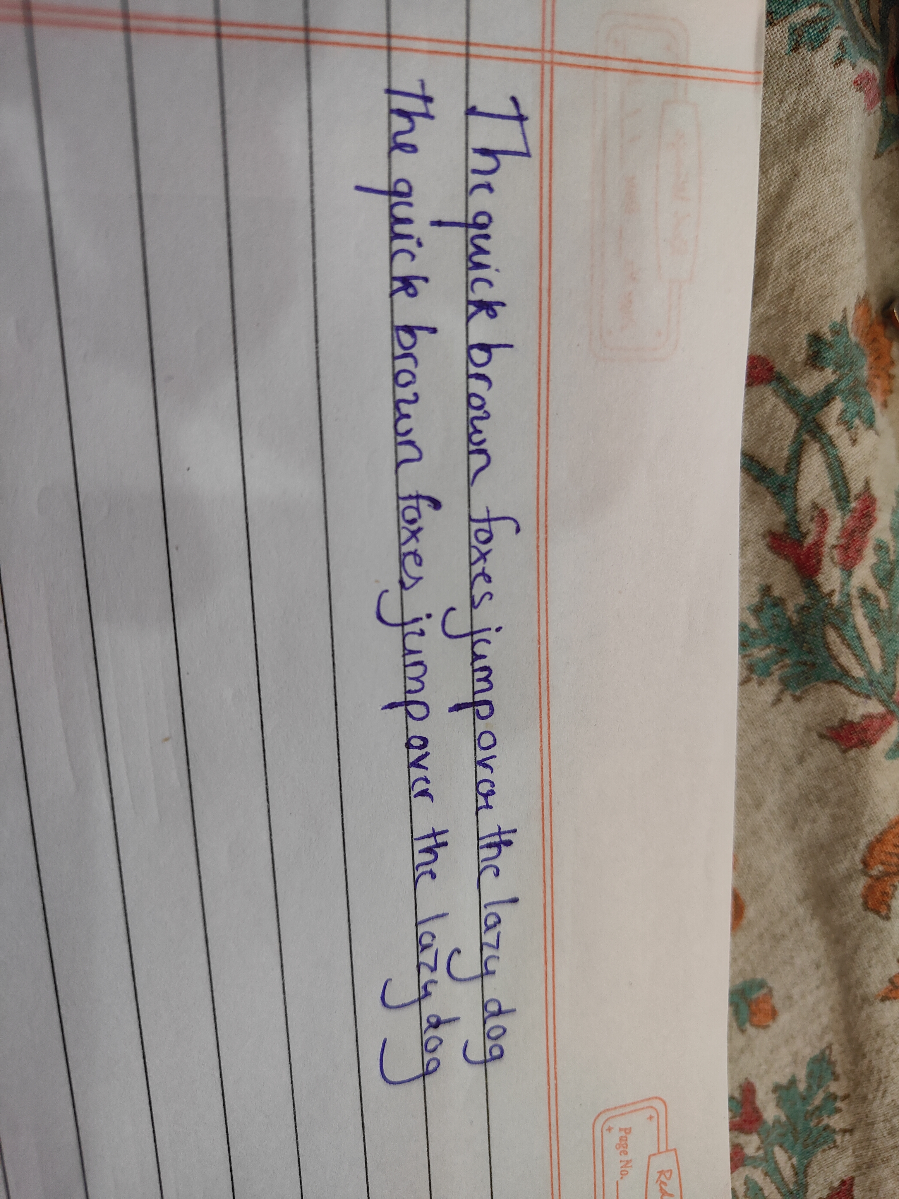
This handwriting blends curves and angles, suggesting a balanced personality with room for improved consistency and legibility. Practicing baseline adherence and letter spacing would enhance the writing's overall appeal.
The handwriting is characterized by a somewhat upright slant, exhibiting a blend of curves and angles. Letter formations are generally rounded, though some angles are apparent in letters like 'x' and 'k'. The baseline adherence appears inconsistent, with words slightly drifting up and down, and some letters like 'j' extend far below the line. The writing pressure seems moderate, producing lines of medium thickness. The size of the letters is fairly uniform, but the spacing between words is slightly inconsistent.
Based on this sample, the writer may be someone who is generally balanced, exhibiting both thoughtful and practical tendencies. The inconsistency in baseline adherence may indicate a degree of adaptability or a tendency to be easily swayed by external influences. The rounded letter forms could point to a person who values harmony and interpersonal relationships, while the angularity in some letters might suggest a degree of determination or a critical mindset.
To improve the handwriting, focusing on maintaining a consistent baseline would greatly enhance its legibility. Practicing uniform letter spacing and size can also contribute to a neater appearance. Experimenting with varying the writing pressure to achieve a more consistent line thickness might add a touch of refinement. Pay particular attention to the letter 'j', ensuring the downward stroke doesn't deviate too much from the line.
Legibility
Expressiveness
Consistency
Overall
Leaderboard for Monday, 27 October 2025
| 1 | The Analytical Mind |
74
|
| 2 | The Constitutionalist |
74
|
| 3 | The Eloquent Educator |
71
|
| 4 | The Student's Script |
70
|
| 5 | The Constitutionalist |
68
|
| 6 | The Optimistic Poet |
68
|
| 7 | The Diligent Penman |
67
|
| 8 | The Agrarian Academic |
67
|
| 9 | The Calculating Hand |
65
|
| 10 | The Analytical Alchemist |
65
|
| 11 | The Aesthetic Typist |
65
|
| 12 | The Contemplative Soul |
64
|
| 13 | The Agile Leaper |
64
|
| 14 | The Diligent Note-Taker |
64
|
| 15 | The Mathematical Muse |
64
|
| 16 | The Quill of Conviction |
62
|
| 17 | The Agile Artisan |
61
|
| 18 | The Democratic Dreamer |
59
|
| 19 | The Curious Chemist |
59
|
| 20 | The Devout Note-Taker |
58
|
| 21 | The Elaborate Chronicler |
58
|
| 22 | The Practical Notetaker |
58
|
| 23 | The Orderly Typewriter |
56
|
| 24 | The Considerate Confidant |
56
|
| 25 | The Forward Leaning Letterer |
54
|
| 26 | The Flourishing Academic |
53
|
| 27 | The Aspiring Typesetter |
53
|
| 28 | The Architect of Letters |
53
|
| 29 | The Diligent Note-Taker |
53
|
| 30 | The Steadfast Student |
53
|