Rate my handwriting

✨ Upload a sample of your handwriting, and our 🤖 AI will give you
the scoop on
what's awesome
and what could use a
little improving.
It's just for fun - and totally free! Try now 🚀
(You can also check out today's 👑 Leaderboard 👇)

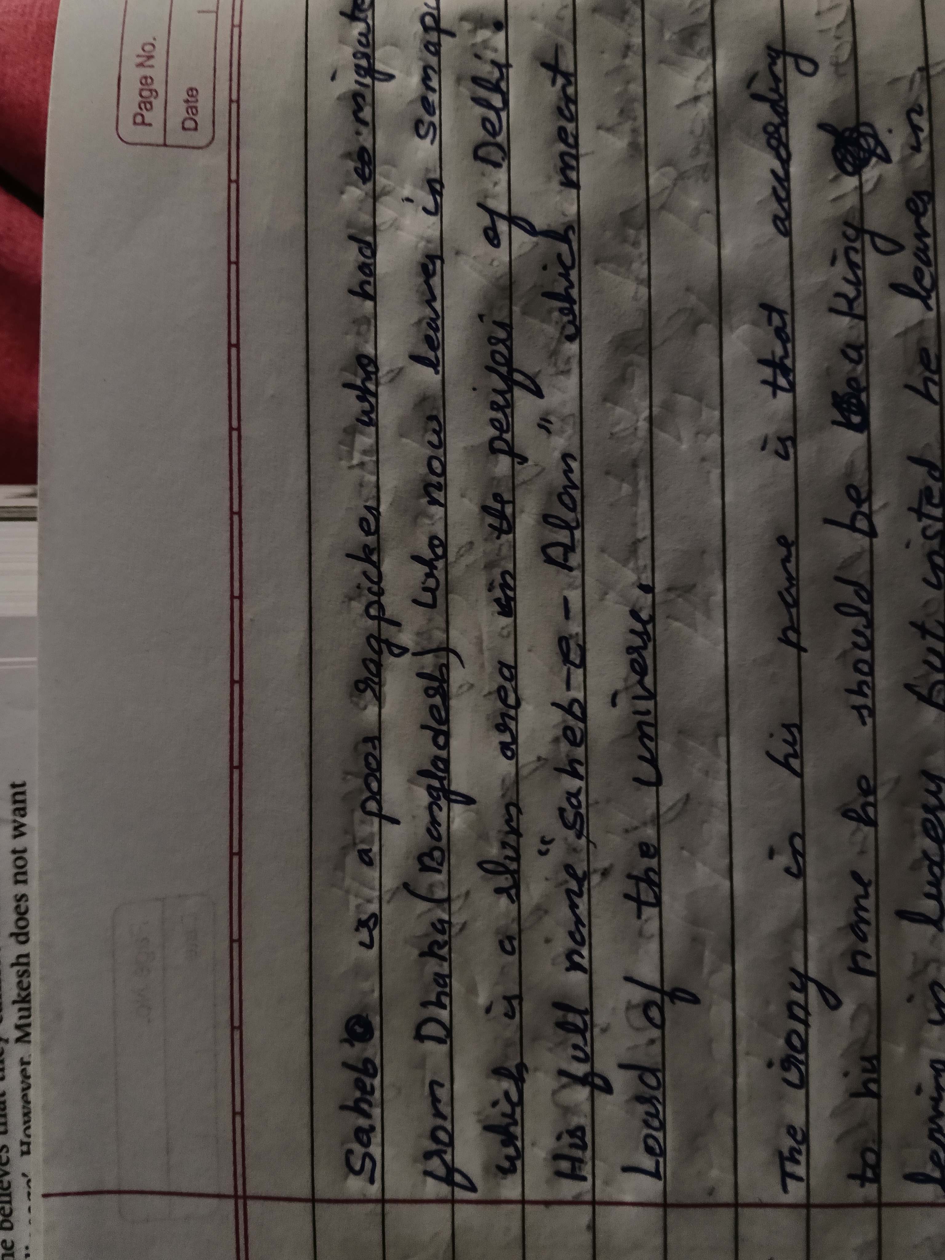
The Lord of the Universe
This handwriting reveals a practical and efficient communicator, who values clarity and directness. A touch more dynamism and variation in the strokes could enhance the overall aesthetic appeal.
The handwriting sample presents a connected style, with most letters joined together, indicating a good flow of thoughts and ideas. The letters are of medium height and width, with consistent spacing between words and lines, demonstrating an organised approach. The slant is mostly upright, suggesting independence and objectivity. The baseline is relatively straight, implying stability and practicality. The lowercase "a" often appears open at the top and the "g" has a simple loop, which can be seen in words like "ragpicker", "Bangladesh" and "according". These are all traits of an efficient and clear communication style.
This style of handwriting indicates that the writer is a straightforward and logical individual, possibly someone who prefers practicality over flamboyance. The connected letters point towards a desire for connection and communication with others, while the upright slant hints at a level-headed and rational nature. The consistency in size and spacing suggests a focus on order and efficiency, possibly combined with a certain level of perfectionism. This person likely values clarity and directness in communication, avoiding unnecessary embellishments or ambiguity.
While the handwriting is legible, it could benefit from a bit more flair and dynamism. Try experimenting with different pen grips and writing speeds to introduce more variation in the stroke thickness. This can add visual interest and personality to the writing. Also, try exaggerating the ascenders and descenders of letters like "h", "l", "f", and "g" to add more vertical emphasis. Adding distinct flourishes or embellishments to the capitals or ending strokes can also enhance the overall aesthetic appeal of the writing, without sacrificing legibility. Don't be afraid to add your own unique touch!
Legibility
Expressiveness
Consistency
Overall
Leaderboard for Sunday, 26 October 2025
| 1 | The Flowing Quill |
74
|
| 2 | The Constitutionalist |
74
|
| 3 | The Curator's Script |
72
|
| 4 | The Eloquent Educator |
71
|
| 5 | The Dreamer's Quill |
70
|
| 6 | The Hopeful Heart's Script |
68
|
| 7 | The Constitutionalist |
68
|
| 8 | The Flowing Quill |
68
|
| 9 | The Flowing Hand |
68
|
| 10 | The Agrarian Academic |
67
|
| 11 | The Unassuming Hand |
66
|
| 12 | The Calculating Hand |
65
|
| 13 | The Studious Student |
65
|
| 14 | The Contemplative Soul |
64
|
| 15 | The Mathematical Muse |
64
|
| 16 | The Flowing Font |
63
|
| 17 | The Gentle Flow |
63
|
| 18 | The Looping Legend |
62
|
| 19 | The Contemplative Calligrapher |
60
|
| 20 | The Democratic Dreamer |
59
|
| 21 | The Pragmatic Idealist |
59
|
| 22 | The Signature Stylist |
59
|
| 23 | The Devout Note-Taker |
58
|
| 24 | The Cipher's Quill |
57
|
| 25 | The Atom Alchemist |
57
|
| 26 | The Loop-de-Loop Legend |
56
|
| 27 | The Scientific Mind |
56
|
| 28 | The Calligrapher's Flourish |
54
|
| 29 | The Forward Leaning Letterer |
54
|
| 30 | The Celestial Stylist |
54
|