Rate my handwriting

✨ Upload a sample of your handwriting, and our 🤖 AI will give you
the scoop on
what's awesome
and what could use a
little improving.
It's just for fun - and totally free! Try now 🚀
(You can also check out today's 👑 Leaderboard 👇)
The Hasty Healer
This handwriting suggests an intelligent and quick-witted personality with a tendency towards impatience and distraction. A focus on consistency in slant, letterforms and sizing would improve readability.
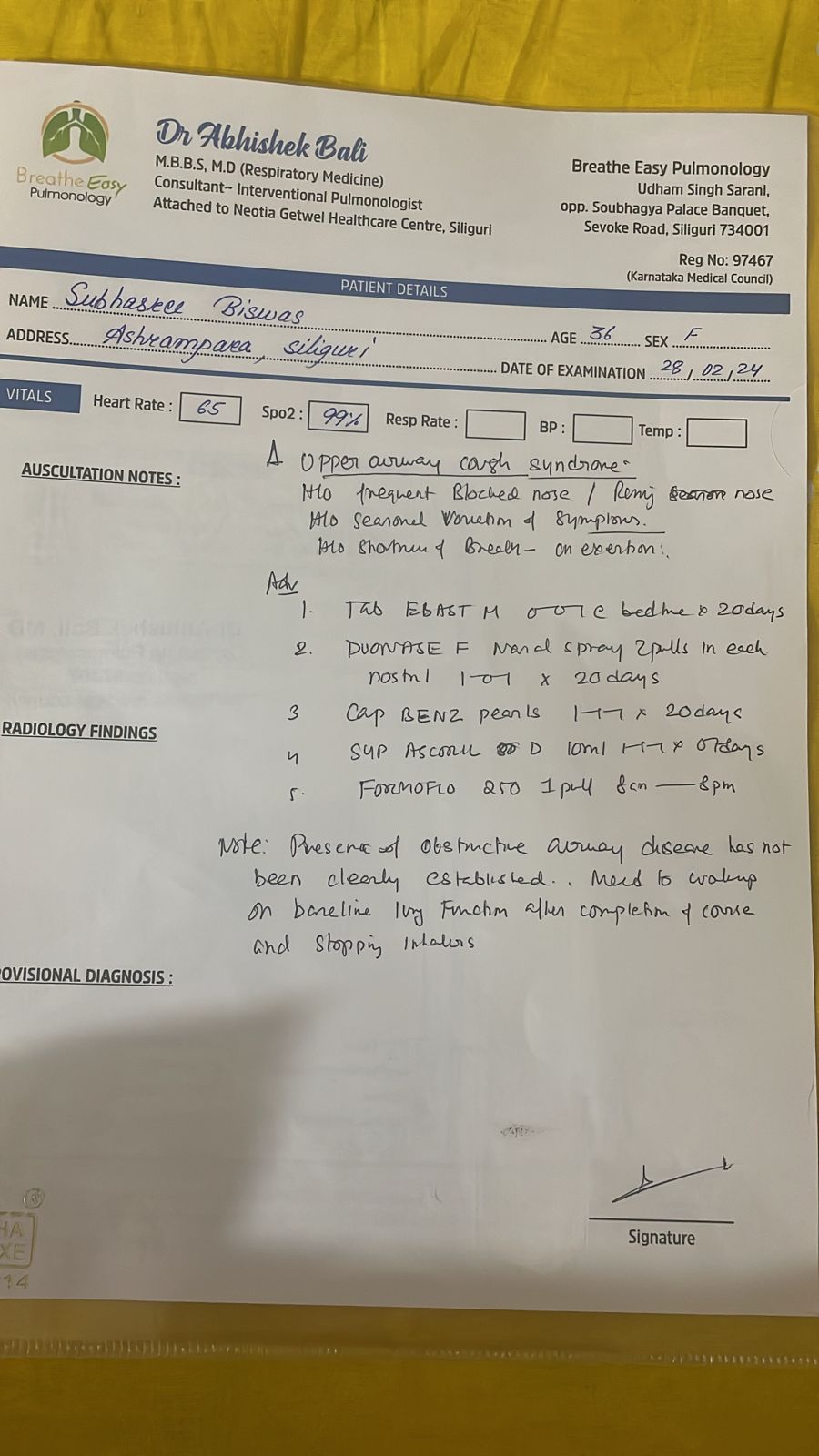
The handwriting sample is generally legible, although rushed and inconsistent. The pen strokes vary in pressure and thickness, indicating varying levels of attention and care. For instance, the capital letters, such as the "S" in "Subhaskee", are disproportionately large compared to the lowercase letters. This is especially apparent in the address, where "Siliguri" has a larger, more pronounced "S" than any other letter. The slant also varies considerably, shifting from a slight rightward tilt in some words to almost vertical in others. Certain words like "cough" and "syndrome" in the "Auscultation Notes" section are particularly loosely formed, as if hastily written. The lowercase "g" in "Siliguri" also demonstrates this hastiness with its exaggerated, looping tail.
This handwriting suggests a personality that is intelligent and quick-witted, yet possibly impatient and prone to distraction. The large, somewhat irregular lettering may indicate a desire for self-expression and a tendency to be spontaneous. The inconsistency of the slant suggests adaptability, but also potential mood swings. Overall, the style gives an impression of someone who is always on the go, focused on efficiency, but perhaps at the expense of precision and attention to detail. The rushed style, as in the word "exertion" where the 'x' almost resembles a scribble, further emphasizes this impatience and eagerness to move onto the next task.
To improve this handwriting, I would recommend focusing on consistency. Practicing letter formations, particularly lowercase letters and ascenders/descenders, will enhance overall legibility. Working on maintaining a uniform slant and size for all letters would also be beneficial. Concentrating on controlled, even strokes, as opposed to varying pressure and speed, can help to create a more refined and polished look. For example, in the "Radiology Findings" section, more evenness in letter sizes and consistent slant will enhance readability. Finally, dedicating just a few moments to neatness, ensuring ample spacing between words and lines, would contribute to a more polished appearance.
Legibility
Expressiveness
Consistency
Overall
Leaderboard for Tuesday, 28 October 2025
| 1 | The Divine Calligrapher |
80
|
| 2 | The Humble Hand |
76
|
| 3 | The Cursive Narrator |
74
|
| 4 | The Pristine Print |
71
|
| 5 | The Diligent Student |
71
|
| 6 | The Coastal Bard |
69
|
| 7 | Sunrise Musings |
68
|
| 8 | The Cursive Cartographer |
68
|
| 9 | The Considerate Soul |
67
|
| 10 | The Coastal Chronicler |
67
|
| 11 | The Cursive Narrator |
67
|
| 12 | The Diligent Note-Taker |
67
|
| 13 | The Coastal Dreamer |
67
|
| 14 | The Diligent Calligrapher |
67
|
| 15 | The River's Flow |
67
|
| 16 | The Eloquent Pen |
66
|
| 17 | The Studious Note-Taker |
66
|
| 18 | The Pragmatic Pen |
66
|
| 19 | The Pharmacist's Note |
65
|
| 20 | The Deliberate Draftsman |
65
|
| 21 | The Upright Pen |
65
|
| 22 | The Dream Weaver |
65
|
| 23 | The Historian's Hand |
64
|
| 24 | The Script of Devotion |
64
|
| 25 | The Traditionalist's Script |
64
|
| 26 | The Elegant Academic |
63
|
| 27 | The Studious Note-Taker |
63
|
| 28 | The Gridiron Enthusiast |
63
|
| 29 | The Typographer's Testament |
63
|
| 30 | The Aquatic Caller |
62
|