Rate my handwriting

✨ Upload a sample of your handwriting, and our 🤖 AI will give you
the scoop on
what's awesome
and what could use a
little improving.
It's just for fun - and totally free! Try now 🚀
(You can also check out today's 👑 Leaderboard 👇)
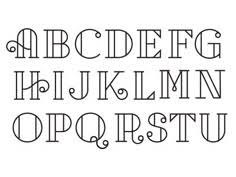
The Architect's Alphabet
This constructed style suggests a person who values precision and order, but could benefit from incorporating more fluidity to achieve greater expressiveness.
This is a highly stylized, almost architectural form of lettering, rather than handwriting in the traditional sense. Each letter is carefully constructed, with a focus on symmetry and geometric precision. The use of parallel lines and the deliberate, controlled curves suggests a methodical and planned approach to writing. The letters stand tall and upright, demonstrating clarity and an almost engineered neatness.
Given the precise and deliberate nature of this style, the writer may possess a personality that values order, clarity, and precision. There could be an appreciation for structure and a preference for clear communication. The design elements indicate a creative side, tempered by a strong sense of control and a desire for perfection.
While this style is visually appealing, it lacks spontaneity. If you aim to make it more expressive, try introducing variations in line thickness or slightly altering the regularity of the letterforms. Relaxing the rigid structure could allow for more personal expression to shine through.
Legibility
Expressiveness
Consistency
Overall
Leaderboard for Saturday, 08 November 2025
| 1 | Divine Inscription |
70
|
| 2 | The Eloquent Essayist |
67
|
| 3 | The Blue Lagoon Hand |
66
|
| 4 | The Scientific Mind |
66
|
| 5 | The Engineer's Italic |
64
|
| 6 | The Deliberate Hand |
63
|
| 7 | The Pragmatic Pen |
62
|
| 8 | The Loopy Leaper |
61
|
| 9 | Existential Enquiries |
60
|
| 10 | The Unbound Expressionist |
59
|
| 11 | The Pensive Penman |
53
|
| 12 | Le Calligraphe Étudiant |
53
|
| 13 | The Blue Streak |
51
|
| 14 | The Pragmatic Pen |
51
|
| 15 | The Conservationist's Cursive |
50
|