Rate my handwriting

✨ Upload a sample of your handwriting, and our 🤖 AI will give you
the scoop on
what's awesome
and what could use a
little improving.
It's just for fun - and totally free! Try now 🚀
(You can also check out today's 👑 Leaderboard 👇)
The Curious Case of the Mathematical Penmanship
This handwriting exhibits a creative and sociable flair, but could benefit from increased consistency. Focused practice on letter sizing and spacing would greatly improve its legibility and neatness.
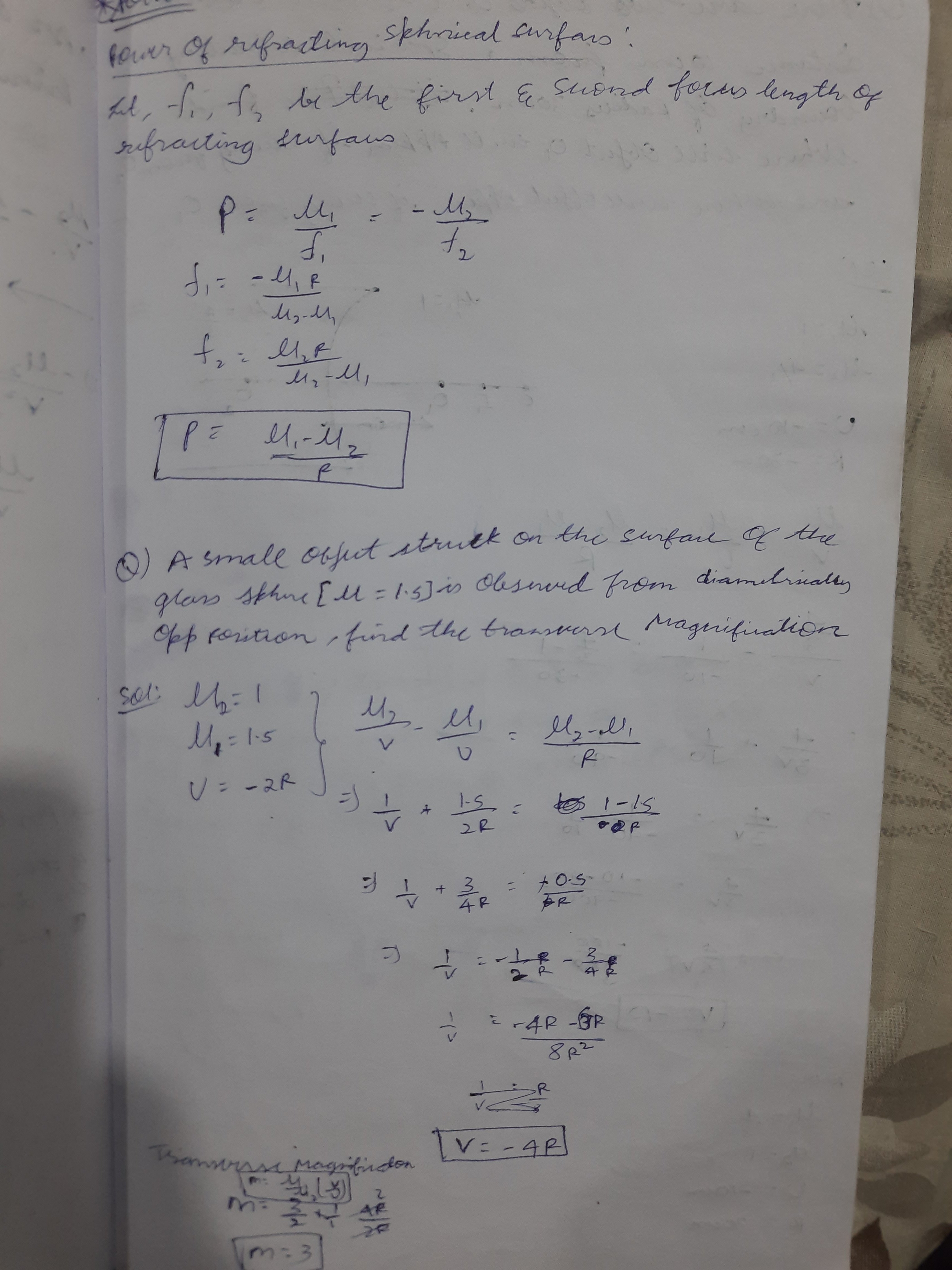
The handwriting displays a looping, cursive style, particularly evident in words like "refracting" and "surface". The letter formations are generally rounded, creating a flowing, connected appearance. There is a degree of slant, leaning towards the right, which adds to the overall dynamism. However, consistency seems to waver, with some words appearing neater and more carefully formed than others, giving it a slightly uneven look.
This handwriting suggests a personality that is likely expressive and sociable, due to the rightward slant. The loops and curves hint at creativity and a willingness to explore new ideas. However, the occasional inconsistencies might reflect a tendency towards impulsiveness or a struggle with maintaining focus, which could mean they're easily distracted but also highly adaptable.
To improve your handwriting, try focusing on consistent letter sizing and spacing. Practicing slow, deliberate strokes can help in achieving a more uniform appearance. Pay attention to the baseline and ensure your letters align properly. Regular practice, even for a few minutes each day, can make a significant difference in legibility and overall neatness.
Legibility
Expressiveness
Consistency
Overall
Leaderboard for Thursday, 30 October 2025
| 1 | The Economist's Italic Hand |
74
|
| 2 | The Poet's Quill |
71
|
| 3 | The Flourishing Font |
69
|
| 4 | The Scientific Hand |
68
|
| 5 | The Upright Student |
67
|
| 6 | The Digital Diarist |
67
|
| 7 | The Logical Chemist |
66
|
| 8 | The Prudent Pen |
66
|
| 9 | The Pensive Student |
65
|
| 10 | The Literary Cartographer |
65
|
| 11 | The Agile Quill |
65
|
| 12 | The Pragmatic Planner |
65
|
| 13 | The Bio Notes |
64
|
| 14 | The Civic Philosopher |
63
|
| 15 | The Studious Scholar |
63
|
| 16 | The Meticulous Planner |
63
|
| 17 | The Elusive Poet |
62
|
| 18 | The Calligrapher's Chronicle |
62
|
| 19 | Le Gribouillage Scientifique |
62
|
| 20 | The Deliberate Democrat |
62
|
| 21 | Le Calligraphe Studieux |
61
|
| 22 | Algorithmic Alchemist |
61
|
| 23 | The Cellular Biologist |
61
|
| 24 | The Atomic Pen |
60
|
| 25 | The Spirited Student |
60
|
| 26 | The Fluent Intellectual |
60
|
| 27 | The Global Trotter |
59
|
| 28 | The Forthright Fount |
59
|
| 29 | The Determined Hand |
58
|
| 30 | The Energetic Note-Taker |
58
|