Rate my handwriting

✨ Upload a sample of your handwriting, and our 🤖 AI will give you
the scoop on
what's awesome
and what could use a
little improving.
It's just for fun - and totally free! Try now 🚀
(You can also check out today's 👑 Leaderboard 👇)
The Cursive Cartographer
This cursive handwriting indicates a friendly, detail-oriented person with a balanced approach, though improvements to letter clarity and consistency could enhance its expressiveness and legibility.
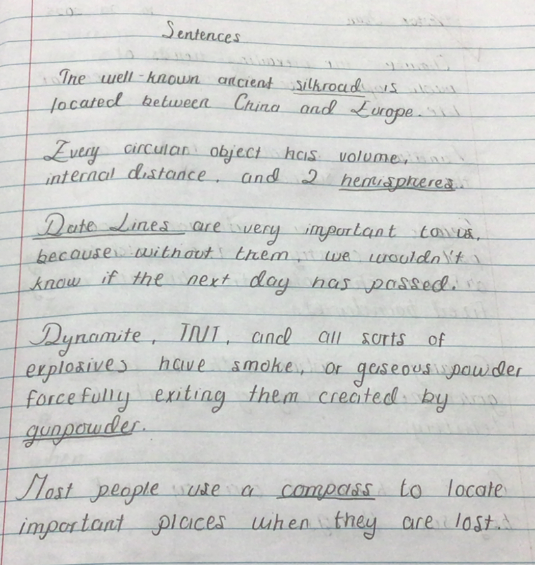
The handwriting sample presents a connected cursive style, with noticeable loops and curves. The letters tend to slant slightly to the right, which is evident in words like "silkroad" and "Europe". The size of the letters is relatively consistent, though some words are slightly more compressed than others. The overall appearance is neat and generally legible, though some letter formations could be clearer, such as the 'r' in 'circular'.
Based on this sample, the writer may possess a friendly and outgoing nature, suggested by the rightward slant and connected strokes, indicating a desire to connect with others. The careful letter formations and general neatness imply attention to detail and a desire to present oneself well. The consistent size and spacing suggest a balanced and controlled approach to life.
To further enhance the handwriting, focus on refining letter formations to improve clarity. Practice the 'r' and other letters that appear less distinct. Maintaining consistent spacing between words and lines will also contribute to greater legibility. Paying attention to the baseline will also help improve the appearance of the handwriting. With some focused practice, the writing could become even more expressive and aesthetically pleasing.
Legibility
Expressiveness
Consistency
Overall
Leaderboard for Monday, 27 October 2025
| 31 | The Quill of Conviction |
62
|
| 32 | Babylonian Beaches |
62
|
| 33 | The Agile Artisan |
61
|
| 34 | The Flowing Script |
61
|
| 35 | The Diplomat's Quill |
60
|
| 36 | Coastal Rhapsody |
60
|
| 37 | Coastal Contemplations |
59
|
| 38 | The Curious Chemist |
59
|
| 39 | The Grand Calligrapher |
58
|
| 40 | The Practical Notetaker |
58
|
| 41 | The Idealist's Cursive |
58
|
| 42 | The Elaborate Chronicler |
58
|
| 43 | The Deliberate Doodler |
57
|
| 44 | The Orderly Typewriter |
56
|
| 45 | The Advocate's Quill |
56
|
| 46 | The Considerate Confidant |
56
|
| 47 | The Hurried Healer |
55
|
| 48 | The Eloquent Essayist |
54
|
| 49 | The Coastal Contemplator |
53
|
| 50 | Neptune's Prose |
53
|
| 51 | The Gentle Leaning Tower |
53
|
| 52 | The Diligent Note-Taker |
53
|
| 53 | The Aspiring Typesetter |
53
|
| 54 | The Flourishing Academic |
53
|
| 55 | The Pragmatic Hand |
52
|
| 56 | Celestial Notes |
52
|
| 57 | The Ambitious Note-Taker |
52
|
| 58 | The Pragmatic Note-Taker |
52
|
| 59 | Pierre's Ponderings |
51
|
| 60 | The Budding Chemist |
51
|