Rate my handwriting

✨ Upload a sample of your handwriting, and our 🤖 AI will give you
the scoop on
what's awesome
and what could use a
little improving.
It's just for fun - and totally free! Try now 🚀
(You can also check out today's 👑 Leaderboard 👇)
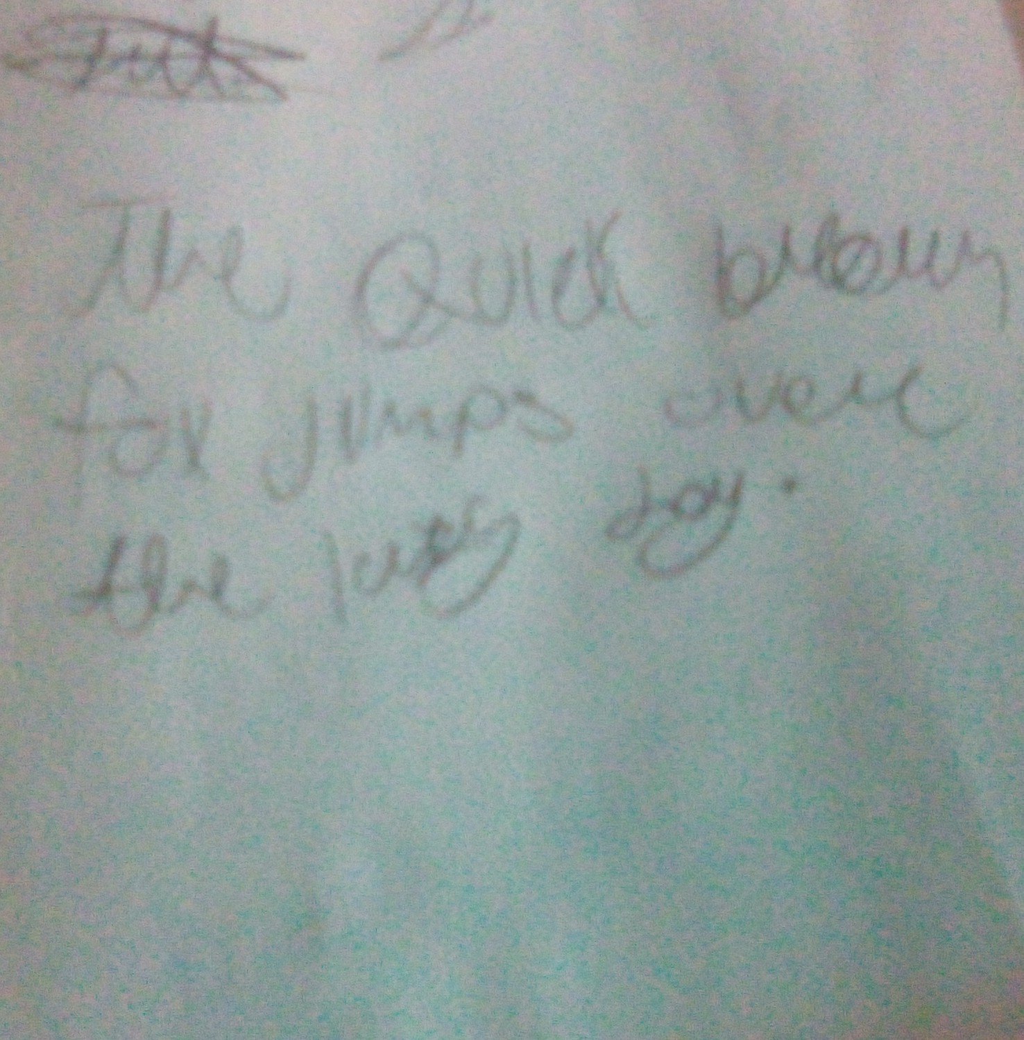
The Nimble Penman
This handwriting suggests an adaptable and spontaneous personality with a penchant for both efficiency and clarity. With minor improvements in consistency and spacing, this already legible script can achieve greater elegance and impact.
This handwriting sample showcases a style that is generally legible, with a connected cursive script interspersed with disconnected printed letters, creating a dynamic visual rhythm. The varying slant and letter sizes in words like "quick" and "brown" suggest a degree of impulsiveness. While individual letters, like the "f" in "for" and the "j" in "jumps", maintain distinct shapes, they also exhibit inconsistencies that hint at a certain carefree nature.
The combination of cursive and print, along with fluctuating slants and sizes, paints a picture of someone adaptable and spontaneous. The connected letters speak to a desire for efficiency and flow, while the printed letters suggest a need for clarity and precision. This duality might reflect a personality that is both quick-witted and detail-oriented. The impulsive strokes hint at an adventurous spirit, someone who embraces change and enjoys exploring new ideas.
While this handwriting is generally legible, a few tweaks could enhance its overall neatness. Consistent letter sizes and slants would create a more polished look. Focusing on maintaining uniform spacing between words, as seen in the phrase "over the", would improve readability. Practicing joining letters consistently, especially within words, would enhance the flow and elegance of the script.
Legibility
Expressiveness
Consistency
Overall
Leaderboard for Sunday, 26 October 2025
| 1 | The Flowing Quill |
74
|
| 2 | The Constitutionalist |
74
|
| 3 | The Curator's Script |
72
|
| 4 | The Eloquent Educator |
71
|
| 5 | The Dreamer's Quill |
70
|
| 6 | The Hopeful Heart's Script |
68
|
| 7 | The Constitutionalist |
68
|
| 8 | The Flowing Quill |
68
|
| 9 | The Flowing Hand |
68
|
| 10 | The Agrarian Academic |
67
|
| 11 | The Unassuming Hand |
66
|
| 12 | The Calculating Hand |
65
|
| 13 | The Studious Student |
65
|
| 14 | The Contemplative Soul |
64
|
| 15 | The Mathematical Muse |
64
|
| 16 | The Flowing Font |
63
|
| 17 | The Gentle Flow |
63
|
| 18 | The Looping Legend |
62
|
| 19 | The Contemplative Calligrapher |
60
|
| 20 | The Democratic Dreamer |
59
|
| 21 | The Pragmatic Idealist |
59
|
| 22 | The Signature Stylist |
59
|
| 23 | The Devout Note-Taker |
58
|
| 24 | The Cipher's Quill |
57
|
| 25 | The Atom Alchemist |
57
|
| 26 | The Loop-de-Loop Legend |
56
|
| 27 | The Scientific Mind |
56
|
| 28 | The Calligrapher's Flourish |
54
|
| 29 | The Forward Leaning Letterer |
54
|
| 30 | The Celestial Stylist |
54
|