Rate my handwriting

✨ Upload a sample of your handwriting, and our 🤖 AI will give you
the scoop on
what's awesome
and what could use a
little improving.
It's just for fun - and totally free! Try now 🚀
(You can also check out today's 👑 Leaderboard 👇)
The Analytical Economist
This functional handwriting reveals an analytical and detail-oriented mind, focused on clarity and precision, but some minor adjustments could improve legibility and add flair.
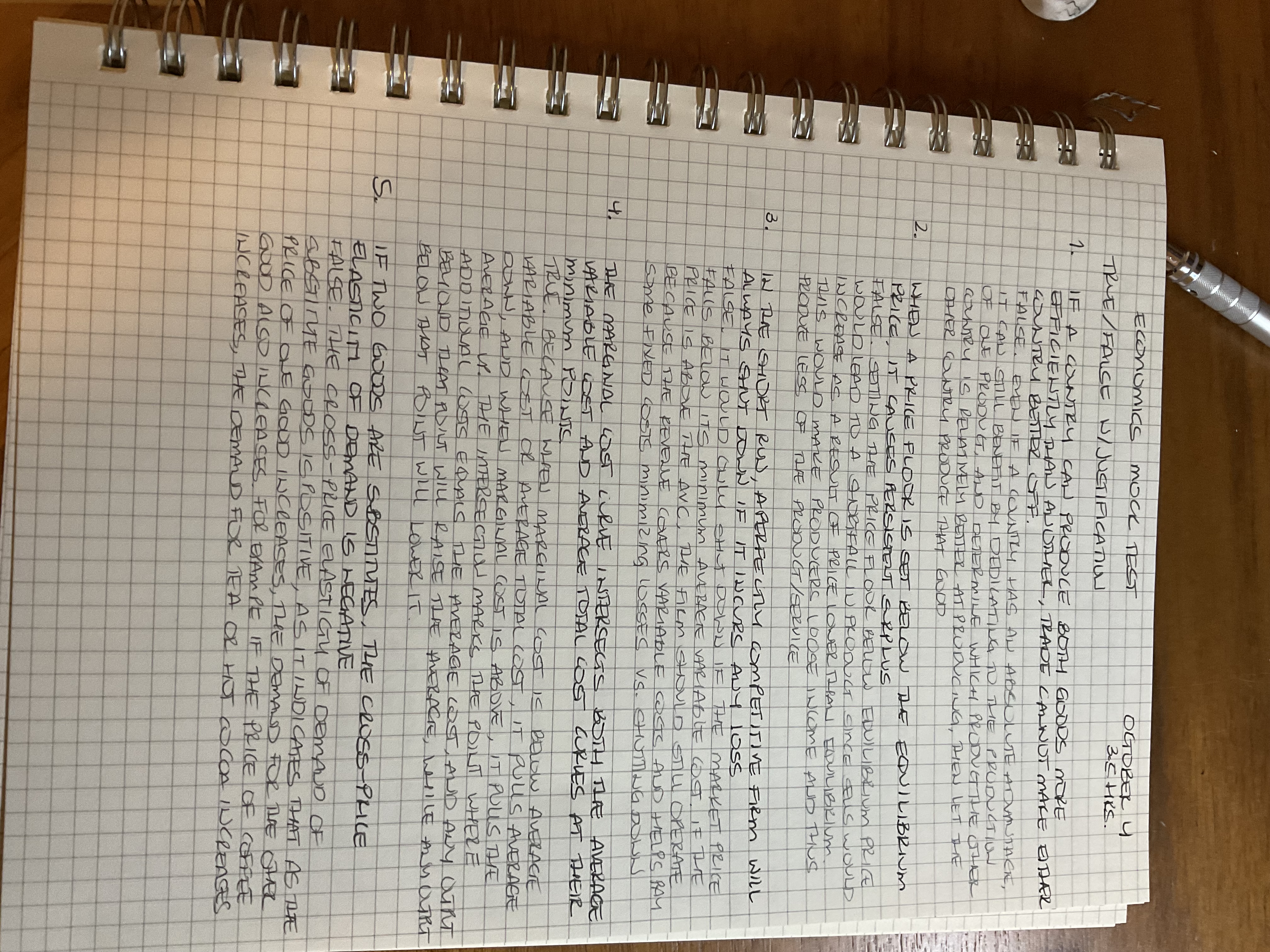
The handwriting presents as functional and practical. Letter forms are generally upright, with a slight tendency toward a vertical slant, suggesting objectivity. There is a clear differentiation between uppercase and lowercase letters. The writing fills the available space on the page, but it's quite cramped and lacks space between the lines. Some letters, such as the 'E' in 'ECONOMICS' or the 'A' in 'AVERAGE' show a degree of angularity. There is evidence of both print and cursive forms. The letter size is consistent, which implies self-control. Overall, the writing leans towards a legible and pragmatic style, as shown in the example 'IF TWO GOODS ARE SUBSTITUTES'.
This handwriting style suggests a personality that is analytical, focused, and efficient. The writer is likely detail-oriented and appreciates structure, as indicated by the consistent letter size and upright slant. The functional quality of the writing points to a pragmatic and goal-driven nature. The presence of angularity in some letters hints at a critical and decisive mind. The individual probably values clarity and precision, which reflects in the neatness and organization of the writing. Overall, the person is very conscientious and values completing tasks to a high standard.
To enhance the handwriting, consider introducing more space between the lines to improve readability. Experiment with a more consistent slant to achieve a smoother flow. Practice creating rounder letter forms to reduce angularity and soften the overall impression. Pay attention to letter spacing to create a more harmonious appearance. These adjustments will improve legibility and add a touch of flair to your practical handwriting style.
Legibility
Expressiveness
Consistency
Overall
Leaderboard for Monday, 27 October 2025
| 1 | The Analytical Mind |
74
|
| 2 | The Eloquent Educator |
71
|
| 3 | The Student's Script |
70
|
| 4 | The Optimistic Poet |
68
|
| 5 | The Agrarian Academic |
67
|
| 6 | The Diligent Penman |
67
|
| 7 | The Analytical Alchemist |
65
|
| 8 | The Calculating Hand |
65
|
| 9 | The Scientific Hand |
65
|
| 10 | The Aesthetic Typist |
65
|
| 11 | The Mathematical Muse |
64
|
| 12 | The Agile Leaper |
64
|
| 13 | The Diligent Note-Taker |
64
|
| 14 | The Quill of Conviction |
62
|
| 15 | The Agile Artisan |
61
|
| 16 | The Curious Chemist |
59
|
| 17 | The Practical Notetaker |
58
|
| 18 | The Devout Note-Taker |
58
|
| 19 | The Elaborate Chronicler |
58
|
| 20 | The Considerate Confidant |
56
|
| 21 | The Orderly Typewriter |
56
|
| 22 | The Hurried Healer |
55
|
| 23 | The Aspiring Typesetter |
53
|
| 24 | The Architect of Letters |
53
|
| 25 | The Flourishing Academic |
53
|
| 26 | The Diligent Note-Taker |
53
|
| 27 | The Steadfast Student |
53
|
| 28 | The Ambitious Note-Taker |
52
|
| 29 | Celestial Notes |
52
|
| 30 | The Pragmatic Hand |
52
|