Rate my handwriting

✨ Upload a sample of your handwriting, and our 🤖 AI will give you
the scoop on
what's awesome
and what could use a
little improving.
It's just for fun - and totally free! Try now 🚀
(You can also check out today's 👑 Leaderboard 👇)
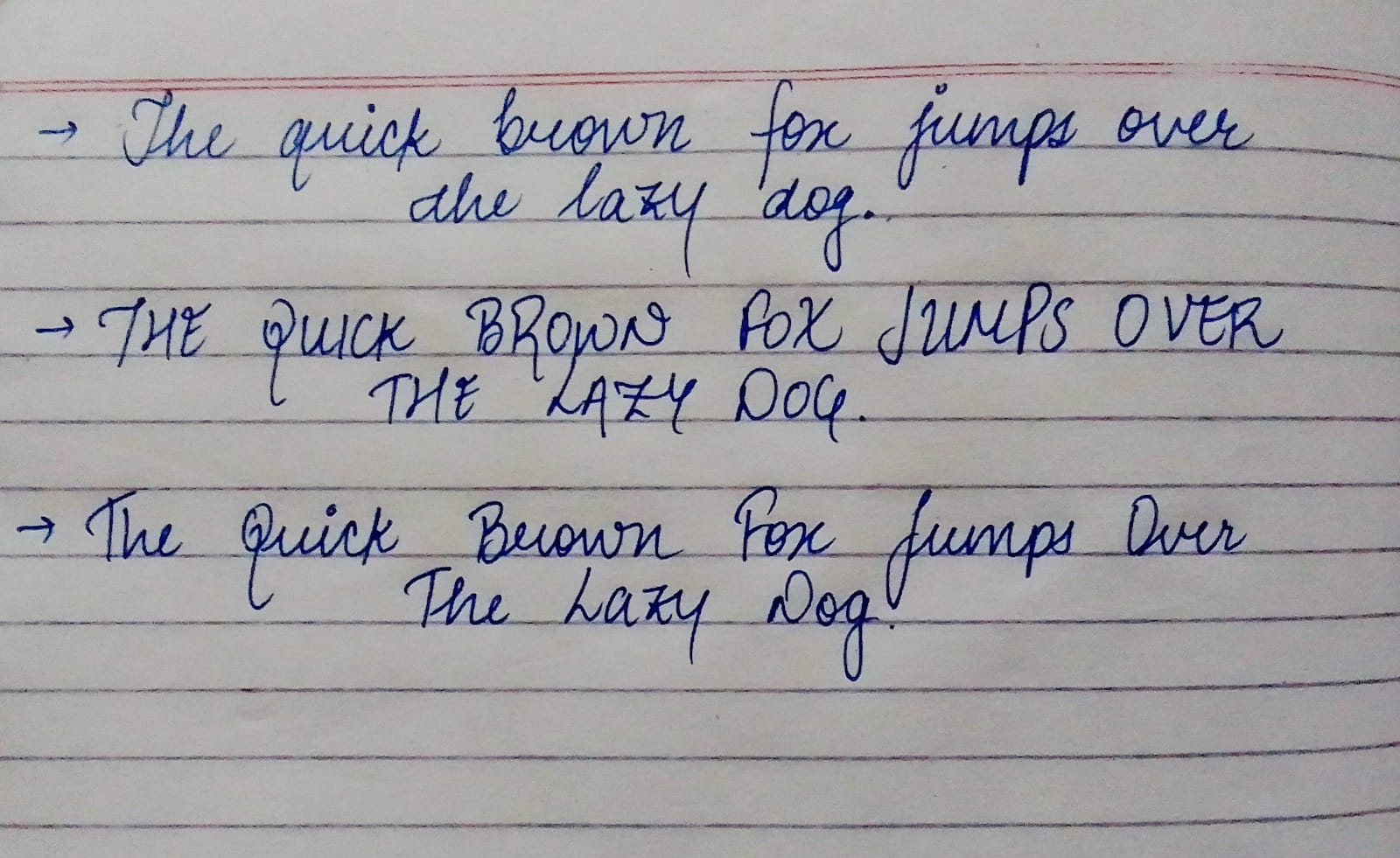
The Blue Jumper
This handwriting displays a conscientious and approachable nature with a blend of control and fluidity. Some refinements in consistency and flow could further elevate the writing's clarity and aesthetic appeal.
The handwriting in this sample showcases a mix of cursive and print styles, leaning towards a deliberate, controlled form. The strokes are generally smooth, but with some variation in pressure. Letter formations, particularly in the capitalized words, have a somewhat rounded quality, such as the 'B' in 'Brown' and the 'O' in 'Over'. The lowercase 'q' and 'j' have descenders that are long and loopy. Overall, the writing is relatively neat and legible, though there's a slight inconsistency in the slant and spacing between words.
Based on the careful letter formation and overall neatness, the writer likely possesses a degree of conscientiousness and attention to detail. The rounded forms might suggest a friendly and approachable personality. The variability in pressure could indicate a fluctuating level of energy or perhaps a tendency to be adaptable to different situations. The combination of uppercase and lowercase letters suggests a balance between assertiveness and a more relaxed, informal approach.
To enhance the handwriting, focusing on consistent slant and spacing could improve the overall aesthetic. Practicing letter connections to achieve a more uniform flow would also be beneficial. Consider experimenting with different pen grips to find one that allows for more even pressure distribution. Finally, working on the consistency of letter sizes could improve legibility.
Legibility
Expressiveness
Consistency
Overall
Leaderboard for Monday, 27 October 2025
| 1 | The Divine Calligrapher |
80
|
| 2 | The Humble Hand |
76
|
| 3 | The Cursive Narrator |
74
|
| 4 | The Analytical Mind |
74
|
| 5 | The Pristine Print |
71
|
| 6 | The Diligent Student |
71
|
| 7 | The Coastal Bard |
69
|
| 8 | The Optimistic Poet |
68
|
| 9 | Sunrise Musings |
68
|
| 10 | The Cursive Cartographer |
68
|
| 11 | The Cursive Narrator |
67
|
| 12 | The Diligent Note-Taker |
67
|
| 13 | The Coastal Dreamer |
67
|
| 14 | The River's Flow |
67
|
| 15 | The Coastal Chronicler |
67
|
| 16 | The Pragmatic Pen |
66
|
| 17 | The Studious Note-Taker |
66
|
| 18 | The Eloquent Pen |
66
|
| 19 | The Aesthetic Typist |
65
|
| 20 | The Scientific Hand |
65
|
| 21 | The Deliberate Draftsman |
65
|
| 22 | The Analytical Alchemist |
65
|
| 23 | The Dream Weaver |
65
|
| 24 | The Traditionalist's Script |
64
|
| 25 | The Agile Leaper |
64
|
| 26 | The Script of Devotion |
64
|
| 27 | The Studious Note-Taker |
63
|
| 28 | The Elegant Academic |
63
|
| 29 | The Typographer's Testament |
63
|
| 30 | Babylonian Beaches |
62
|