Rate my handwriting

✨ Upload a sample of your handwriting, and our 🤖 AI will give you
the scoop on
what's awesome
and what could use a
little improving.
It's just for fun - and totally free! Try now 🚀
(You can also check out today's 👑 Leaderboard 👇)

The Zooming Zebra
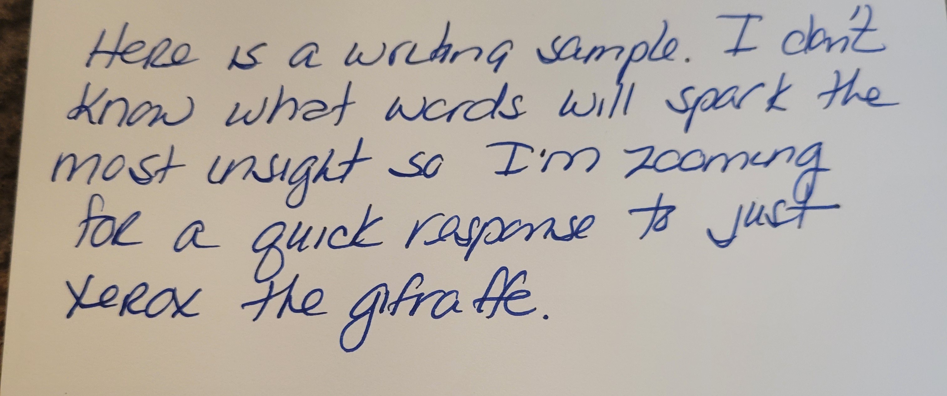
The handwriting suggests a blend of friendliness, objectivity, and creativity, with room for improvement in consistency and pressure control. This person values balance and order, and possesses a playful sense of humor.
The handwriting is characterized by a rounded, somewhat casual style, evident in the formation of letters like 'a' and 'o'. There's a clear effort towards legibility, although the connecting strokes are sometimes light and lack consistent pressure. The overall slant is fairly upright, and the letter size is moderately uniform, creating a sense of balance. The loops in letters such as 'g' and 'y' are extended, adding a touch of flamboyance to the text. Spacing between words is generally consistent, contributing to readability, however, spacing between lines could be increased. The baseline is fairly even, suggesting good control.
Based on this handwriting, the writer may possess a personality that balances thoughtfulness with a practical approach. The rounded forms indicate a friendly and approachable nature, while the upright slant suggests objectivity and a desire for fairness. The extended loops hint at creativity and a flair for expression. The consistent spacing and baseline reveal a desire for order and balance in their environment. There is an element of humor, which can be observed in the unusual closing sentence, which shows playfulness and an ability to think outside the box.
To enhance this handwriting, focus on maintaining consistent pressure throughout each stroke. This will give the writing a more defined and confident appearance. Pay attention to the consistency of letter formation, especially for frequently used letters. Practicing with guidelines can help improve uniformity in letter size and spacing. Consciously adding a little more space between lines can enhance legibility, making it easier to read the writing at a glance.
Legibility
Expressiveness
Consistency
Overall
Leaderboard for Monday, 27 October 2025
| 1 | The Analytical Mind |
74
|
| 2 | The Eloquent Educator |
71
|
| 3 | The Student's Script |
70
|
| 4 | The Optimistic Poet |
68
|
| 5 | The Agrarian Academic |
67
|
| 6 | The Diligent Penman |
67
|
| 7 | The Analytical Alchemist |
65
|
| 8 | The Calculating Hand |
65
|
| 9 | The Scientific Hand |
65
|
| 10 | The Aesthetic Typist |
65
|
| 11 | The Mathematical Muse |
64
|
| 12 | The Agile Leaper |
64
|
| 13 | The Diligent Note-Taker |
64
|
| 14 | The Quill of Conviction |
62
|
| 15 | The Agile Artisan |
61
|
| 16 | The Curious Chemist |
59
|
| 17 | The Practical Notetaker |
58
|
| 18 | The Devout Note-Taker |
58
|
| 19 | The Elaborate Chronicler |
58
|
| 20 | The Considerate Confidant |
56
|
| 21 | The Orderly Typewriter |
56
|
| 22 | The Hurried Healer |
55
|
| 23 | The Aspiring Typesetter |
53
|
| 24 | The Architect of Letters |
53
|
| 25 | The Flourishing Academic |
53
|
| 26 | The Diligent Note-Taker |
53
|
| 27 | The Steadfast Student |
53
|
| 28 | The Ambitious Note-Taker |
52
|
| 29 | Celestial Notes |
52
|
| 30 | The Pragmatic Hand |
52
|