Rate my handwriting

✨ Upload a sample of your handwriting, and our 🤖 AI will give you
the scoop on
what's awesome
and what could use a
little improving.
It's just for fun - and totally free! Try now 🚀
(You can also check out today's 👑 Leaderboard 👇)
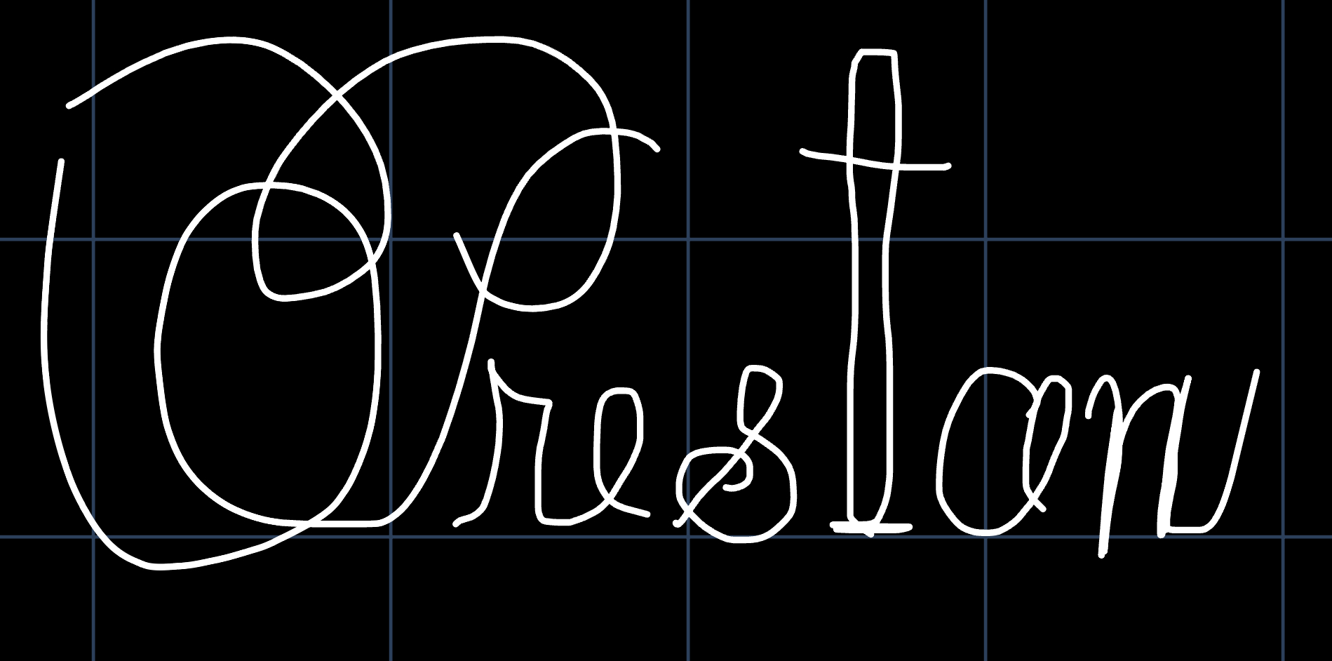
The Architect's Signature
The handwriting shows a blend of creativity and assertiveness. A bit more consistency would help to improve its overall appearance.
The handwriting is characterized by a unique blend of bold strokes and elegant curves, seen in the oversized "P" which dominates the sample. The loops and connections are fluid, although the the letterforms themselves are rather simplistic and rounded, for example in the 'e' and 'o'. The overall impression is of a somewhat hurried, yet deliberate hand.
This style suggests an individual who is both creative and assertive. The bold strokes indicate confidence and a willingness to take charge, while the elegant curves reveal a sense of aesthetic appreciation. The slightly inconsistent letterforms imply a flexible and adaptable nature, someone who is not afraid to deviate from the norm.
To improve, focus on achieving greater consistency in letter size and spacing. Pay attention to the baseline and strive for more uniform letter height. Slowing down slightly and concentrating on each stroke can help refine the overall appearance of the handwriting, lending it a more polished and professional look.
Legibility
Expressiveness
Consistency
Overall
Leaderboard for Monday, 17 November 2025
| 1 | The Pragmatic Planner |
73
|
| 2 | The Elegant Poet |
71
|
| 3 | The Outsider's Quill |
70
|
| 4 | Ocean Gazer |
70
|
| 5 | The Dreamer's Quill |
70
|
| 6 | The Gourmet's Penmanship |
69
|
| 7 | The Flourishing Signature |
68
|
| 8 | The Whimsical Looper |
68
|
| 9 | The Friendly Loop |
68
|
| 10 | La Caligrafía Reflexiva |
68
|
| 11 | The Refined Alchemist |
68
|
| 12 | The Flowing Stream |
68
|
| 13 | The Spirited Signature |
68
|
| 14 | Calligraphic Muse |
66
|
| 15 | The Professor's Lecture Notes |
66
|
| 16 | The Copperplate Prodigy |
66
|
| 17 | The Diligent Notetaker |
64
|
| 18 | The Diligent Pen |
64
|
| 19 | The Fluid Dreamer |
63
|
| 20 | The Orchard Typist |
62
|
| 21 | The Pragmatic Professor |
61
|
| 22 | The Aviator's Itinerary |
61
|
| 23 | The Calligrapher's Contemplation |
61
|
| 24 | The Pragmatic Planner |
60
|
| 25 | The Flourishing Signature |
60
|
| 26 | The Precise Performer |
60
|
| 27 | The Practical Dreamer |
58
|
| 28 | The Pragmatic Hand |
58
|
| 29 | The Scholar's Cursive |
58
|
| 30 | The Flourishing Celebrator |
57
|