Rate my handwriting

✨ Upload a sample of your handwriting, and our 🤖 AI will give you
the scoop on
what's awesome
and what could use a
little improving.
It's just for fun - and totally free! Try now 🚀
(You can also check out today's 👑 Leaderboard 👇)
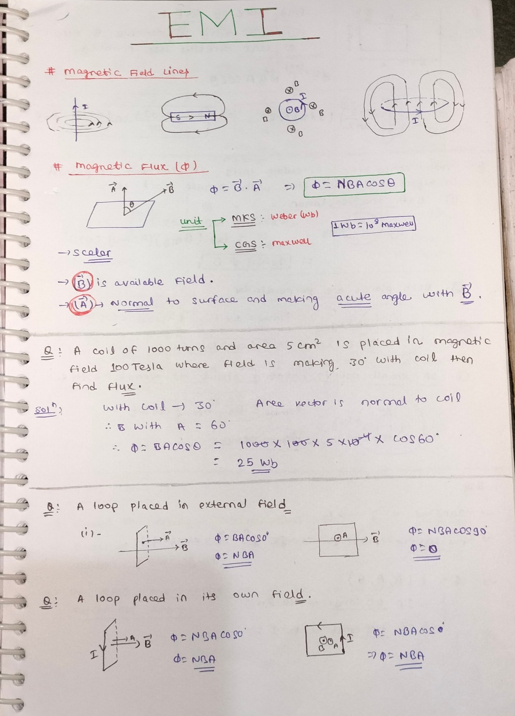
The Precise Physicist
This handwriting analysis suggests a methodical and detail-oriented individual who values clarity and precision. Some adjustments to letter spacing and consistency could enhance the writing's legibility and expressiveness.
The handwriting exhibits a blend of neatness and precision, evident in the carefully formed letters and well-organized layout. The handwriting style is upright with minimal slant. Capital letters like 'E', 'M', and 'I' are distinctly separated and larger than the lowercase letters, demonstrating a clear hierarchy. There's a notable consistency in letter size and spacing, though some words are slightly cramped, indicating a possible focus on fitting information efficiently. The writing is legible overall, with only minor instances where the letter formation could be improved for clarity. Overall, the writing is neat and organised, and well suited to recording scientific information.
Based on this handwriting, one might infer that the writer is methodical, detail-oriented, and values clarity and order. The precision in letter formation and the organized layout suggest a disciplined and focused personality. The writer likely has a strong sense of purpose and strives for accuracy in their work. The organized nature of the handwriting suggests that the writer is logical and rational, preferring a structured approach to problem-solving. They likely appreciate a clean and orderly environment and may have a preference for clarity in communication.
To improve the handwriting, consider practicing letter spacing to avoid cramped words. Focus on maintaining consistent letter size, especially for lowercase letters. Incorporating some loops into the lower-case letters could make the handwriting flow more smoothly. Additionally, varying the pen pressure could add a more expressive quality to the writing, creating a more visually appealing script.
Legibility
Expressiveness
Consistency
Overall
Leaderboard for Thursday, 20 November 2025
| 1 | Alphabetical Aspirations |
72
|
| 2 | The Determined Achiever |
71
|
| 3 | The Upright Optimist |
71
|
| 4 | The Benevolent Block Letterer |
70
|
| 5 | The Flowing Fountain |
68
|
| 6 | The Chicken Nugget Chronicler |
68
|
| 7 | The Highland Chronicler |
68
|
| 8 | The Gentle Hand |
68
|
| 9 | The Flowing Idealist |
68
|
| 10 | The Cursive Contessa |
67
|
| 11 | The Steady Hand |
67
|
| 12 | The Pragmatic Penman |
65
|
| 13 | The Persuasive Pleader |
65
|
| 14 | The Loopy Dreamer |
65
|
| 15 | The Quiet Thinker |
65
|
| 16 | The Neurologist's Notes |
65
|
| 17 | The Cryptographer |
65
|
| 18 | The Level-Headed Penman |
65
|
| 19 | The Biologist's Quill |
64
|
| 20 | The Inspirationalist |
62
|
| 21 | The Executive Note-Taker |
61
|
| 22 | The Optimistic Maximalist |
61
|
| 23 | The Script of Pleasant Journeys |
61
|
| 24 | The Serene Stream |
61
|
| 25 | The Agile Jumper |
60
|
| 26 | The Studious Biologist |
60
|
| 27 | The Architect's Interruption |
59
|
| 28 | The Swift Fox's Jumps |
58
|
| 29 | The Analytical Student |
56
|
| 30 | The Precise Naturalist |
56
|