Rate my handwriting

✨ Upload a sample of your handwriting, and our 🤖 AI will give you
the scoop on
what's awesome
and what could use a
little improving.
It's just for fun - and totally free! Try now 🚀
(You can also check out today's 👑 Leaderboard 👇)
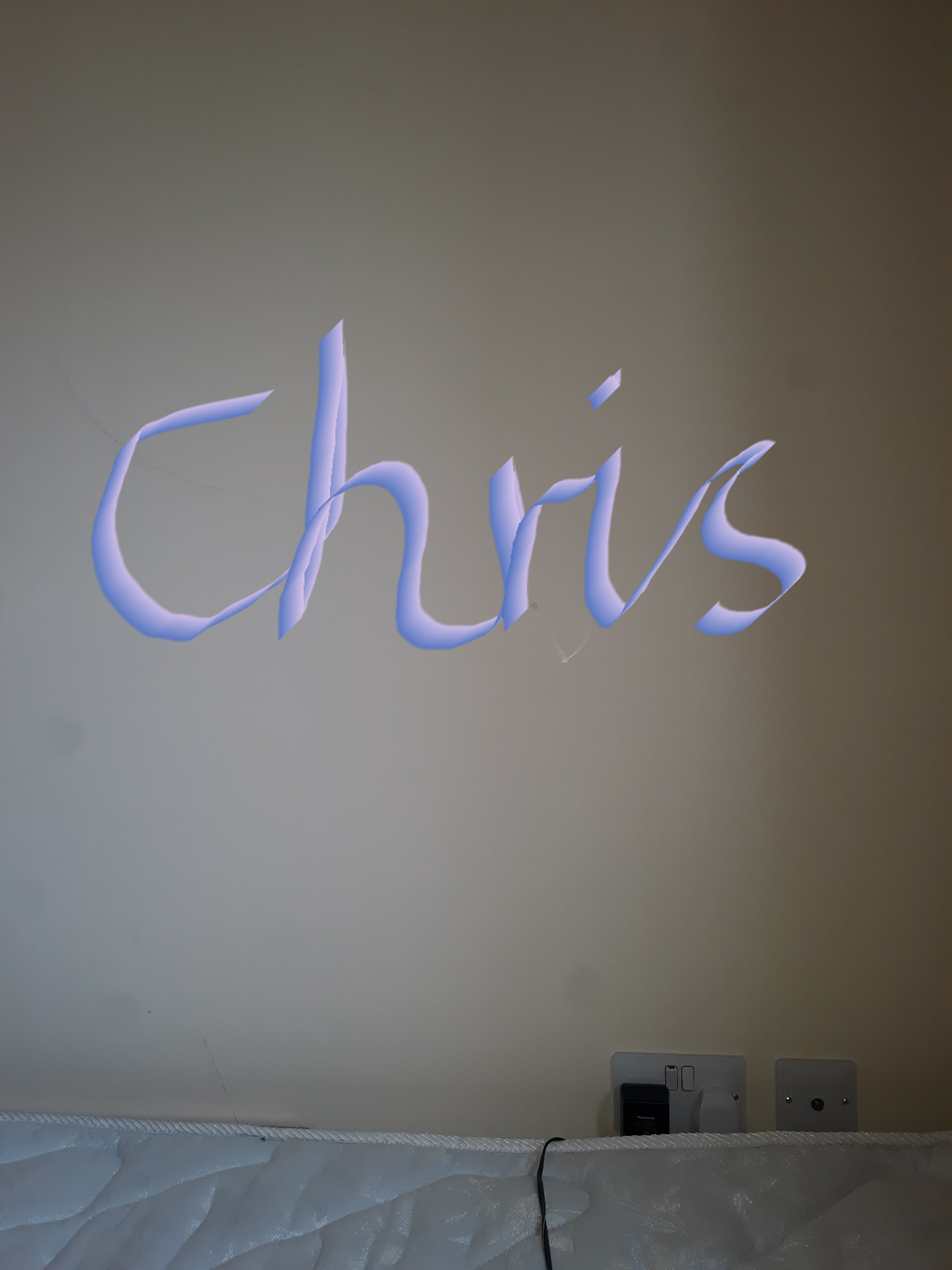
The Ribbon Dancer
This calligraphic handwriting style suggests a creative and expressive personality, but clarity could be improved by simplifying letterforms and ensuring consistency.
The handwriting sample, displaying the name "Chris", exhibits a distinct calligraphic flair, reminiscent of ribbons gracefully unfurling. The strokes are fluid and connected, with a noticeable slant to the right. Each letter is formed with deliberate curves and sharp angles, creating a visually appealing, almost stylized effect. The 'C' is particularly large and open, while the 'h' and 'r' are elongated, contributing to the overall sense of movement and elegance. The 'i' and 's' are more compact, providing a balance to the composition. The consistency is maintained throughout, with a uniform stroke width and letter height. However, the embellishments and artistic flourishes might compromise its overall legibility.
Based on this handwriting, the writer likely possesses a creative and expressive personality. The flowing lines suggest someone who is adaptable and open to new experiences, with a natural inclination towards aesthetics. The bold 'C' indicates confidence and a desire to stand out, while the overall harmony suggests a balanced and thoughtful individual. The writer is likely imaginative, artistic, and enjoys expressing themselves in unique ways. This person may also be sensitive to beauty and have a strong appreciation for artistic endeavors.
To improve the handwriting's clarity, the writer could focus on simplifying the letterforms and reducing the embellishments. Practicing consistent letter spacing and size would also enhance legibility. While the current style is aesthetically pleasing, prioritizing clarity could make the handwriting more accessible and easier to read. Perhaps experimenting with different pen types or nib sizes could also help refine the strokes and achieve a more balanced appearance between artistic expression and functional communication.
Legibility
Expressiveness
Consistency
Overall
Leaderboard for Tuesday, 28 October 2025
| 1 | The Divine Calligrapher |
80
|
| 2 | The Humble Hand |
76
|
| 3 | The Cursive Narrator |
74
|
| 4 | The Pristine Print |
71
|
| 5 | The Diligent Student |
71
|
| 6 | The Coastal Bard |
69
|
| 7 | Sunrise Musings |
68
|
| 8 | The Cursive Cartographer |
68
|
| 9 | The Considerate Soul |
67
|
| 10 | The Coastal Chronicler |
67
|
| 11 | The Cursive Narrator |
67
|
| 12 | The Diligent Note-Taker |
67
|
| 13 | The Coastal Dreamer |
67
|
| 14 | The Diligent Calligrapher |
67
|
| 15 | The River's Flow |
67
|
| 16 | The Eloquent Pen |
66
|
| 17 | The Studious Note-Taker |
66
|
| 18 | The Pragmatic Pen |
66
|
| 19 | The Pharmacist's Note |
65
|
| 20 | The Deliberate Draftsman |
65
|
| 21 | The Upright Pen |
65
|
| 22 | The Dream Weaver |
65
|
| 23 | The Historian's Hand |
64
|
| 24 | The Script of Devotion |
64
|
| 25 | The Traditionalist's Script |
64
|
| 26 | The Elegant Academic |
63
|
| 27 | The Studious Note-Taker |
63
|
| 28 | The Gridiron Enthusiast |
63
|
| 29 | The Typographer's Testament |
63
|
| 30 | The Aquatic Caller |
62
|