Rate my handwriting

✨ Upload a sample of your handwriting, and our 🤖 AI will give you
the scoop on
what's awesome
and what could use a
little improving.
It's just for fun - and totally free! Try now 🚀
(You can also check out today's 👑 Leaderboard 👇)
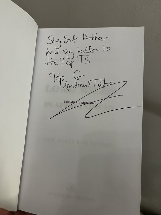
The Maverick's Mark
This handwriting indicates a practical and self-assured personality, but legibility could be improved with more consistent spacing and letter formation.
The handwriting is characterized by its upright slant and slightly irregular baseline. The letter formations are generally simple and functional, with a mix of rounded and angular shapes. The connections between letters vary, showing some degree of fluidity, but with occasional abrupt stops. The size of the letters is relatively consistent, but the spacing between words is somewhat uneven, as we can see in the line 'And say hello to the Top Ts'. The pressure applied is moderate, resulting in a solid, clear line quality.
This handwriting style suggests a personality that is direct, practical, and self-assured. The upright slant indicates a balanced approach to life, neither overly emotional nor detached. The simple letter forms and functional connections suggest someone who is efficient and straightforward in their thinking and actions. The slight irregularities in the baseline and spacing might reflect a certain level of spontaneity or a tendency to deviate from strict rules.
To improve legibility, focus on maintaining a more consistent baseline and spacing between words. Practicing letter formation with a focus on uniformity can also enhance the overall clarity of the handwriting. Experiment with different pen grips and writing speeds to find what feels most comfortable and allows for the most consistent results. Pay attention to the formation of the uppercase letters, ensuring they are distinct and proportional to the lowercase letters.
Legibility
Expressiveness
Consistency
Overall
Leaderboard for Sunday, 26 October 2025
| 1 | The Constitutionalist |
74
|
| 2 | The Flowing Quill |
74
|
| 3 | The Curator's Script |
72
|
| 4 | The Eloquent Educator |
71
|
| 5 | The Student's Script |
70
|
| 6 | The Dreamer's Quill |
70
|
| 7 | The Constitutionalist |
68
|
| 8 | The Flowing Quill |
68
|
| 9 | The Hopeful Heart's Script |
68
|
| 10 | The Diligent Penman |
67
|
| 11 | The Agrarian Academic |
67
|
| 12 | The Unassuming Hand |
66
|
| 13 | The Studious Student |
65
|
| 14 | The Calculating Hand |
65
|
| 15 | The Diligent Note-Taker |
64
|
| 16 | The Mathematical Muse |
64
|
| 17 | The Contemplative Soul |
64
|
| 18 | The Flowing Font |
63
|
| 19 | The Gentle Flow |
63
|
| 20 | The Looping Legend |
62
|
| 21 | The Contemplative Calligrapher |
60
|
| 22 | The Signature Stylist |
59
|
| 23 | The Democratic Dreamer |
59
|
| 24 | The Devout Note-Taker |
58
|
| 25 | The Cipher's Quill |
57
|
| 26 | The Atom Alchemist |
57
|
| 27 | The Scientific Mind |
56
|
| 28 | The Loop-de-Loop Legend |
56
|
| 29 | The Orderly Typewriter |
56
|
| 30 | The Forward Leaning Letterer |
54
|