Rate my handwriting

✨ Upload a sample of your handwriting, and our 🤖 AI will give you
the scoop on
what's awesome
and what could use a
little improving.
It's just for fun - and totally free! Try now 🚀
(You can also check out today's 👑 Leaderboard 👇)
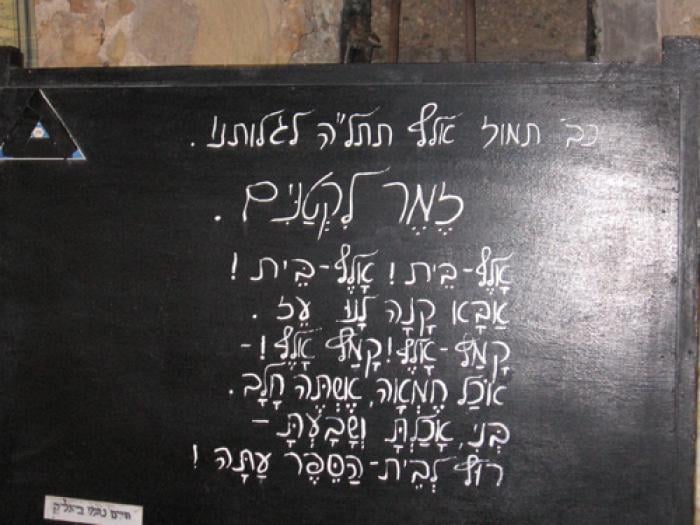
The Enigmatic Chalkboard
The chalkboard handwriting shows a mix of order and spontaneity, suggesting a personality that values both logic and creativity. Improving consistency in letter size and spacing could make the writing more legible without sacrificing its character.
The Hebrew script on the chalkboard presents a distinctive style, marked by its somewhat inconsistent sizing and spacing. The letters themselves are formed with a certain fluidity, noticeable in the rounded curves of the "ת" and the extended tails of the "ק". However, the overall impression is one of controlled chaos, with certain letters like the "א" appearing compressed, while others like the "ל" stretch elegantly across the board. The spacing between words varies, sometimes cramped, sometimes generous, creating a sense of rhythmic irregularity. This idiosyncratic approach extends to punctuation as well, with the exclamation marks exhibiting varying heights and angles.
This handwriting suggests a personality that embraces both structure and spontaneity. The deliberate formation of the letters indicates a methodical mind, while the variations in size and spacing hint at a playful, perhaps even rebellious, spirit. The overall impression is one of someone who values both clarity and creative expression, someone who is not afraid to break the rules while still maintaining a sense of order. This individual likely enjoys puzzles and wordplay, finding satisfaction in both the intellectual and artistic aspects of language.
To improve this handwriting, focusing on consistency would be beneficial. Paying closer attention to the size and spacing of letters, as well as the uniformity of punctuation marks, could enhance legibility without sacrificing the unique character of the script. Practicing writing on lined paper could also help regulate the baseline and create a more even flow across the lines. Embracing these small adjustments could refine the script, making it both visually appealing and easier to read.
Legibility
Expressiveness
Consistency
Overall
Leaderboard for Sunday, 26 October 2025
| 1 | The Flowing Quill |
74
|
| 2 | The Constitutionalist |
74
|
| 3 | The Curator's Script |
72
|
| 4 | The Eloquent Educator |
71
|
| 5 | The Dreamer's Quill |
70
|
| 6 | The Hopeful Heart's Script |
68
|
| 7 | The Constitutionalist |
68
|
| 8 | The Flowing Quill |
68
|
| 9 | The Flowing Hand |
68
|
| 10 | The Agrarian Academic |
67
|
| 11 | The Unassuming Hand |
66
|
| 12 | The Calculating Hand |
65
|
| 13 | The Studious Student |
65
|
| 14 | The Contemplative Soul |
64
|
| 15 | The Mathematical Muse |
64
|
| 16 | The Flowing Font |
63
|
| 17 | The Gentle Flow |
63
|
| 18 | The Looping Legend |
62
|
| 19 | The Contemplative Calligrapher |
60
|
| 20 | The Democratic Dreamer |
59
|
| 21 | The Pragmatic Idealist |
59
|
| 22 | The Signature Stylist |
59
|
| 23 | The Devout Note-Taker |
58
|
| 24 | The Cipher's Quill |
57
|
| 25 | The Atom Alchemist |
57
|
| 26 | The Loop-de-Loop Legend |
56
|
| 27 | The Scientific Mind |
56
|
| 28 | The Calligrapher's Flourish |
54
|
| 29 | The Forward Leaning Letterer |
54
|
| 30 | The Celestial Stylist |
54
|