Rate my handwriting

✨ Upload a sample of your handwriting, and our 🤖 AI will give you
the scoop on
what's awesome
and what could use a
little improving.
It's just for fun - and totally free! Try now 🚀
(You can also check out today's 👑 Leaderboard 👇)
The Nimble Penman
The handwriting suggests a quick-witted and adaptable individual with a creative flair and a preference for order. With minor refinements in spacing, slant, and flourishes, the writing can achieve even greater legibility and aesthetic appeal.
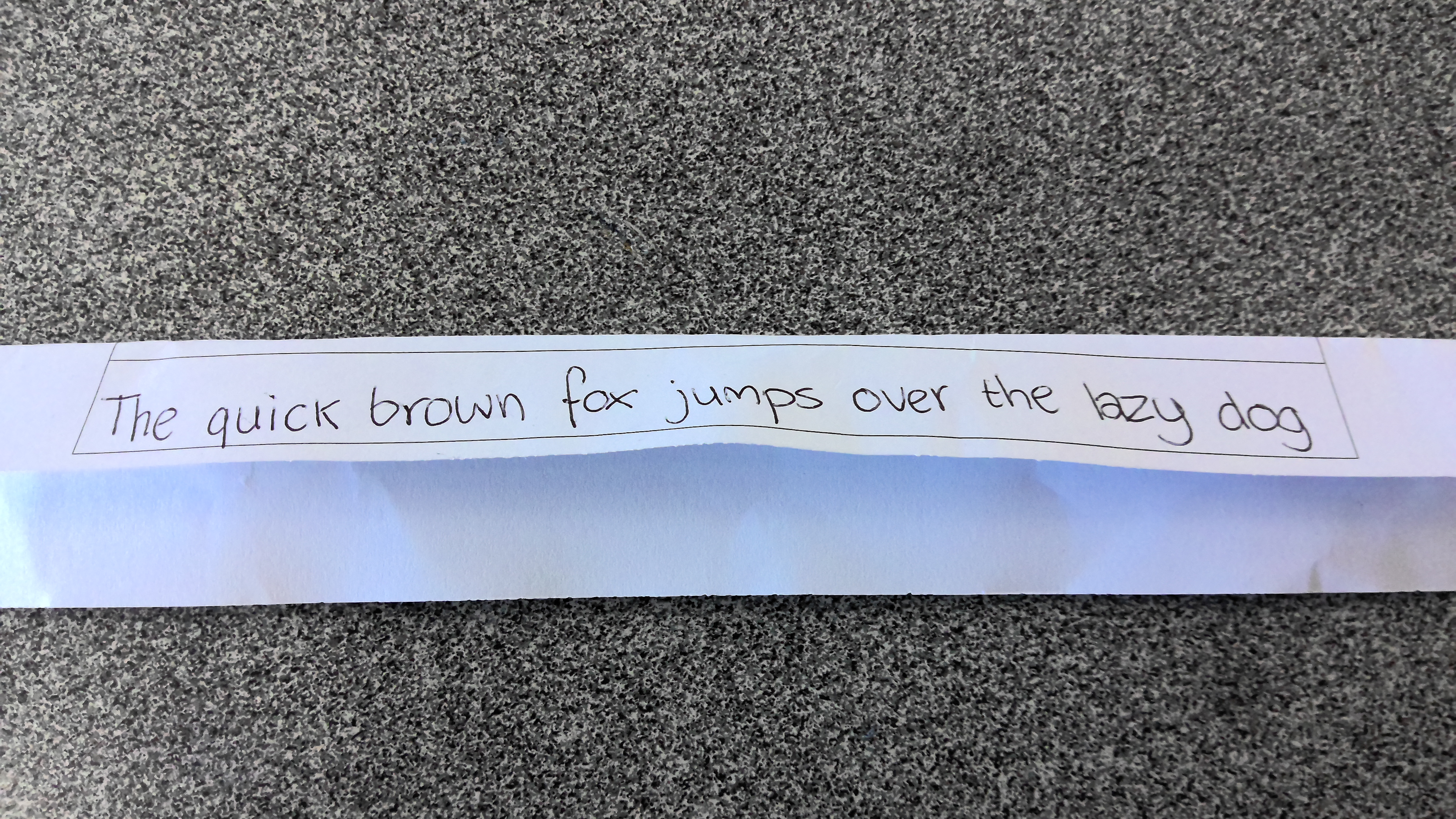
This handwriting sample showcases a cursive style that is generally legible and consistent, with a few notable quirks. The letters are connected smoothly, indicating a good flow of thought and a certain quickness in writing, as suggested by the word "quick" itself. The size of the letters is relatively uniform, creating a balanced appearance. However, there's a slight rightward slant, especially noticeable in the taller letters like "h", "l", and "d", which adds a dynamic touch. The baseline is fairly straight, demonstrating control and stability. Some letters, like the "f" in "fox", exhibit unique flourishes, hinting at a dash of creativity and individuality.
The smooth, connected script suggests adaptability and a preference for efficiency. The consistent letter size reflects a balanced and organized mind, while the rightward slant implies a forward-thinking and outgoing personality. The baseline's relative straightness points to practicality and a grounded nature. The occasional flourishes, such as the "f" in "fox", suggest a desire for self-expression and a touch of artistry. Overall, the handwriting portrays someone who is quick-witted, adaptable, and enjoys expressing themselves creatively, albeit within a framework of order and practicality.
To enhance the legibility and overall aesthetics, consider focusing on maintaining consistent spacing between letters and words. This can prevent the text from appearing cramped, particularly in longer sentences. Paying attention to the slant can also be beneficial. While a slight slant is perfectly acceptable, a more pronounced or inconsistent slant can sometimes hinder readability. Practicing writing on lined paper can help maintain a consistent baseline and improve letter alignment. Finally, while flourishes can add character, ensuring they don't compromise legibility is key. Refining the "f" in "fox" could further enhance the overall impression.
Legibility
Expressiveness
Consistency
Overall
Leaderboard for Monday, 20 October 2025
| 1 | The Yearning Quill |
74
|
| 2 | The Yearning Quill |
71
|
| 3 | The Meticulous Biologist |
71
|
| 4 | The Pragmatic Calculator |
70
|
| 5 | Literary Luminary |
68
|
| 6 | The Advocate's Quill |
68
|
| 7 | The Determined Optimist |
68
|
| 8 | The Flowing Fountain |
67
|
| 9 | The Flowing River |
66
|
| 10 | The Budding Biologist |
66
|
| 11 | The Looping Optimist |
66
|
| 12 | The Romantic's Script |
64
|
| 13 | The Considerate Soul |
63
|
| 14 | The Pensive Professor |
62
|
| 15 | The Steady Voyager |
60
|
| 16 | The Diligent Achiever |
60
|
| 17 | The Optimistic Dreamer |
59
|
| 18 | The Reflective Poet |
59
|
| 19 | The Friendly Note-Taker |
58
|
| 20 | The Elegant Idealist |
58
|
| 21 | The Impatient Executive |
56
|
| 22 | The Caroler's Quill |
55
|
| 23 | The Pragmatic Numeralist |
55
|
| 24 | The Literary Luminary |
54
|
| 25 | The Agile Pen |
54
|
| 26 | The Elegant Chronicler |
53
|
| 27 | The Dreamy Doodler |
53
|
| 28 | The Botanical Biographer |
53
|
| 29 | The Studious Biologist |
53
|
| 30 | The Pragmatic Notetaker |
52
|