Rate my handwriting

✨ Upload a sample of your handwriting, and our 🤖 AI will give you
the scoop on
what's awesome
and what could use a
little improving.
It's just for fun - and totally free! Try now 🚀
(You can also check out today's 👑 Leaderboard 👇)

The Idealist's Hand
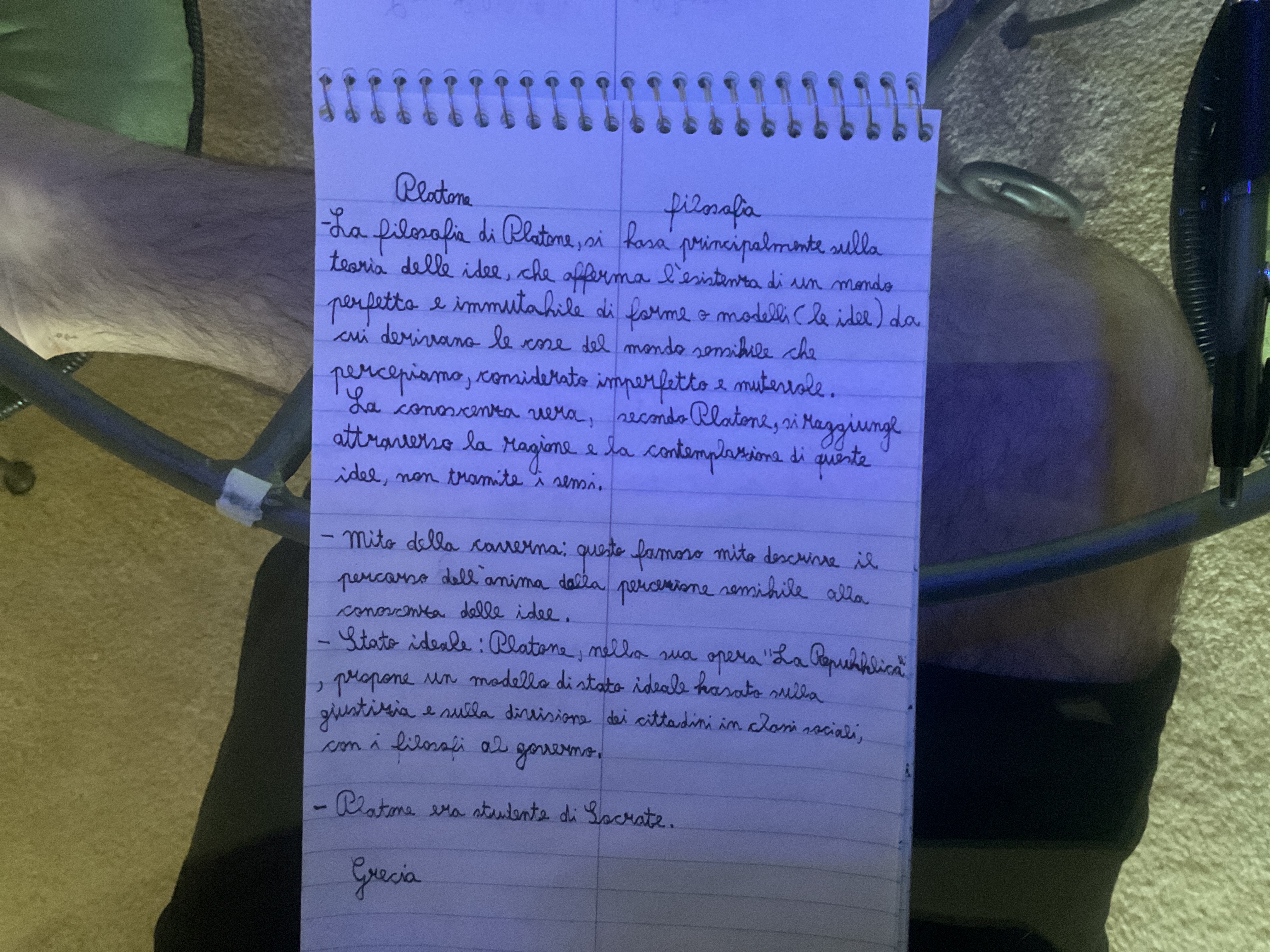
This handwriting exhibits a thoughtful and organized style, hinting at conscientiousness and a desire for clarity, with minor inconsistencies that could be refined with practice.
The handwriting style is neat and deliberate, suggesting a thoughtful and organized approach to writing and thinking. The letter formations are generally rounded and connected, as can be seen in the words "filosofia" and "Platone", indicating a flowing and harmonious writing style. The spacing between words is consistent, contributing to the overall legibility. The handwriting leans slightly to the right, suggesting a degree of openness and willingness to engage with the world. There's a slight variation in letter size, which can be seen between words like "cose" and "mondo", indicating a flexible approach. Overall, the handwriting presents a controlled yet expressive style.
Based on the handwriting, one might infer that the writer possesses traits such as conscientiousness, attention to detail, and a desire for clarity and understanding. The rounded letter formations and connected strokes suggest a harmonious and cooperative nature. The slight rightward slant indicates an outgoing and approachable personality. The writer likely values order and structure, as evidenced by the consistent spacing and neatness. There's also a hint of idealism, reflected in the pursuit of knowledge and understanding of complex concepts.
To improve the handwriting, one could focus on maintaining a consistent letter size and baseline. Paying attention to the slant of the letters and ensuring uniformity can enhance the overall appearance. Practicing letter drills to refine specific letter formations, such as the 'g' in "raggiunge" or the 'z' in "giustizia", could further improve the handwriting. Varying the pressure applied to the pen can also add depth and expressiveness to the writing.
Legibility
Expressiveness
Consistency
Overall
Leaderboard for Monday, 27 October 2025
| 1 | The Analytical Mind |
74
|
| 2 | The Eloquent Educator |
71
|
| 3 | The Student's Script |
70
|
| 4 | The Optimistic Poet |
68
|
| 5 | The Agrarian Academic |
67
|
| 6 | The Diligent Penman |
67
|
| 7 | The Analytical Alchemist |
65
|
| 8 | The Calculating Hand |
65
|
| 9 | The Scientific Hand |
65
|
| 10 | The Aesthetic Typist |
65
|
| 11 | The Mathematical Muse |
64
|
| 12 | The Agile Leaper |
64
|
| 13 | The Diligent Note-Taker |
64
|
| 14 | The Quill of Conviction |
62
|
| 15 | The Agile Artisan |
61
|
| 16 | The Curious Chemist |
59
|
| 17 | The Practical Notetaker |
58
|
| 18 | The Devout Note-Taker |
58
|
| 19 | The Elaborate Chronicler |
58
|
| 20 | The Considerate Confidant |
56
|
| 21 | The Orderly Typewriter |
56
|
| 22 | The Hurried Healer |
55
|
| 23 | The Aspiring Typesetter |
53
|
| 24 | The Architect of Letters |
53
|
| 25 | The Flourishing Academic |
53
|
| 26 | The Diligent Note-Taker |
53
|
| 27 | The Steadfast Student |
53
|
| 28 | The Ambitious Note-Taker |
52
|
| 29 | Celestial Notes |
52
|
| 30 | The Pragmatic Hand |
52
|