Rate my handwriting

✨ Upload a sample of your handwriting, and our 🤖 AI will give you
the scoop on
what's awesome
and what could use a
little improving.
It's just for fun - and totally free! Try now 🚀
(You can also check out today's 👑 Leaderboard 👇)
The Historian's Quill
This handwriting reflects a practical and reliable individual, with an opportunity to refine letter spacing and consistency for improved legibility and visual appeal. While clear and functional, some consistency exercises would add to the handwriting's overall aesthetic.
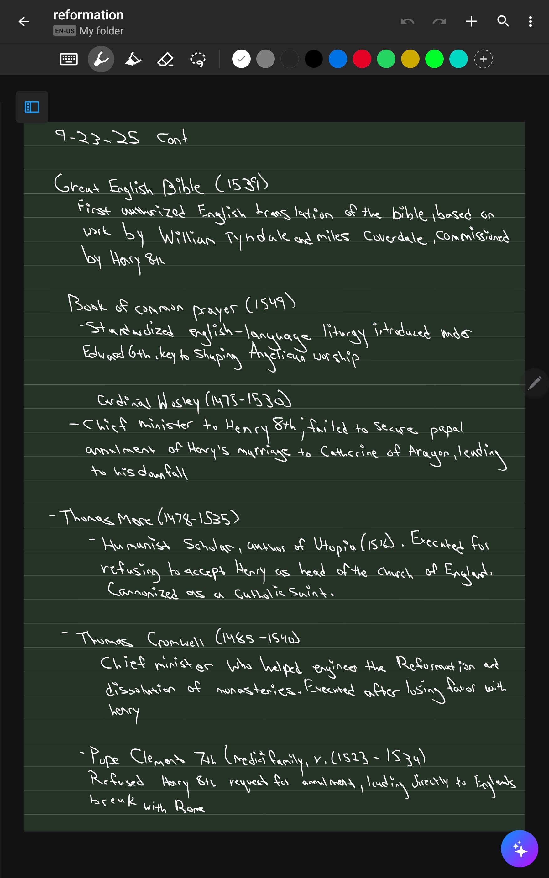
The handwriting presents as a somewhat informal, upright style, lacking significant slant. The size is generally uniform, though spacing varies, leading to areas that appear a little crowded, especially in the lines with longer words like "commissioned" and "standardized". Letter formations are relatively simple and clear, with some inconsistencies, for example, the varying forms of 'H' and 'r' throughout the text. The pressure appears consistent, without much variation in stroke thickness. The overall impression is functional, but without significant flourishes.
Based on this handwriting, one might infer a personality that is practical and direct. The consistent pressure suggests a steady and reliable nature, while the upright style could indicate a balanced and objective outlook. The variations in spacing might suggest occasional impulsiveness or a tendency to juggle multiple thoughts simultaneously. While not overtly artistic, the legibility indicates a desire to communicate clearly, pointing towards conscientiousness and a structured approach to tasks.
To enhance the handwriting, focus on consistent letter spacing for improved readability. Practice uniform letter formations, paying attention to details like the 'H' and 'r'. Consider adding slight variations in pressure to create a more dynamic and engaging appearance. Experimenting with a slight slant could introduce a touch of personal flair, though maintaining overall legibility should remain the priority.
Legibility
Expressiveness
Consistency
Overall
Leaderboard for Thursday, 30 October 2025
| 1 | The Economist's Italic Hand |
74
|
| 2 | The Poet's Quill |
71
|
| 3 | The Flourishing Font |
69
|
| 4 | The Scientific Hand |
68
|
| 5 | The Digital Diarist |
67
|
| 6 | The Upright Student |
67
|
| 7 | The Logical Chemist |
66
|
| 8 | The Prudent Pen |
66
|
| 9 | The Agile Quill |
65
|
| 10 | The Pensive Student |
65
|
| 11 | The Literary Cartographer |
65
|
| 12 | The Pragmatic Planner |
65
|
| 13 | The Bio Notes |
64
|
| 14 | The Civic Philosopher |
63
|
| 15 | The Studious Scholar |
63
|
| 16 | The Meticulous Planner |
63
|
| 17 | The Calligrapher's Chronicle |
62
|
| 18 | The Elusive Poet |
62
|
| 19 | Le Gribouillage Scientifique |
62
|
| 20 | The Deliberate Democrat |
62
|
| 21 | The Cellular Biologist |
61
|
| 22 | Algorithmic Alchemist |
61
|
| 23 | Le Calligraphe Studieux |
61
|
| 24 | The Spirited Student |
60
|
| 25 | The Atomic Pen |
60
|
| 26 | The Fluent Intellectual |
60
|
| 27 | The Global Trotter |
59
|
| 28 | The Forthright Fount |
59
|
| 29 | The Determined Hand |
58
|
| 30 | The Energetic Student |
58
|