Rate my handwriting

✨ Upload a sample of your handwriting, and our 🤖 AI will give you
the scoop on
what's awesome
and what could use a
little improving.
It's just for fun - and totally free! Try now 🚀
(You can also check out today's 👑 Leaderboard 👇)
The Pragmatic Penman
This handwriting sample suggests a pragmatic and efficient personality with a focus on clear communication and functionality. Minor improvements in consistency and letter size would enhance legibility and visual appeal.
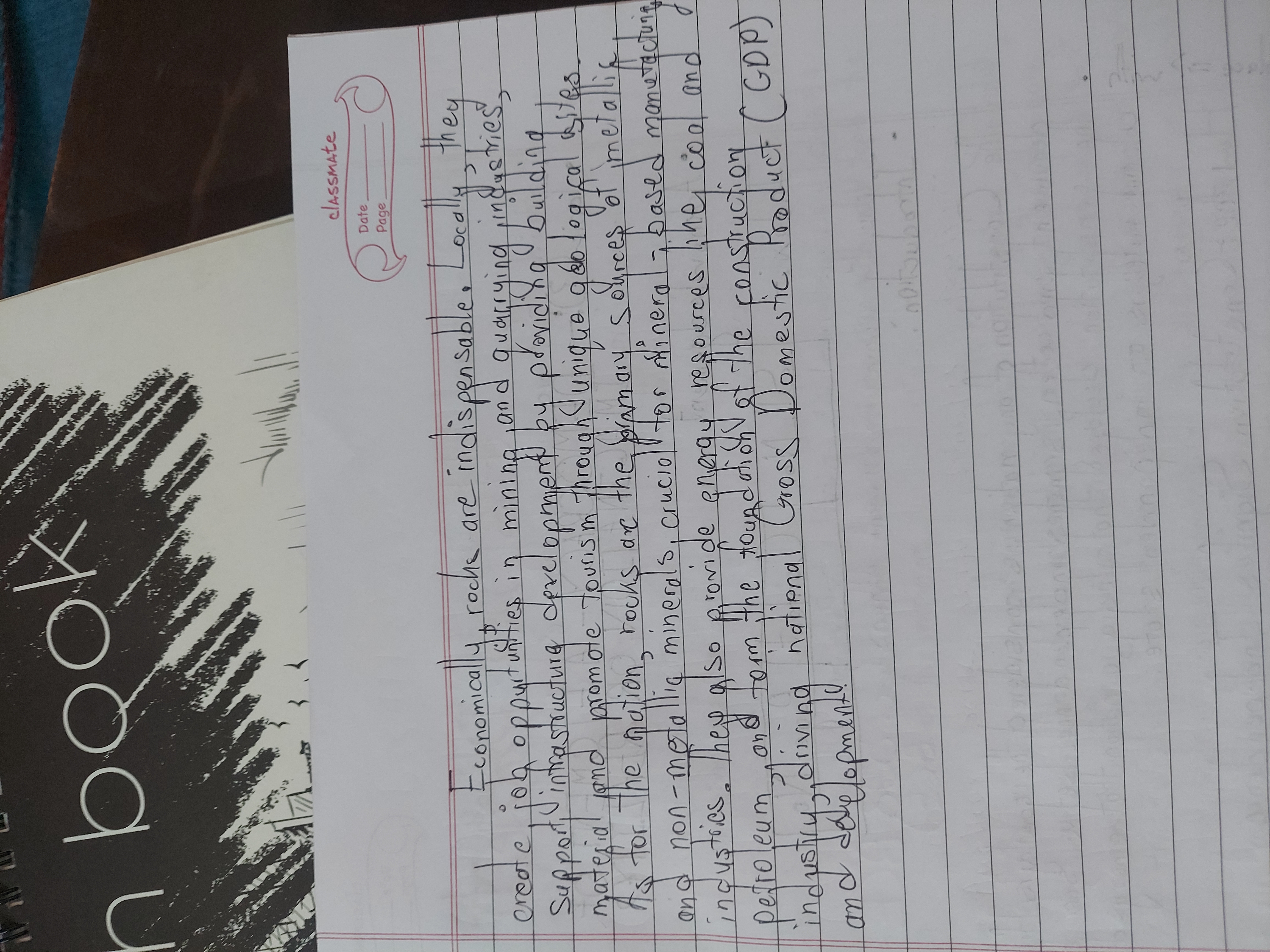
This handwriting sample presents a generally legible and consistent style, although there are some inconsistencies in letterforms, such as the 'r' in 'create' and the 'y' in 'they'. The slant is fairly upright, with a moderate baseline and consistent spacing between words and lines, indicating a disciplined approach. The varying letter sizes, as seen in the words 'Locally' and 'indispensable', add a touch of expressiveness to the otherwise uniform style. Certain embellishments, like the extended crossbar of the 't' in 'industries', and the distinctive 'g' in 'mining' suggest a creative, albeit restrained, flair.
This handwriting suggests a personality that is both practical and efficient. The consistent slant and spacing point towards a logical and organized mind. The controlled yet varied letterforms imply an ability to adapt to different situations, while the generally legible nature of the writing hints at a desire for clear communication. The relatively simple style may indicate a focus on substance over form, prioritizing clarity and functionality over elaborate aesthetics.
While generally legible, focusing on greater consistency in letterforms could enhance the overall neatness. Paying attention to the 'r' and 'a' specifically, ensuring they maintain a consistent shape throughout the writing, would be beneficial. Additionally, slightly increasing the size of some letters, especially those that tend to get smaller, such as the 'e' in 'create' and 'the', would improve readability. Finally, incorporating more consistent ascender and descender heights for letters like 'h', 'l', and 'y' would further enhance the visual appeal and legibility of the writing.
Legibility
Expressiveness
Consistency
Overall
Leaderboard for Tuesday, 28 October 2025
| 1 | The Divine Calligrapher |
80
|
| 2 | The Humble Hand |
76
|
| 3 | The Cursive Narrator |
74
|
| 4 | The Pristine Print |
71
|
| 5 | The Diligent Student |
71
|
| 6 | The Coastal Bard |
69
|
| 7 | The Cursive Cartographer |
68
|
| 8 | Sunrise Musings |
68
|
| 9 | The Coastal Chronicler |
67
|
| 10 | The Coastal Dreamer |
67
|
| 11 | The Cursive Narrator |
67
|
| 12 | The River's Flow |
67
|
| 13 | The Diligent Note-Taker |
67
|
| 14 | The Studious Note-Taker |
66
|
| 15 | The Eloquent Pen |
66
|
| 16 | The Pragmatic Pen |
66
|
| 17 | The Deliberate Draftsman |
65
|
| 18 | The Upright Pen |
65
|
| 19 | The Dream Weaver |
65
|
| 20 | The Scientific Hand |
65
|
| 21 | The Historian's Hand |
64
|
| 22 | The Traditionalist's Script |
64
|
| 23 | The Script of Devotion |
64
|
| 24 | The Elegant Academic |
63
|
| 25 | The Typographer's Testament |
63
|
| 26 | The Studious Note-Taker |
63
|
| 27 | The Loopy Dreamer |
62
|
| 28 | Babylonian Beaches |
62
|
| 29 | The Aquatic Caller |
62
|
| 30 | The Pragmatic Professor |
61
|