Rate my handwriting

✨ Upload a sample of your handwriting, and our 🤖 AI will give you
the scoop on
what's awesome
and what could use a
little improving.
It's just for fun - and totally free! Try now 🚀
(You can also check out today's 👑 Leaderboard 👇)
The Pragmatic Penman
A dynamic and mostly legible hand, reflecting a practical yet adaptable nature with a hint of impulsiveness.
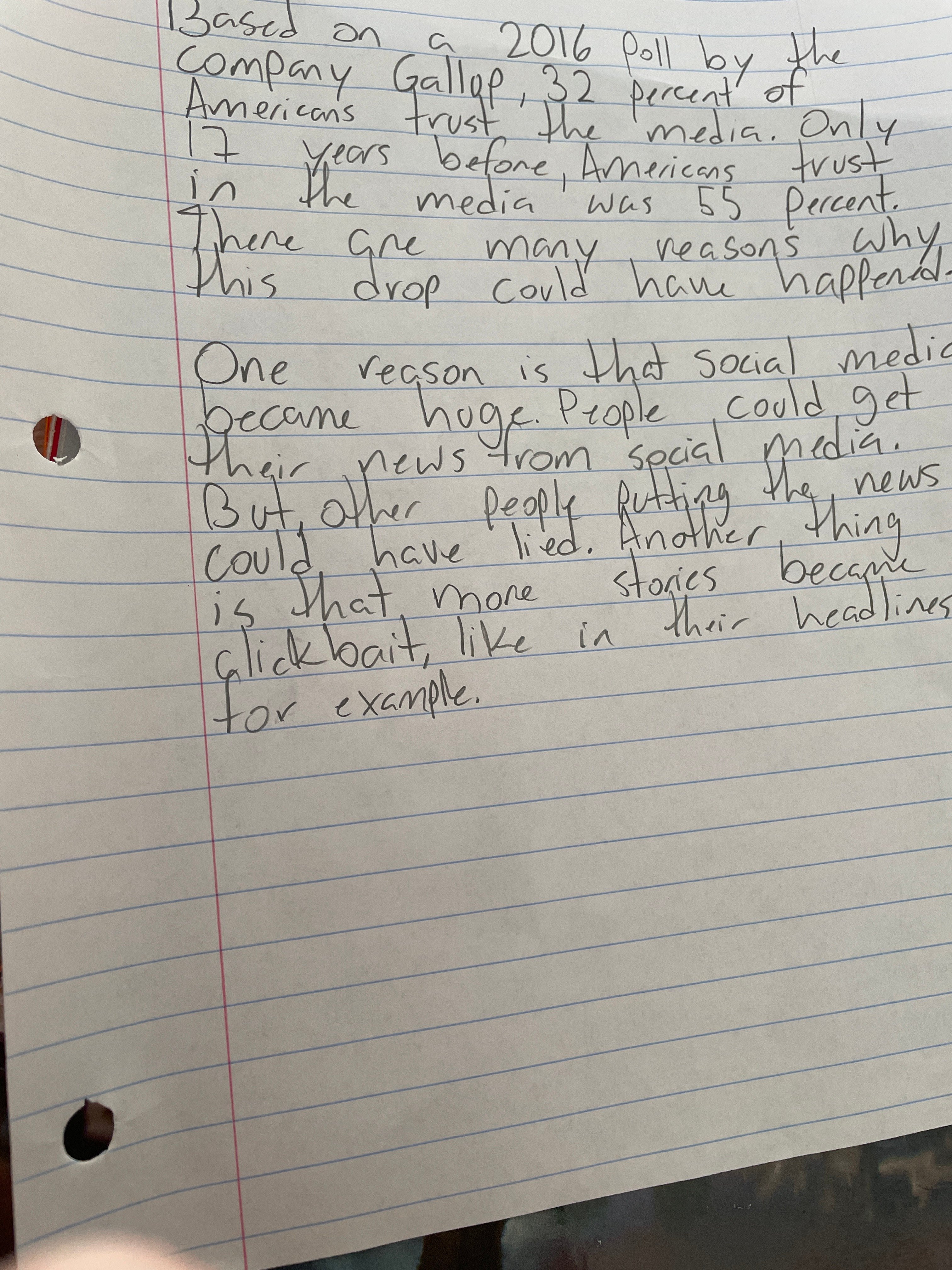
This handwriting sample presents a connected style, with rounded letters and a slight rightward slant. The varying letter sizes, especially noticeable in words like "reasons" and "putting," along with the occasional tapered stroke as seen in "media," create a dynamic, if slightly uneven, flow across the page. While generally legible, certain letter formations, like the 'a' in "that," could be more distinct.
This handwriting suggests a practical and adaptable personality. The connectedness of the letters hints at a systematic thought process, while the rounded forms convey a degree of warmth and approachability. The varying letter sizes could indicate occasional impulsiveness or inconsistency. The rightward slant may signify an inclination towards action and a focus on the future, aligning with the content's focus on change over time.
While mostly readable, some improvements can enhance clarity. Paying attention to the uniformity of letter sizes, especially vowels, could boost legibility. Ensuring consistent spacing between words will prevent crowding and improve the overall visual appeal. Practicing more distinct letter formations, especially those prone to ambiguity, would solidify the impression of clarity and precision.
Legibility
Expressiveness
Consistency
Overall
Leaderboard for Tuesday, 28 October 2025
| 1 | The Divine Calligrapher |
80
|
| 2 | The Humble Hand |
76
|
| 3 | The Cursive Narrator |
74
|
| 4 | The Analytical Mind |
74
|
| 5 | The Pristine Print |
71
|
| 6 | The Diligent Student |
71
|
| 7 | The Coastal Bard |
69
|
| 8 | The Cursive Cartographer |
68
|
| 9 | Sunrise Musings |
68
|
| 10 | The Optimistic Poet |
68
|
| 11 | The Diligent Note-Taker |
67
|
| 12 | The River's Flow |
67
|
| 13 | The Coastal Chronicler |
67
|
| 14 | The Coastal Dreamer |
67
|
| 15 | The Cursive Narrator |
67
|
| 16 | The Pragmatic Pen |
66
|
| 17 | The Eloquent Pen |
66
|
| 18 | The Studious Note-Taker |
66
|
| 19 | The Dream Weaver |
65
|
| 20 | The Aesthetic Typist |
65
|
| 21 | The Scientific Hand |
65
|
| 22 | The Upright Pen |
65
|
| 23 | The Analytical Alchemist |
65
|
| 24 | The Deliberate Draftsman |
65
|
| 25 | The Historian's Hand |
64
|
| 26 | The Script of Devotion |
64
|
| 27 | The Agile Leaper |
64
|
| 28 | The Traditionalist's Script |
64
|
| 29 | The Elegant Academic |
63
|
| 30 | The Typographer's Testament |
63
|