Rate my handwriting

✨ Upload a sample of your handwriting, and our 🤖 AI will give you
the scoop on
what's awesome
and what could use a
little improving.
It's just for fun - and totally free! Try now 🚀
(You can also check out today's 👑 Leaderboard 👇)

The Cursive Chronicler
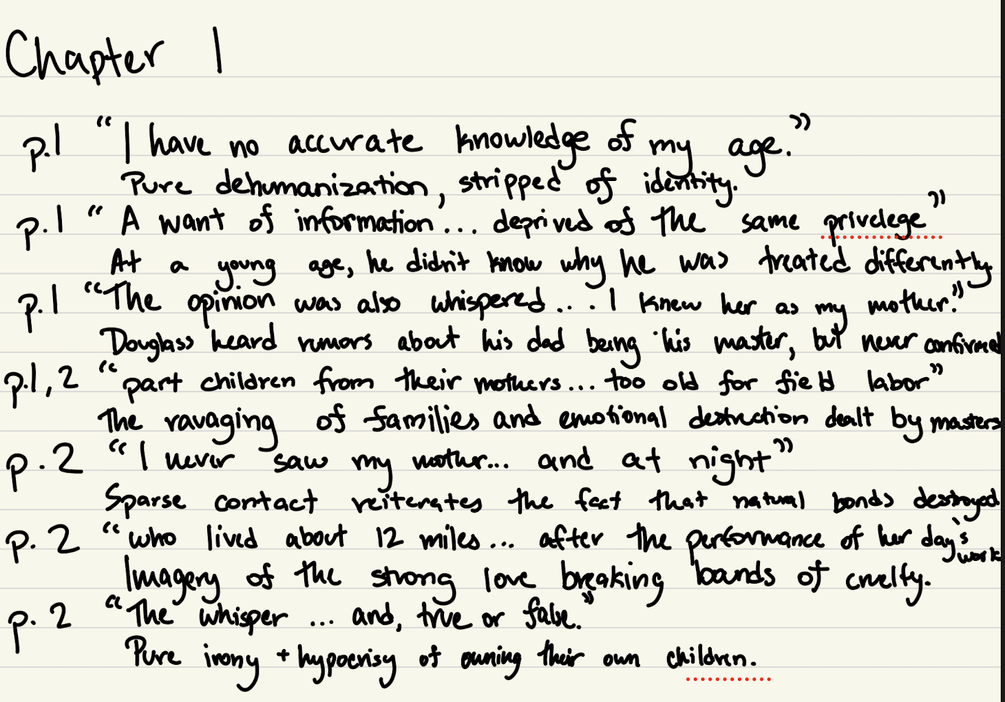
The handwriting is neat and legible, reflecting a personality that values clarity and organization, but it could benefit from variations in stroke weight and slant to enhance its expressiveness.
The handwriting presents a generally neat and legible style, leaning towards a rounded, almost childlike aesthetic. Letter formations are distinct, and the spacing between words is ample, contributing to the overall readability. The upstrokes and downstrokes are of consistent thickness, indicating a steady hand and controlled movement. Noticeable is the uniformity in letter height and slant, lending a sense of order and balance to the writing. The letter 'y' has a deep curve, as in the phrase "why he was treated differently".
This handwriting suggests a personality that values clarity and organization. The writer likely appreciates structure and takes care in presenting information in an accessible manner. There is an indication of patience and attention to detail, as evidenced by the careful formation of each letter. A possible inclination towards empathy and consideration for others might be inferred from the easy-to-read nature of the script, as if the writer wishes to ensure their thoughts are easily understood.
To elevate this handwriting, consider practicing variations in stroke weight to add dynamism and visual interest. Experimenting with different degrees of slant could introduce a personal flair and enhance the expressive quality of the writing. Focus on the consistency of the baseline. While legibility is excellent, introducing subtle flourishes could add a unique touch while maintaining the overall clarity and neatness. In summary, focus on consistency in slant and baseline to further improve the visual harmony.
Legibility
Expressiveness
Consistency
Overall
Leaderboard for Monday, 27 October 2025
| 1 | The Analytical Mind |
74
|
| 2 | The Eloquent Educator |
71
|
| 3 | The Student's Script |
70
|
| 4 | The Optimistic Poet |
68
|
| 5 | The Agrarian Academic |
67
|
| 6 | The Diligent Penman |
67
|
| 7 | The Analytical Alchemist |
65
|
| 8 | The Calculating Hand |
65
|
| 9 | The Scientific Hand |
65
|
| 10 | The Aesthetic Typist |
65
|
| 11 | The Mathematical Muse |
64
|
| 12 | The Agile Leaper |
64
|
| 13 | The Diligent Note-Taker |
64
|
| 14 | The Quill of Conviction |
62
|
| 15 | The Agile Artisan |
61
|
| 16 | The Curious Chemist |
59
|
| 17 | The Practical Notetaker |
58
|
| 18 | The Devout Note-Taker |
58
|
| 19 | The Elaborate Chronicler |
58
|
| 20 | The Considerate Confidant |
56
|
| 21 | The Orderly Typewriter |
56
|
| 22 | The Hurried Healer |
55
|
| 23 | The Aspiring Typesetter |
53
|
| 24 | The Architect of Letters |
53
|
| 25 | The Flourishing Academic |
53
|
| 26 | The Diligent Note-Taker |
53
|
| 27 | The Steadfast Student |
53
|
| 28 | The Ambitious Note-Taker |
52
|
| 29 | Celestial Notes |
52
|
| 30 | The Pragmatic Hand |
52
|