Rate my handwriting

✨ Upload a sample of your handwriting, and our 🤖 AI will give you
the scoop on
what's awesome
and what could use a
little improving.
It's just for fun - and totally free! Try now 🚀
(You can also check out today's 👑 Leaderboard 👇)

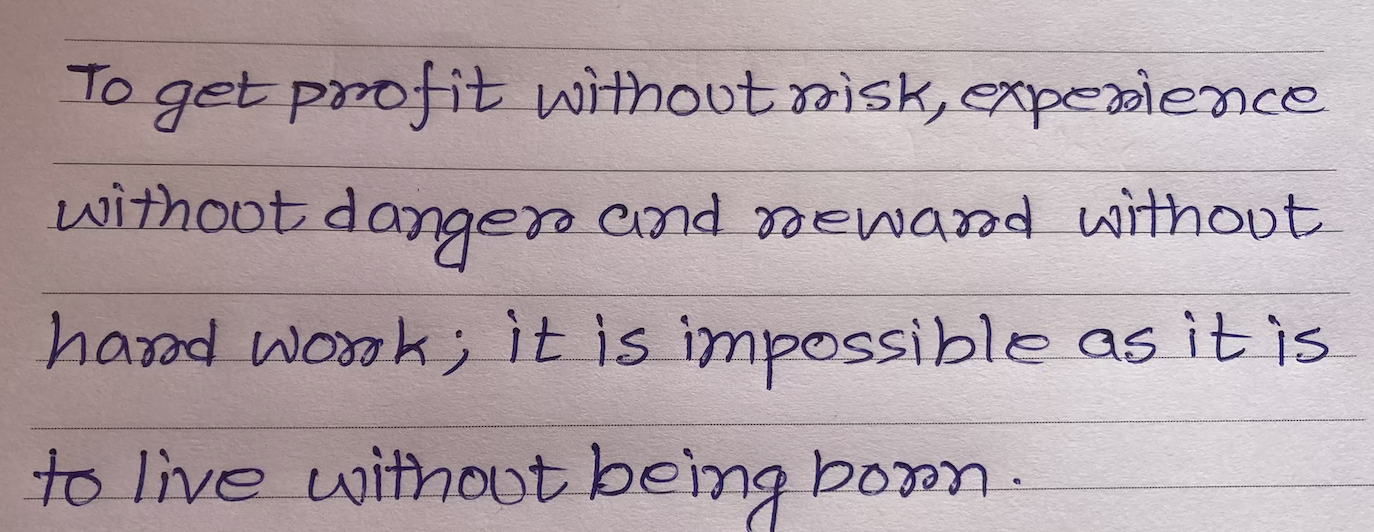
The Idealist's Italic
This rounded, forward-slanting handwriting suggests an enthusiastic and empathetic individual who values clear communication, though consistency in baseline could be improved. Further angularity may enhance precision.
The handwriting is characterized by a rounded, cursive style with consistent spacing between letters and words. The strokes are smooth and fluid, indicating a comfortable and practiced hand. There's a noticeable forward slant, suggesting a sense of enthusiasm. The size is moderate and the writing generally adheres to the lines, although there is a tendency to float above the line towards the end of the sentences. The 't' crossings are firm and decisive, while the loops in letters like 'p' and 'd' are fully formed and open. The words are mostly connected within each line, suggesting a connected thought process. The letter 'r' is sometimes written with a curve. There are no excessive embellishments or unnecessary strokes.
Based on this style, the writer is likely someone who is open-minded and sociable, with a strong desire for connection and understanding. The forward slant indicates a proactive and forward-thinking nature. The rounded forms and smooth strokes suggest a kind and empathetic personality. The clarity and legibility indicate a person who values clear communication and presents themselves well. The consistency of the handwriting points to a reliable and stable individual. The slight variations may indicate that the person is creative and willing to try new things.
To further refine the handwriting, focus on maintaining a consistent baseline. While the upward drift adds a touch of optimism, it can also make the writing appear less grounded. Practicing letter formations with slightly more angular strokes could enhance precision and control. Experiment with varying the pressure applied to the pen to add depth and character to the writing. The roundness of the letters can be slightly reduced to add an edge to the personality conveyed through the writing.
Legibility
Expressiveness
Consistency
Overall
Leaderboard for Tuesday, 28 October 2025
| 1 | The Divine Calligrapher |
80
|
| 2 | The Humble Hand |
76
|
| 3 | The Cursive Narrator |
74
|
| 4 | The Pristine Print |
71
|
| 5 | The Diligent Student |
71
|
| 6 | The Coastal Bard |
69
|
| 7 | Sunrise Musings |
68
|
| 8 | The Cursive Cartographer |
68
|
| 9 | The Considerate Soul |
67
|
| 10 | The Coastal Chronicler |
67
|
| 11 | The Cursive Narrator |
67
|
| 12 | The Diligent Note-Taker |
67
|
| 13 | The Coastal Dreamer |
67
|
| 14 | The Diligent Calligrapher |
67
|
| 15 | The River's Flow |
67
|
| 16 | The Eloquent Pen |
66
|
| 17 | The Studious Note-Taker |
66
|
| 18 | The Pragmatic Pen |
66
|
| 19 | The Pharmacist's Note |
65
|
| 20 | The Deliberate Draftsman |
65
|
| 21 | The Upright Pen |
65
|
| 22 | The Dream Weaver |
65
|
| 23 | The Historian's Hand |
64
|
| 24 | The Script of Devotion |
64
|
| 25 | The Traditionalist's Script |
64
|
| 26 | The Elegant Academic |
63
|
| 27 | The Studious Note-Taker |
63
|
| 28 | The Gridiron Enthusiast |
63
|
| 29 | The Typographer's Testament |
63
|
| 30 | The Aquatic Caller |
62
|