Rate my handwriting

✨ Upload a sample of your handwriting, and our 🤖 AI will give you
the scoop on
what's awesome
and what could use a
little improving.
It's just for fun - and totally free! Try now 🚀
(You can also check out today's 👑 Leaderboard 👇)
The Elegant Educator
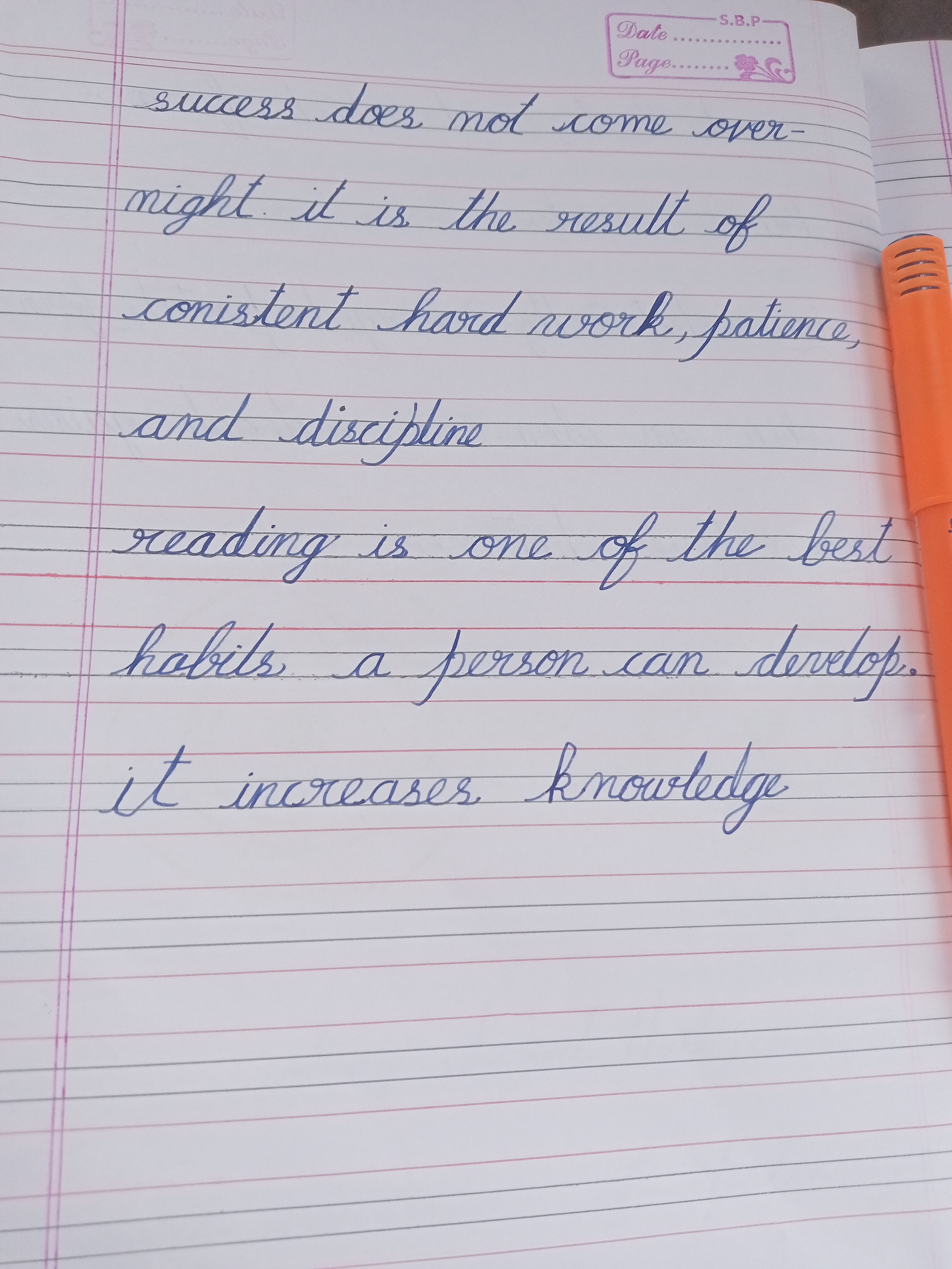
This elegant handwriting, with its flowing curves and forward slant, reveals an optimistic and aesthetically driven individual, but some work is needed on spelling accuracy. Focusing on precision and consistent letter formation will further enhance the writing's impact.
The handwriting sample presents a graceful, cursive style with a noticeable slant to the right. The letter formations are rounded and flowing, with loops and connecting strokes that give the writing a sense of rhythm and movement. Words like "success", "patience", and "knowledge" are elegantly formed, indicating attention to detail and a desire for aesthetic appeal. The writing maintains a relatively consistent size and spacing, although there is some variation in letter height, particularly in ascending letters like 't' and 'd'. Overall, the handwriting appears neat and legible, though some words like "conistent" (consistent) and "hobits" (habits) are misspelled, which impacts legibility.
This handwriting suggests a personality that values harmony, aesthetics, and attention to detail. The rightward slant indicates a forward-thinking and optimistic outlook, while the rounded letter forms suggest a gentle and approachable nature. The connecting strokes imply a desire for connection and communication with others. The misspelling suggests an individual who may be more focused on the overall impression than on strict adherence to rules, and perhaps a more creative than conventionally academic mind.
To further refine this handwriting, consider focusing on precision and consistency in letter formation. Paying closer attention to spelling would improve legibility and overall impact. Practicing the formation of letters like 's' and 't' to ensure uniformity would enhance the writing's visual appeal. Experimenting with variations in stroke weight could add depth and character to the writing while maintaining its elegance.
Legibility
Expressiveness
Consistency
Overall
Leaderboard for Thursday, 25 September 2025
| 31 | The Optimist's Agenda |
58
|
| 32 | The Thermodynamic Thinker |
58
|
| 33 | The Flourishing Signature |
58
|
| 34 | The Charismatic Commander |
56
|
| 35 | The Deliberate Hand |
56
|
| 36 | The Promotional Hand |
56
|
| 37 | The Loop Master |
53
|
| 38 | The Romantic's Quill |
53
|
| 39 | Environmental Guardian's Script |
52
|
| 40 | The Epicurean Hand |
52
|
| 41 | The Flowing Fountain |
52
|
| 42 | The Existentialist's Quill |
52
|
| 43 | The Ledger Keeper |
51
|
| 44 | The Pious Penman |
50
|
| 45 | The Ledger Keeper |
45
|