Rate my handwriting

✨ Upload a sample of your handwriting, and our 🤖 AI will give you
the scoop on
what's awesome
and what could use a
little improving.
It's just for fun - and totally free! Try now 🚀
(You can also check out today's 👑 Leaderboard 👇)
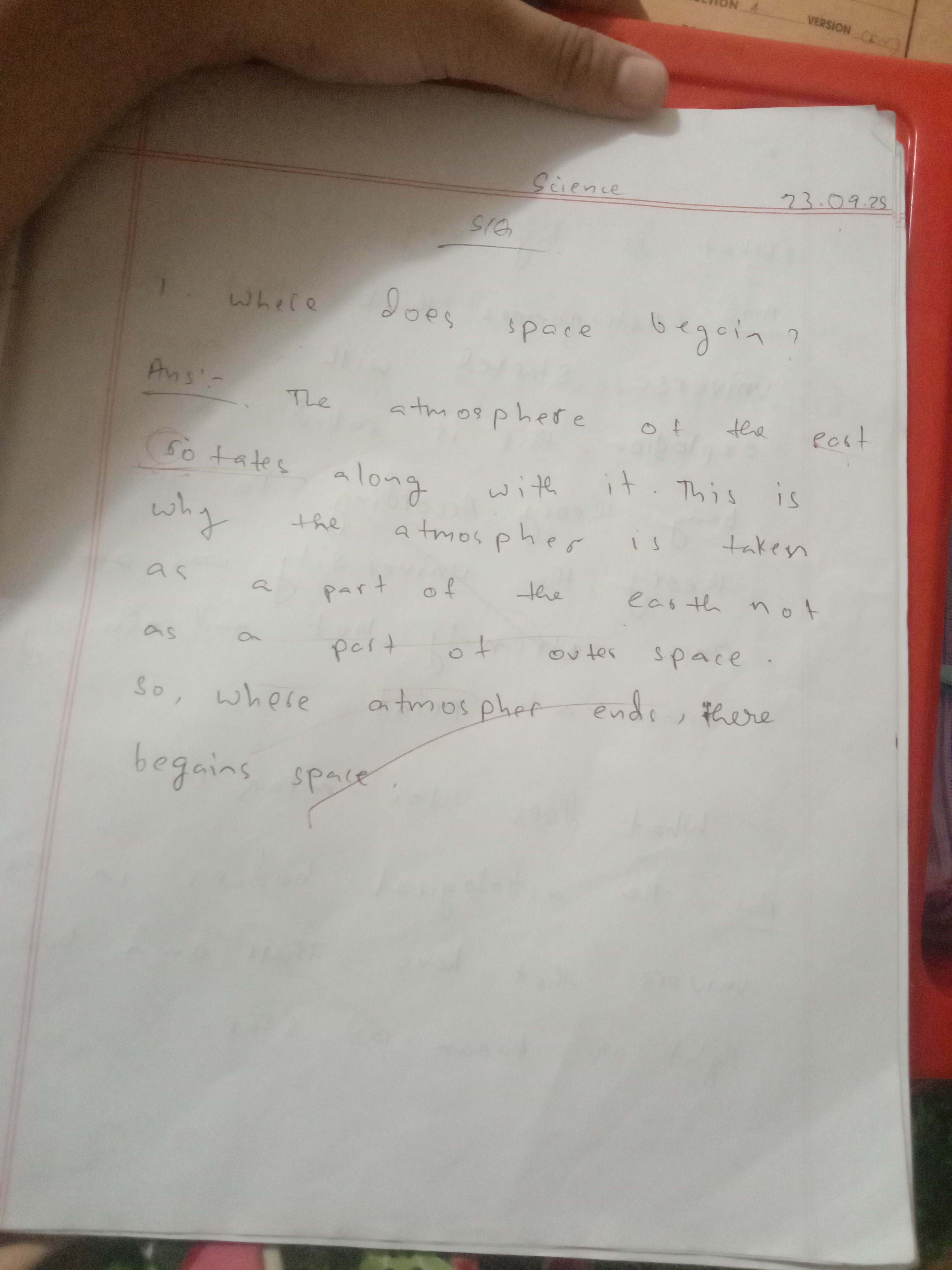
The Space Explorer's Quill
This handwriting suggests a practical individual who values efficiency over meticulous detail. By focusing on letter sizing, spacing and baseline consistency, the writing can be improved.
The handwriting leans towards a simplified, almost child-like style, evident in the rounded forms and inconsistent letter sizing. There's a notable lack of embellishment, with letters formed directly and without flourishes. The spacing between words varies, creating an uneven rhythm across the page. Some words, like "atmosphere" and "begains", display inconsistencies in letter formation, suggesting a writer who prioritizes speed over precision.
Based on this sample, the writer may possess a practical and straightforward approach to tasks. The simplified letter forms suggest someone who values efficiency and avoids unnecessary complexity. There could be a tendency to prioritize the overall message over meticulous details, indicating a focus on the bigger picture. The unevenness might reflect a personality that's adaptable and not overly concerned with rigid structures.
To improve legibility and create a more polished impression, consider focusing on consistent letter sizing and spacing. Practicing letter forms individually can help build muscle memory and improve consistency. Slowing down slightly during writing can allow for more careful formation and attention to detail. Paying attention to the baseline can also enhance the overall neatness and readability of the handwriting.
Legibility
Expressiveness
Consistency
Overall
Leaderboard for Saturday, 01 November 2025
| 1 | The Precise Constitutionalist |
72
|
| 2 | The Idealist's Quill |
71
|
| 3 | The Optimist |
71
|
| 4 | The Architect's Hand |
69
|
| 5 | The Communal Calligrapher |
68
|
| 6 | The Serpentine Thinker |
68
|
| 7 | The Friendly Tester |
68
|
| 8 | The Print-Maker |
68
|
| 9 | The Pragmatist's Script |
67
|
| 10 | The Benevolent Calligrapher |
66
|
| 11 | Geometric Soul |
66
|
| 12 | The Elementary Author |
65
|
| 13 | The Spirited Athlete |
65
|
| 14 | The Maverick's Mark |
65
|
| 15 | The Leader's Mark |
64
|
| 16 | The Bard's Quill |
63
|
| 17 | The Deliberate Student |
63
|
| 18 | The Determined Deep Diver |
62
|
| 19 | The Deliberate Artificer |
61
|
| 20 | The Environmentalist's Cursive |
61
|
| 21 | The Maverick's Manifesto |
60
|
| 22 | The Cosmographer's Quill |
59
|
| 23 | The Introspective Calligrapher |
59
|
| 24 | Optimistic Outlook |
58
|
| 25 | Optimistic Penman |
57
|
| 26 | The Environmentalist's Cursive |
56
|
| 27 | The Looping Liberal |
56
|
| 28 | The Diligent Student |
56
|
| 29 | The Student |
56
|
| 30 | Arctic Musings |
55
|