Rate my handwriting

✨ Upload a sample of your handwriting, and our 🤖 AI will give you
the scoop on
what's awesome
and what could use a
little improving.
It's just for fun - and totally free! Try now 🚀
(You can also check out today's 👑 Leaderboard 👇)

The Cartographer's Quill
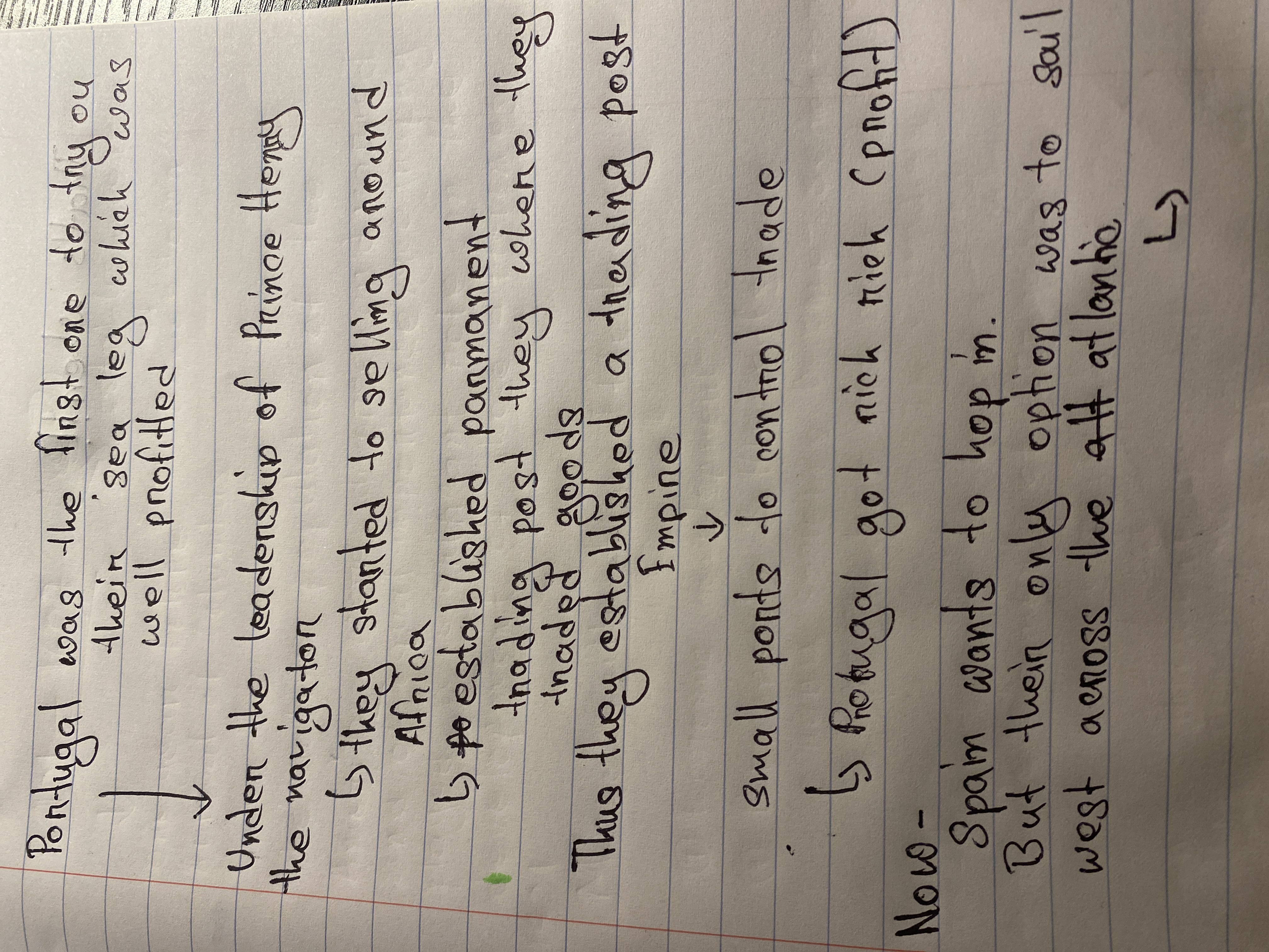
This handwriting reveals a friendly yet analytical personality, suggesting someone who is adaptable and forward-looking, with some minor improvements that can be made to consistency.
The handwriting displays a mix of cursive and print, with a slight rightward slant. The letter formations are generally rounded, seen in words like "around" and "option", but with some angularity, especially in letters like 't' and 'k'. The size is moderate, with some variation between lines, and spacing between words is fairly consistent, enhancing readability. There's a casualness to the style, evident in the simplified letter forms and occasional abbreviations like 'att atlantic'.
This handwriting suggests a practical and adaptable personality. The rounded letter forms indicate a friendly and approachable nature, while the angular elements show a determined and analytical side. The rightward slant indicates enthusiasm and a forward-looking attitude. The variation in size and spacing may reflect a flexible and spontaneous approach to life. Overall, it points to someone who is comfortable in their own skin and able to balance different aspects of their personality.
To improve your handwriting, focus on maintaining a consistent letter size and baseline. Practice letter formations to reduce inconsistencies and ensure greater uniformity. Pay attention to the pressure applied while writing to avoid variations in stroke thickness. Also, be mindful of letter connections, particularly in cursive, to improve the flow and rhythm of your writing. By addressing these aspects, you can enhance both the legibility and aesthetic appeal of your handwriting.
Legibility
Expressiveness
Consistency
Overall