Rate my handwriting

✨ Upload a sample of your handwriting, and our 🤖 AI will give you
the scoop on
what's awesome
and what could use a
little improving.
It's just for fun - and totally free! Try now 🚀
(You can also check out today's 👑 Leaderboard 👇)
The Minimalist
This handwriting style indicates a preference for simplicity, clarity, and organization, reflecting a personality that values practicality and straightforwardness. By playing with stroke weights and spacing, the writer could introduce a touch of individuality while maintaining legibility.
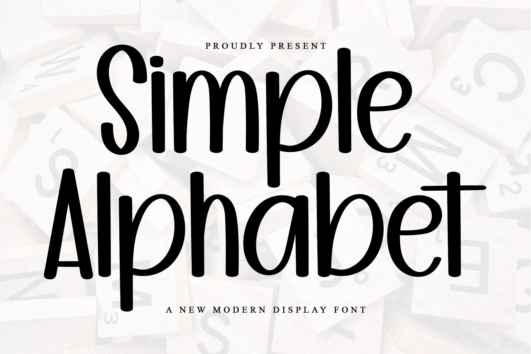
The handwriting style exhibits a distinct 'Simple Alphabet', with rounded letterforms that lend a playful yet controlled aesthetic. The strokes are thick and consistent, demonstrating a confident hand. There is an absence of flamboyant flourishes, pointing towards a preference for clarity and directness. The letter 't' crosses are consistently short and centered, which is a curious detail.
Based on the simplicity and neatness of the writing, one might infer that the individual is practical, organized, and appreciates straightforward communication. The consistent strokes suggest a reliable nature, while the rounded forms indicate a friendly and approachable personality. The deliberate lack of embellishment could also imply a preference for efficiency and a focus on essential details.
To enhance this style, consider experimenting with varying stroke weights to add dynamic contrast and visual interest. While maintaining legibility is paramount, incorporating subtle loops or extending letter tails could introduce a touch of individuality. Practice varying the spacing between letters and words to see if it enhances the aesthetic.
Legibility
Expressiveness
Consistency
Overall
Leaderboard for Thursday, 18 September 2025
| 1 | The Gratitude Calligrapher |
76
|
| 2 | The Optimistic Bloom |
74
|
| 3 | The Diligent Student |
73
|
| 4 | The Precise Pen |
73
|
| 5 | The Vertical Validator |
71
|
| 6 | The Kitchen Confidante |
71
|
| 7 | The Rosy Raconteur |
68
|
| 8 | The Pragmatic Student |
68
|
| 9 | The Earnest Communicator |
68
|
| 10 | The Flowing Hand |
68
|
| 11 | The Pragmatic Numerologist |
68
|
| 12 | The Elegant Flow |
68
|
| 13 | The Curriculum Curator |
68
|
| 14 | The Optimistic Time Traveler |
67
|
| 15 | The Diligent Student |
67
|
| 16 | The Curious Chronicler |
66
|
| 17 | The Open Mind |
65
|
| 18 | The Calligrapher's Clarity |
64
|
| 19 | The Mountain Poet |
63
|
| 20 | The Tenacious Calligrapher |
63
|
| 21 | Bengali Script Voyager |
63
|
| 22 | Nepal's Soulful Calligraphy |
62
|
| 23 | The Calendarist |
62
|
| 24 | The Practical Pro |
61
|
| 25 | The Diligent Student |
61
|
| 26 | The Unassuming Classicist |
61
|
| 27 | The Upright Idealist |
60
|
| 28 | The Flowing Stream |
60
|
| 29 | The Balanced Communicator |
60
|
| 30 | The Mushroom Maven |
60
|