Rate my handwriting

✨ Upload a sample of your handwriting, and our 🤖 AI will give you
the scoop on
what's awesome
and what could use a
little improving.
It's just for fun - and totally free! Try now 🚀
(You can also check out today's 👑 Leaderboard 👇)
The Happy Penman
This handwriting sample indicates a neat and consistent style with hints of a cheerful and optimistic personality. Practicing in various contexts would improve handwriting fluency and refine letterforms.
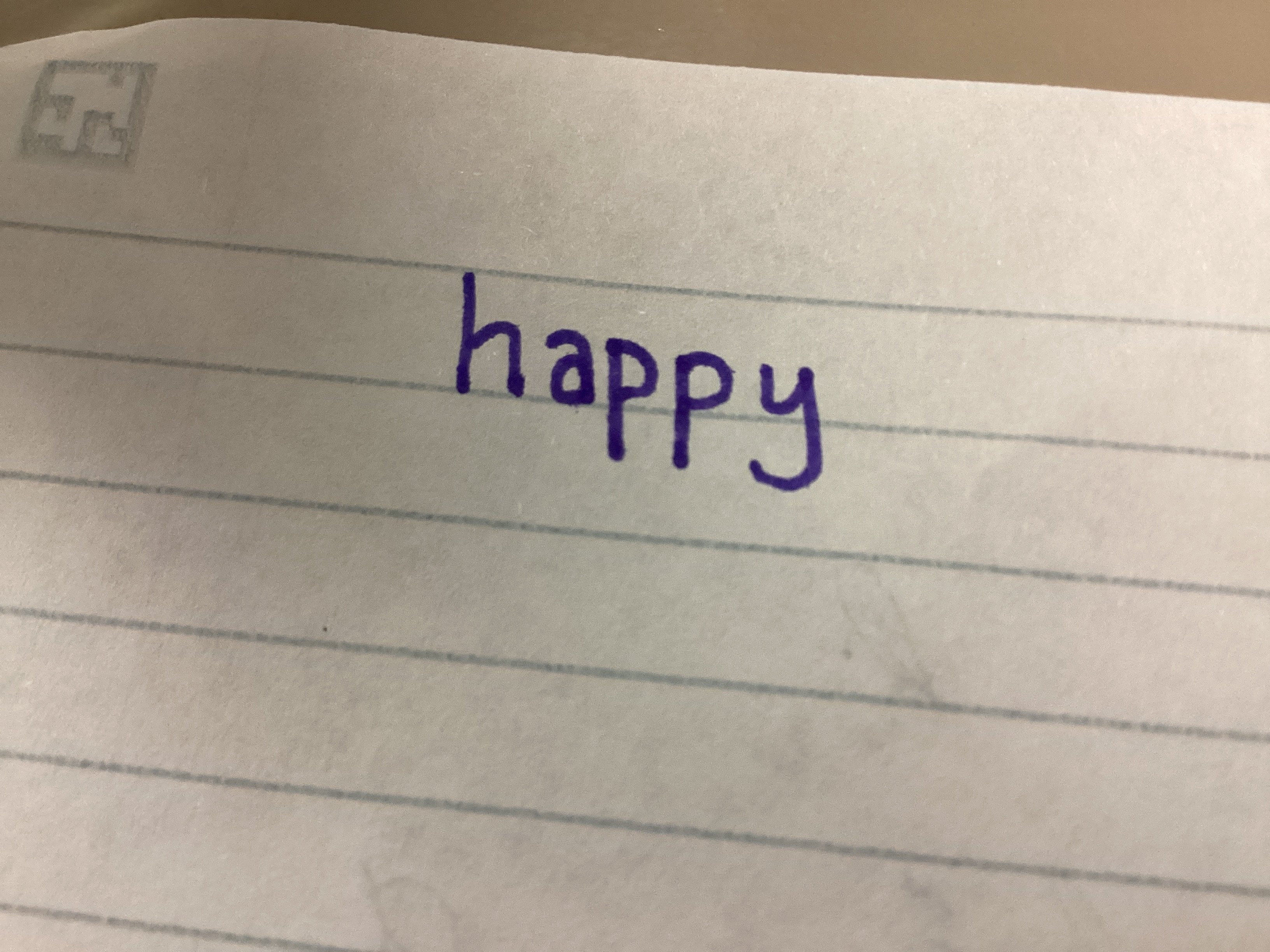
The word "happy" is written in neat cursive, with consistent letter size and spacing. The letters are well-formed, with rounded curves and smooth connections. The baseline is relatively straight, indicating good control over pen movement. The 'h' is noticeably taller than the other letters, adding a touch of flair.
This handwriting suggests a cheerful and optimistic personality. The neatness and consistency reflect a desire for order and precision, while the rounded letters and smooth connections hint at a friendly and approachable nature. The slightly taller 'h' could indicate a touch of pride or confidence.
To improve this handwriting, I would suggest focusing on maintaining consistent letter height. While the 'h' adds a bit of personality, making sure all the letters are of similar height would enhance readability and create a more polished look. Practicing writing in a variety of contexts, such as writing lists, taking notes, or journaling, would help develop fluency and refine letterforms.
Legibility
Expressiveness
Consistency
Overall
Leaderboard for Sunday, 26 October 2025
| 1 | The Constitutionalist |
74
|
| 2 | The Flowing Quill |
74
|
| 3 | The Curator's Script |
72
|
| 4 | The Eloquent Educator |
71
|
| 5 | The Student's Script |
70
|
| 6 | The Dreamer's Quill |
70
|
| 7 | The Constitutionalist |
68
|
| 8 | The Flowing Quill |
68
|
| 9 | The Hopeful Heart's Script |
68
|
| 10 | The Diligent Penman |
67
|
| 11 | The Agrarian Academic |
67
|
| 12 | The Unassuming Hand |
66
|
| 13 | The Studious Student |
65
|
| 14 | The Calculating Hand |
65
|
| 15 | The Diligent Note-Taker |
64
|
| 16 | The Mathematical Muse |
64
|
| 17 | The Contemplative Soul |
64
|
| 18 | The Flowing Font |
63
|
| 19 | The Gentle Flow |
63
|
| 20 | The Looping Legend |
62
|
| 21 | The Contemplative Calligrapher |
60
|
| 22 | The Signature Stylist |
59
|
| 23 | The Democratic Dreamer |
59
|
| 24 | The Devout Note-Taker |
58
|
| 25 | The Cipher's Quill |
57
|
| 26 | The Atom Alchemist |
57
|
| 27 | The Scientific Mind |
56
|
| 28 | The Loop-de-Loop Legend |
56
|
| 29 | The Orderly Typewriter |
56
|
| 30 | The Forward Leaning Letterer |
54
|