Rate my handwriting

✨ Upload a sample of your handwriting, and our 🤖 AI will give you
the scoop on
what's awesome
and what could use a
little improving.
It's just for fun - and totally free! Try now 🚀
(You can also check out today's 👑 Leaderboard 👇)

The Calculating Calligrapher
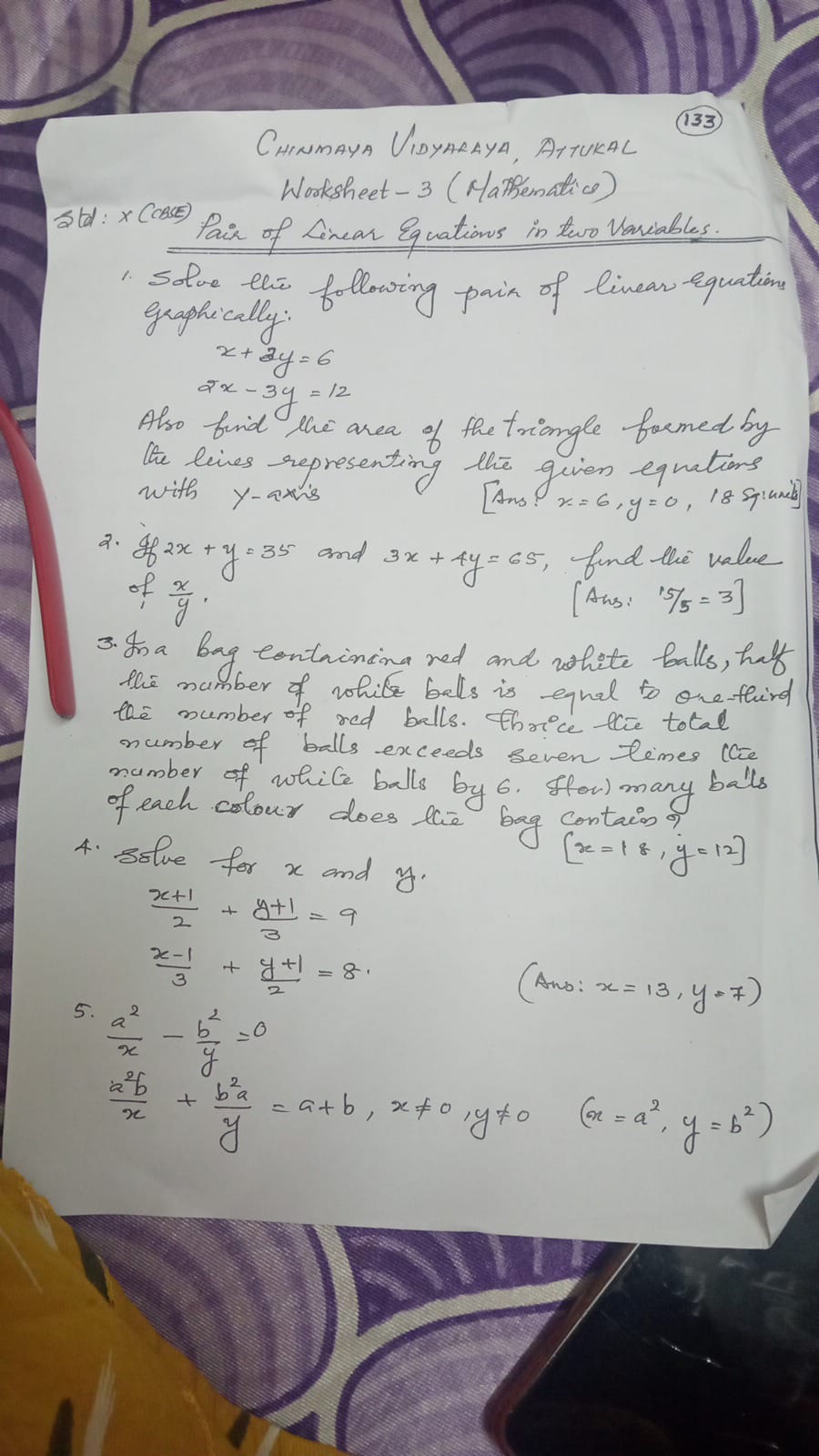
This handwriting exhibits a neat, slightly stylized style, suggesting a thoughtful and organized personality. Focusing on letter and word spacing would improve legibility.
The handwriting presents as neat and somewhat stylized. There's a looping quality to many of the letters, particularly in ascenders and descenders, creating a sense of flow, seen in words like "following", "linear", and "representing". The slant is generally consistent and slightly inclined, indicating a forward-moving energy. The letter size is moderately uniform, contributing to the overall legibility, however the letter spacing could be improved.
Based on this handwriting, the individual is likely methodical and thoughtful, perhaps even possessing a creative streak tempered by a need for structure. The consistent slant and looping formations suggest a sociable and agreeable nature. The generally neat appearance implies attention to detail and a desire to present oneself in an organized manner. The letter spacing hints that the writer is an introvert who needs some space.
To enhance legibility, try to ensure greater separation between words. Practicing letter formation, focusing on maintaining consistent letter heights, would contribute to a more uniform appearance. Additionally, conscious effort to make the letter spacing more even would improve clarity, especially in longer words.
Legibility
Expressiveness
Consistency
Overall
Leaderboard for Tuesday, 28 October 2025
| 1 | The Divine Calligrapher |
80
|
| 2 | The Humble Hand |
76
|
| 3 | The Cursive Narrator |
74
|
| 4 | The Pristine Print |
71
|
| 5 | The Diligent Student |
71
|
| 6 | The Coastal Bard |
69
|
| 7 | Sunrise Musings |
68
|
| 8 | The Cursive Cartographer |
68
|
| 9 | The Considerate Soul |
67
|
| 10 | The Coastal Chronicler |
67
|
| 11 | The Cursive Narrator |
67
|
| 12 | The Diligent Note-Taker |
67
|
| 13 | The Coastal Dreamer |
67
|
| 14 | The Diligent Calligrapher |
67
|
| 15 | The River's Flow |
67
|
| 16 | The Eloquent Pen |
66
|
| 17 | The Studious Note-Taker |
66
|
| 18 | The Pragmatic Pen |
66
|
| 19 | The Pharmacist's Note |
65
|
| 20 | The Deliberate Draftsman |
65
|
| 21 | The Upright Pen |
65
|
| 22 | The Dream Weaver |
65
|
| 23 | The Historian's Hand |
64
|
| 24 | The Script of Devotion |
64
|
| 25 | The Traditionalist's Script |
64
|
| 26 | The Elegant Academic |
63
|
| 27 | The Studious Note-Taker |
63
|
| 28 | The Gridiron Enthusiast |
63
|
| 29 | The Typographer's Testament |
63
|
| 30 | The Aquatic Caller |
62
|