Rate my handwriting

✨ Upload a sample of your handwriting, and our 🤖 AI will give you
the scoop on
what's awesome
and what could use a
little improving.
It's just for fun - and totally free! Try now 🚀
(You can also check out today's 👑 Leaderboard 👇)
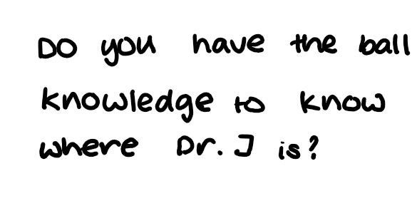
The Friendly Font
The rounded, legible handwriting suggests an approachable and friendly personality, with room for improvement in stroke variation and slant consistency. It has a somewhat childlike quality.
The handwriting is characterized by its rounded, almost cartoonish appearance. The letters are generally large and well-spaced, giving the text an open and airy feel. There is a noticeable lack of sharp angles, with curves dominating the letterforms, for example in words like 'knowledge' and 'know'. The consistency is fairly good, with a uniform stroke width throughout. The letter 'J' is quite distinctive. Legibility is high, thanks to the clear and simple shapes of the letters.
Based on this handwriting, the individual is likely to be approachable and friendly. The rounded forms suggest a gentle and easy-going nature. The clear spacing indicates a need for personal space and a desire for clarity in communication. The high legibility points to a considerate nature, as the writer is making an effort to be easily understood. There is a certain playfulness implied by the somewhat childlike quality of the writing.
To improve the handwriting, the writer could focus on adding a bit more variation in stroke thickness to give the writing more character. Practicing slant consistency would also improve the overall aesthetic. Finally, reducing the size of the letters slightly might give the writing a more mature appearance.
Legibility
Expressiveness
Consistency
Overall
Leaderboard for Monday, 27 October 2025
| 1 | The Divine Calligrapher |
80
|
| 2 | The Humble Hand |
76
|
| 3 | The Analytical Mind |
74
|
| 4 | The Diligent Student |
71
|
| 5 | The Pristine Print |
71
|
| 6 | The Student's Script |
70
|
| 7 | The Coastal Bard |
69
|
| 8 | The Optimistic Poet |
68
|
| 9 | Sunrise Musings |
68
|
| 10 | The Cursive Cartographer |
68
|
| 11 | The Diligent Note-Taker |
67
|
| 12 | The River's Flow |
67
|
| 13 | The Diligent Penman |
67
|
| 14 | The Coastal Chronicler |
67
|
| 15 | The Cursive Narrator |
67
|
| 16 | The Coastal Dreamer |
67
|
| 17 | The Pragmatic Pen |
66
|
| 18 | The Scientific Hand |
65
|
| 19 | The Deliberate Draftsman |
65
|
| 20 | The Aesthetic Typist |
65
|
| 21 | The Analytical Alchemist |
65
|
| 22 | The Agile Leaper |
64
|
| 23 | The Diligent Note-Taker |
64
|
| 24 | The Mathematical Muse |
64
|
| 25 | The Traditionalist's Script |
64
|
| 26 | The Script of Devotion |
64
|
| 27 | The Elegant Academic |
63
|
| 28 | The Studious Note-Taker |
63
|
| 29 | The Typographer's Testament |
63
|
| 30 | Babylonian Beaches |
62
|