Rate my handwriting

✨ Upload a sample of your handwriting, and our 🤖 AI will give you
the scoop on
what's awesome
and what could use a
little improving.
It's just for fun - and totally free! Try now 🚀
(You can also check out today's 👑 Leaderboard 👇)
The Royal Hand
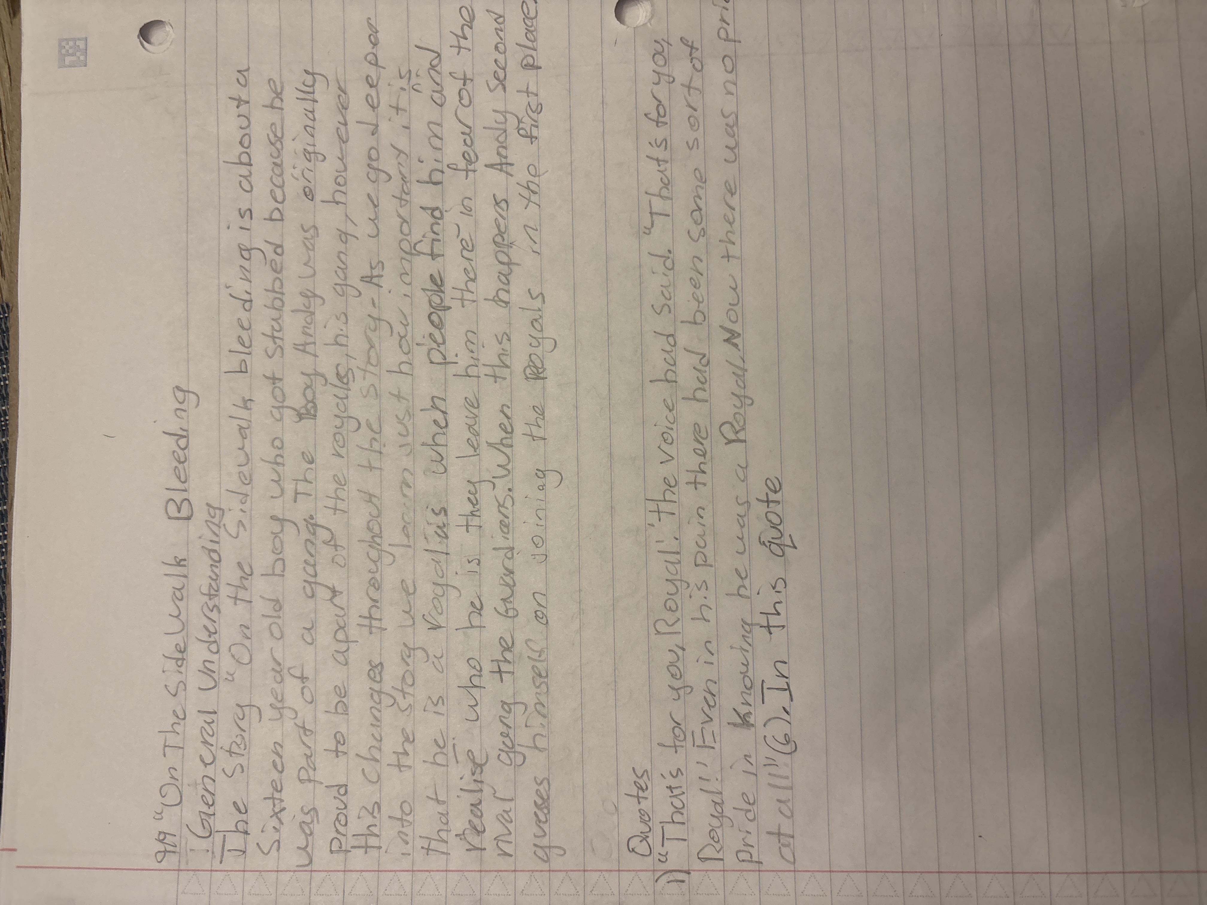
This handwriting displays a mix of clarity and expressiveness, hinting at a personality that balances structure with emotional depth, but could benefit from increased consistency.
The handwriting sample presents a somewhat upright and slightly variable slant, giving the impression of a writer who's trying to balance clarity with a bit of personal flair. Letter formations are generally rounded, such as the 'o's and 'a's, but there are also instances where the strokes become more angular, for example in the 'k's and the connecting strokes between letters. The writing is relatively legible, though some words are a bit crowded, indicating perhaps a rush to get thoughts down on paper. The pressure seems fairly consistent, suggesting a steady hand and mind, though the baseline wavers slightly, hinting at an underlying emotional expressiveness. The size of the letters is fairly uniform, though there is some inconsistency. Some words are larger than others.
Based on this handwriting, the writer seems to be someone who values structure and clarity but also isn't afraid to express themselves. The rounded letter forms suggest a friendly and approachable nature, while the occasional angularity and baseline variation indicate a streak of independence and emotional depth. They are likely to be fairly organized and conscientious, but with a tendency to sometimes let their emotions influence their actions or decisions. The relatively even pressure and rhythm suggest a person who is generally calm and composed, but with the capacity for passionate expression when the situation calls for it.
To improve the handwriting, try to focus on maintaining a more consistent baseline. Practice writing slowly and deliberately, paying attention to the spacing between letters and words. Experiment with different pen grips and writing angles to find a position that feels comfortable and allows for smoother, more fluid strokes. Paying attention to the uniformity of letter sizes could also improve overall legibility. Overall, the handwriting shows promise, and with a few tweaks, it could become even more clear and expressive.
Legibility
Expressiveness
Consistency
Overall
Leaderboard for Monday, 27 October 2025
| 1 | The Divine Calligrapher |
80
|
| 2 | The Humble Hand |
76
|
| 3 | The Cursive Narrator |
74
|
| 4 | The Analytical Mind |
74
|
| 5 | The Pristine Print |
71
|
| 6 | The Diligent Student |
71
|
| 7 | The Coastal Bard |
69
|
| 8 | The Optimistic Poet |
68
|
| 9 | Sunrise Musings |
68
|
| 10 | The Cursive Cartographer |
68
|
| 11 | The Cursive Narrator |
67
|
| 12 | The Diligent Note-Taker |
67
|
| 13 | The Coastal Dreamer |
67
|
| 14 | The River's Flow |
67
|
| 15 | The Coastal Chronicler |
67
|
| 16 | The Pragmatic Pen |
66
|
| 17 | The Studious Note-Taker |
66
|
| 18 | The Eloquent Pen |
66
|
| 19 | The Aesthetic Typist |
65
|
| 20 | The Scientific Hand |
65
|
| 21 | The Deliberate Draftsman |
65
|
| 22 | The Analytical Alchemist |
65
|
| 23 | The Dream Weaver |
65
|
| 24 | The Traditionalist's Script |
64
|
| 25 | The Agile Leaper |
64
|
| 26 | The Script of Devotion |
64
|
| 27 | The Studious Note-Taker |
63
|
| 28 | The Elegant Academic |
63
|
| 29 | The Typographer's Testament |
63
|
| 30 | Babylonian Beaches |
62
|