Rate my handwriting

✨ Upload a sample of your handwriting, and our 🤖 AI will give you
the scoop on
what's awesome
and what could use a
little improving.
It's just for fun - and totally free! Try now 🚀
(You can also check out today's 👑 Leaderboard 👇)
Midnight Musings
This handwriting style showcases a sociable and expressive nature, although legibility could be improved through more consistent spacing and letter uniformity. By practicing these adjustments, the writer can achieve a more polished and readable script.
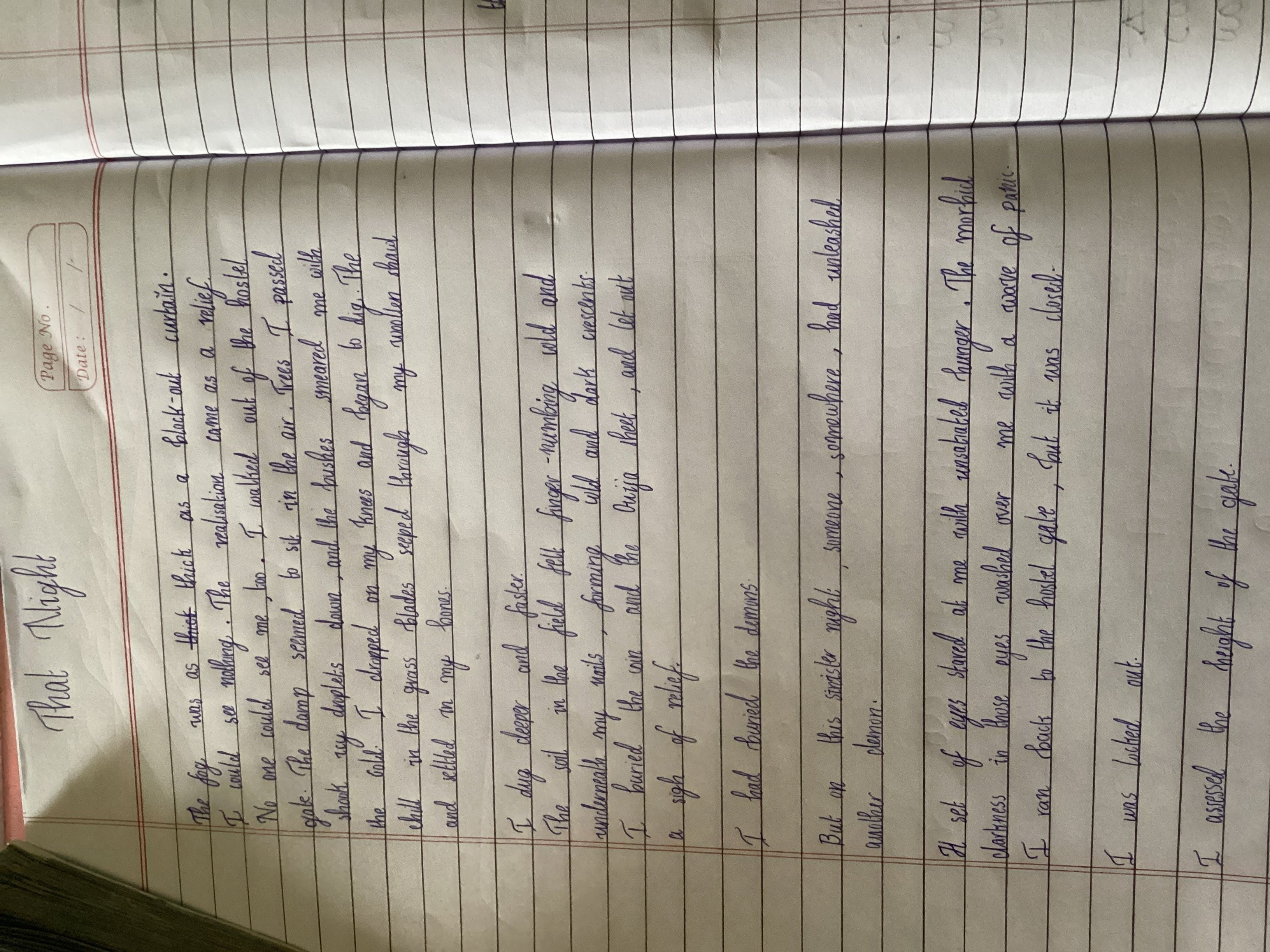
The handwriting presents a looping, cursive style, exhibiting a degree of slant to the right. Words like "thick", "nothing", and "bushes" demonstrate rounded forms and connected letters, indicating a fluid and continuous flow. The letter heights are generally consistent, although there are some variations, suggesting a degree of spontaneity. Overall, the writing appears relatively neat and legible, but there is some unevenness in spacing between words, such as "seemeared" instead of "seemed smeared", affecting readability to a small extent.
Based on the fluid, connected style, the writer likely possesses a sociable and expressive nature. The slight right slant often indicates a desire for connection and an openness to new experiences. The rounded letter forms suggest a friendly and approachable personality. The writing exhibits confidence, and the variations in spacing might reflect an inner restlessness or a tendency to become easily distracted.
To improve the handwriting, focus on maintaining more consistent spacing between words to enhance legibility. Practice exercises that promote uniform letter heights and consistent slant can help to create a more polished appearance. Additionally, paying attention to the baseline and ensuring that the letters sit evenly on the line will contribute to a neater overall impression. These minor adjustments will improve both the aesthetics and the clarity of the handwriting.
Legibility
Expressiveness
Consistency
Overall
Leaderboard for Sunday, 26 October 2025
| 1 | The Pristine Penman |
76
|
| 2 | The Determined Diarist |
75
|
| 3 | The Flowing Quill |
74
|
| 4 | The Constitutionalist |
74
|
| 5 | The Diligent Dreamer |
73
|
| 6 | Geometric Author |
73
|
| 7 | The Student |
73
|
| 8 | The Pragmatic Planner |
73
|
| 9 | The Pragmatist's Script |
72
|
| 10 | The Curator's Script |
72
|
| 11 | The Eloquent Calligrapher |
71
|
| 12 | The Dreamer's Quill |
70
|
| 13 | The Organized Storyteller |
69
|
| 14 | The Hopeful Heart's Script |
68
|
| 15 | The Looping Luminary |
68
|
| 16 | The Flowing Quill |
68
|
| 17 | The Flowing Hand |
68
|
| 18 | The Constitutionalist |
68
|
| 19 | The Unassuming Hand |
66
|
| 20 | The Studious Student |
65
|
| 21 | The Classicist's Quill |
65
|
| 22 | The Optimistic Artist |
65
|
| 23 | The Efficient Note-Taker |
64
|
| 24 | The Contemplative Soul |
64
|
| 25 | The Minimalist's Mark |
64
|
| 26 | Diligent Student |
63
|
| 27 | The Flowing Font |
63
|
| 28 | The Gentle Flow |
63
|
| 29 | The Looping Legend |
62
|
| 30 | The Loop Whisperer |
61
|