Rate my handwriting

✨ Upload a sample of your handwriting, and our 🤖 AI will give you
the scoop on
what's awesome
and what could use a
little improving.
It's just for fun - and totally free! Try now 🚀
(You can also check out today's 👑 Leaderboard 👇)
The Eager Storyteller
This handwriting suggests a warm and friendly personality combined with a systematic and thoughtful approach. Improving consistency in letter size and baseline adherence would enhance legibility and create a more polished impression.
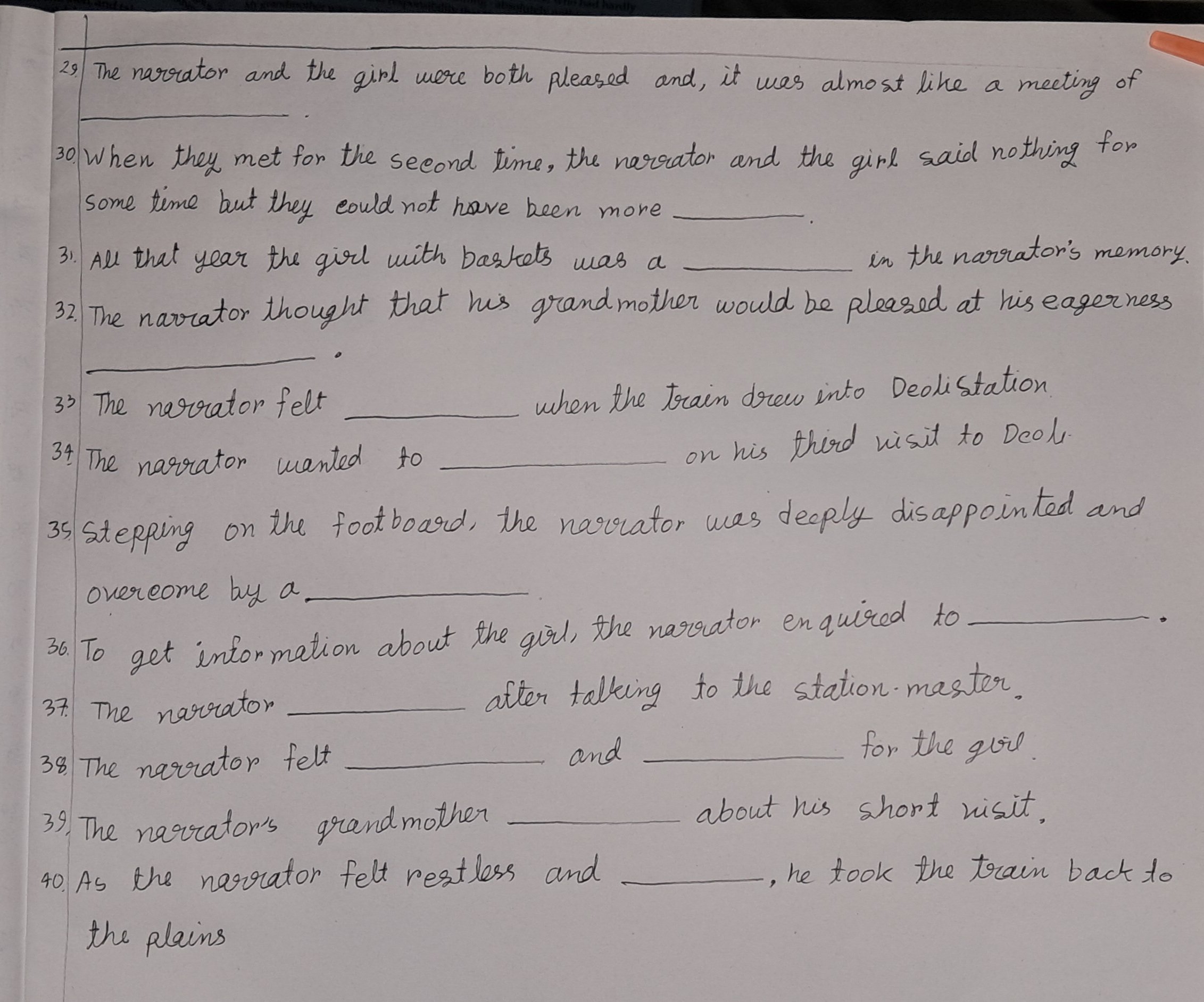
The handwriting in this sample is generally legible and consistent, with a moderate slant to the right. The rounded forms of letters like 'a', 'o', and 'd', as seen in words such as "narrator", "and", and "grandmother", suggest a friendly and approachable nature. The slightly irregular baseline and varying letter sizes, evident in phrases like "Stepping on the footboard", hint at a touch of impulsiveness and a tendency to get caught up in the moment. The writing maintains consistent spacing between words and lines which indicates a systematic and organised thought process. The writer also maintains uniform letter shapes, especially seen in the recurring word "narrator", which demonstrates discipline and clarity of thought.
This handwriting indicates a personality that is generally warm, friendly, and approachable. The slight irregularities suggest a person who is also spontaneous and expressive, perhaps with a good sense of humor. The organized and consistent aspects of the writing point to a person who is thoughtful and systematic in their approach to tasks. This is also indicative of a personality that values clear communication. The writing overall shows traits of being both creative and practical, balancing their emotional expression with a structured thought process. This person's slight right slant in their handwriting indicates a tendency towards forward-thinking and future oriented decision making.
While generally legible, the handwriting could benefit from slightly more consistent letter sizes and a stricter adherence to the baseline. This would improve its overall neatness and create a more polished impression. Paying attention to the height and width of letters, especially in longer words like "disappointed" and "information", could also enhance legibility. Focusing on maintaining consistent spacing between letters within words will further enhance the visual appeal and clarity of the writing. Practice forming letters with deliberate, controlled movements to create a more refined look.
Legibility
Expressiveness
Consistency
Overall
Leaderboard for Sunday, 26 October 2025
| 1 | The Constitutionalist |
74
|
| 2 | The Flowing Quill |
74
|
| 3 | The Curator's Script |
72
|
| 4 | The Eloquent Educator |
71
|
| 5 | The Student's Script |
70
|
| 6 | The Dreamer's Quill |
70
|
| 7 | The Constitutionalist |
68
|
| 8 | The Flowing Quill |
68
|
| 9 | The Hopeful Heart's Script |
68
|
| 10 | The Diligent Penman |
67
|
| 11 | The Agrarian Academic |
67
|
| 12 | The Unassuming Hand |
66
|
| 13 | The Studious Student |
65
|
| 14 | The Calculating Hand |
65
|
| 15 | The Diligent Note-Taker |
64
|
| 16 | The Mathematical Muse |
64
|
| 17 | The Contemplative Soul |
64
|
| 18 | The Flowing Font |
63
|
| 19 | The Gentle Flow |
63
|
| 20 | The Looping Legend |
62
|
| 21 | The Contemplative Calligrapher |
60
|
| 22 | The Signature Stylist |
59
|
| 23 | The Democratic Dreamer |
59
|
| 24 | The Devout Note-Taker |
58
|
| 25 | The Cipher's Quill |
57
|
| 26 | The Atom Alchemist |
57
|
| 27 | The Scientific Mind |
56
|
| 28 | The Loop-de-Loop Legend |
56
|
| 29 | The Orderly Typewriter |
56
|
| 30 | The Forward Leaning Letterer |
54
|