Rate my handwriting

✨ Upload a sample of your handwriting, and our 🤖 AI will give you
the scoop on
what's awesome
and what could use a
little improving.
It's just for fun - and totally free! Try now 🚀
(You can also check out today's 👑 Leaderboard 👇)
The Earnest Correspondent
This handwriting suggests a direct and earnest personality combined with a touch of impatience and fluctuating attention to detail. Improved consistency and spacing would enhance its aesthetic appeal and legibility.
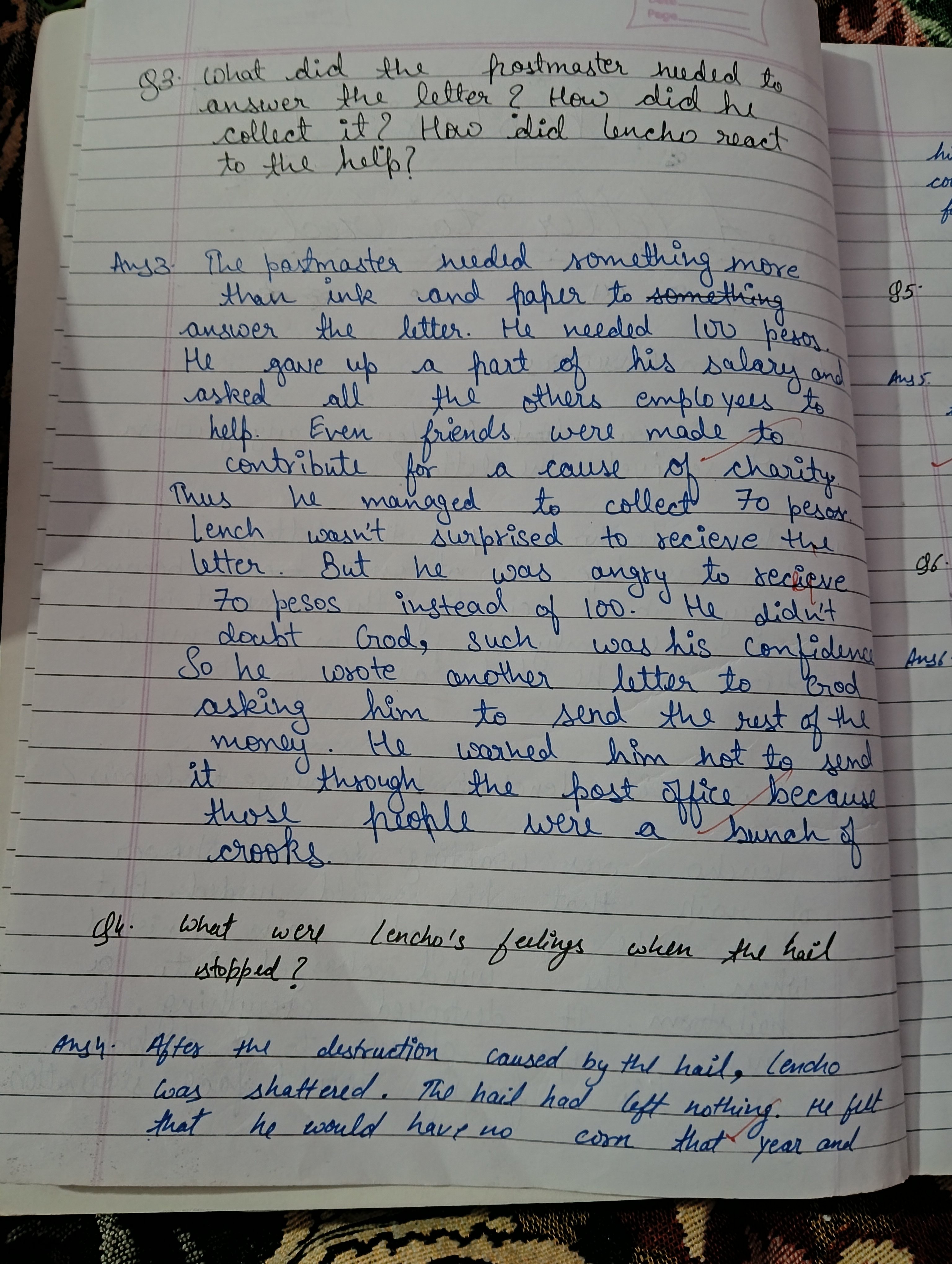
This handwriting presents a mixed bag, aesthetically speaking. The varying slants of letters, like the tilted "h" in "hail" and the upright "t" in "that", suggest an underlying restlessness. Meanwhile, the rounded forms of letters like "o" in "corn" and "a" in "and" hint at a friendly, approachable nature. The inconsistent spacing between words, such as in the phrase "He didn't doubt God", indicates fluctuating levels of attention to detail. While generally legible, the occasional crowding of words, like "a bunch of crooks", can create momentary pauses for the reader.
The writer's personality, as revealed through their script, appears to be a blend of earnestness and impatience. The clear, generally upright strokes in words like "needed" and "collect" speak to a direct and frank nature, while the occasional hurried loops, as seen in the 'l' of "Lencho", betray a desire for swift resolution. The overall impression is one of someone who values communication but may sometimes prioritize speed over precision. This individual likely possesses a strong sense of conviction, as evidenced by the confident strokes and assertive punctuation.
To enhance legibility and overall aesthetic appeal, focusing on consistent slant and spacing would be beneficial. Practicing letter formations, particularly those with loops and curves, could improve uniformity. Additionally, paying closer attention to the baseline and ensuring letters rest upon it consistently would create a more grounded and visually pleasing effect. Finally, slowing down the writing process, even slightly, would likely result in neater and more controlled letterforms.
Legibility
Expressiveness
Consistency
Overall
Leaderboard for Thursday, 30 October 2025
| 1 | The Economist's Italic Hand |
74
|
| 2 | The Poet's Quill |
71
|
| 3 | The Flourishing Font |
69
|
| 4 | The Scientific Hand |
68
|
| 5 | The Upright Student |
67
|
| 6 | The Digital Diarist |
67
|
| 7 | The Logical Chemist |
66
|
| 8 | The Prudent Pen |
66
|
| 9 | The Literary Cartographer |
65
|
| 10 | The Pragmatic Planner |
65
|
| 11 | The Agile Quill |
65
|
| 12 | The Pensive Student |
65
|
| 13 | The Bio Notes |
64
|
| 14 | The Studious Scholar |
63
|
| 15 | The Meticulous Planner |
63
|
| 16 | The Civic Philosopher |
63
|
| 17 | The Flowing Script |
63
|
| 18 | The Calligrapher's Chronicle |
62
|
| 19 | Le Gribouillage Scientifique |
62
|
| 20 | The Deliberate Democrat |
62
|
| 21 | The Elusive Poet |
62
|
| 22 | Algorithmic Alchemist |
61
|
| 23 | The Cellular Biologist |
61
|
| 24 | Le Calligraphe Studieux |
61
|
| 25 | The Atomic Pen |
60
|
| 26 | The Spirited Student |
60
|
| 27 | The Fluent Intellectual |
60
|
| 28 | The Global Trotter |
59
|
| 29 | The Forthright Fount |
59
|
| 30 | The Determined Hand |
58
|