Rate my handwriting

✨ Upload a sample of your handwriting, and our 🤖 AI will give you
the scoop on
what's awesome
and what could use a
little improving.
It's just for fun - and totally free! Try now 🚀
(You can also check out today's 👑 Leaderboard 👇)

The Mathematical Minstrel
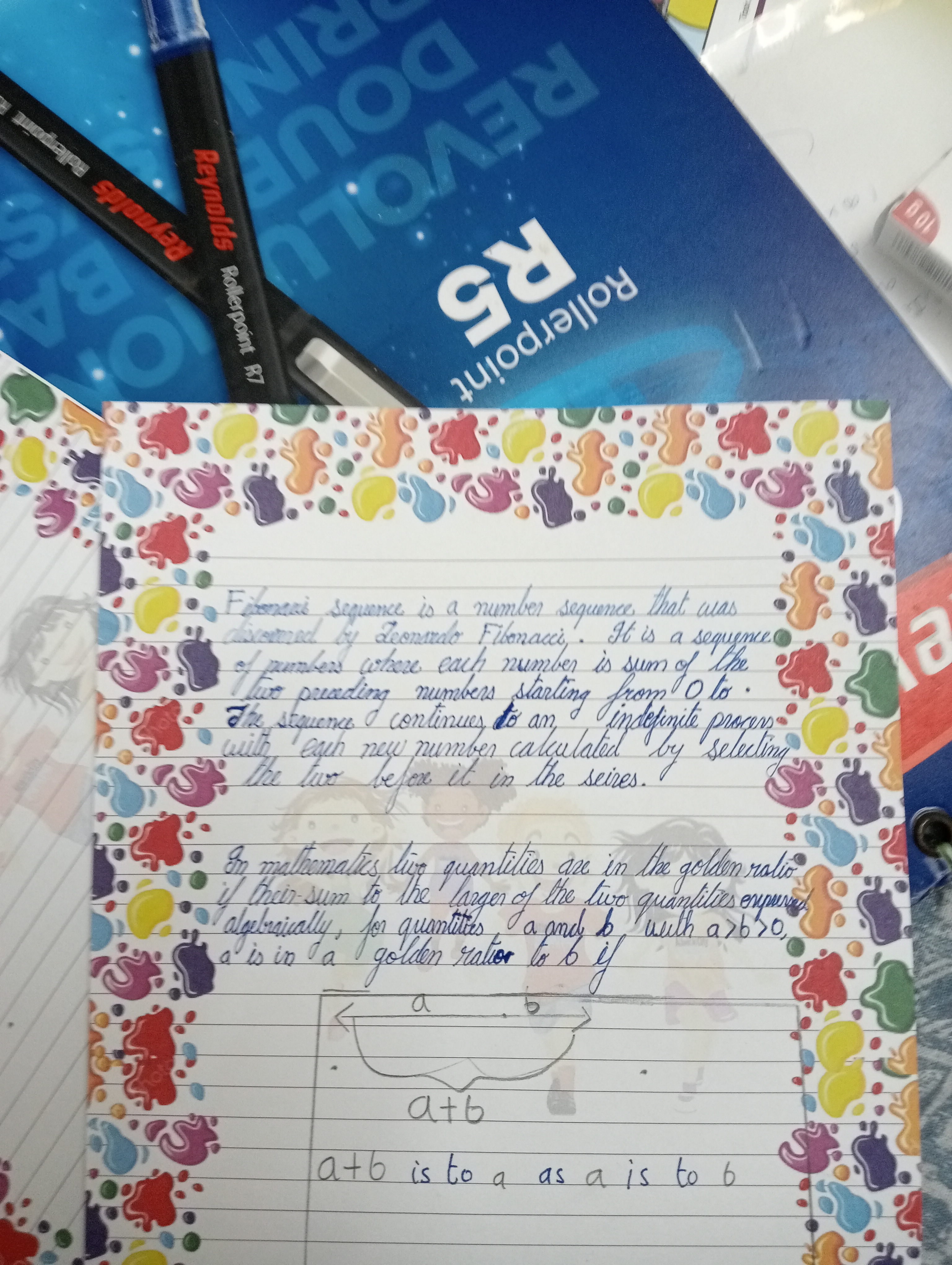
This neat and consistent handwriting reflects a logical and methodical mind with an appreciation for balance and order. Enhancing word spacing and differentiating similar letterforms will further improve legibility.
This sample showcases a neat and generally consistent cursive script. The baseline is steady, reflecting a calm and methodical nature, perfectly illustrated by the neatly structured content. Notice the controlled formation of round letters like "a," "o," and "d" alongside more angular forms like "t," "i," and "n" which hint at a balanced approach to expression and control. There's a distinct rhythm in the flow of words, demonstrated in phrases such as "an indefinite process" and "two preceding numbers," where letters connect seamlessly.
This handwriting suggests a personality that values clarity and precision. The writer likely possesses a structured, logical mind, evidenced by the subject matter. The even spacing between letters indicates an inclination for balance and order, and the consistent slant of the letters may imply dependability and an empathetic nature. The occasional flourish, like in the initial 'F' of Fibonacci, suggests a desire for self-expression.
To further enhance legibility, concentrate on maintaining consistent spacing between words. The 'n' and 'u' sometimes resemble each other, which could be improved by ensuring a distinct upstroke for 'u.' While the overall appearance is neat, focusing on maintaining a consistent letter size, particularly for 's,' will refine the presentation and give a more polished look.
Legibility
Expressiveness
Consistency
Overall
Leaderboard for Sunday, 26 October 2025
| 1 | The Pristine Penman |
76
|
| 2 | The Determined Diarist |
75
|
| 3 | The Flowing Quill |
74
|
| 4 | The Constitutionalist |
74
|
| 5 | The Diligent Dreamer |
73
|
| 6 | Geometric Author |
73
|
| 7 | The Student |
73
|
| 8 | The Pragmatic Planner |
73
|
| 9 | The Pragmatist's Script |
72
|
| 10 | The Curator's Script |
72
|
| 11 | The Eloquent Calligrapher |
71
|
| 12 | The Dreamer's Quill |
70
|
| 13 | The Organized Storyteller |
69
|
| 14 | The Hopeful Heart's Script |
68
|
| 15 | The Looping Luminary |
68
|
| 16 | The Flowing Quill |
68
|
| 17 | The Flowing Hand |
68
|
| 18 | The Constitutionalist |
68
|
| 19 | The Unassuming Hand |
66
|
| 20 | The Studious Student |
65
|
| 21 | The Classicist's Quill |
65
|
| 22 | The Optimistic Artist |
65
|
| 23 | The Efficient Note-Taker |
64
|
| 24 | The Contemplative Soul |
64
|
| 25 | The Minimalist's Mark |
64
|
| 26 | Diligent Student |
63
|
| 27 | The Flowing Font |
63
|
| 28 | The Gentle Flow |
63
|
| 29 | The Looping Legend |
62
|
| 30 | The Loop Whisperer |
61
|