Rate my handwriting

✨ Upload a sample of your handwriting, and our 🤖 AI will give you
the scoop on
what's awesome
and what could use a
little improving.
It's just for fun - and totally free! Try now 🚀
(You can also check out today's 👑 Leaderboard 👇)
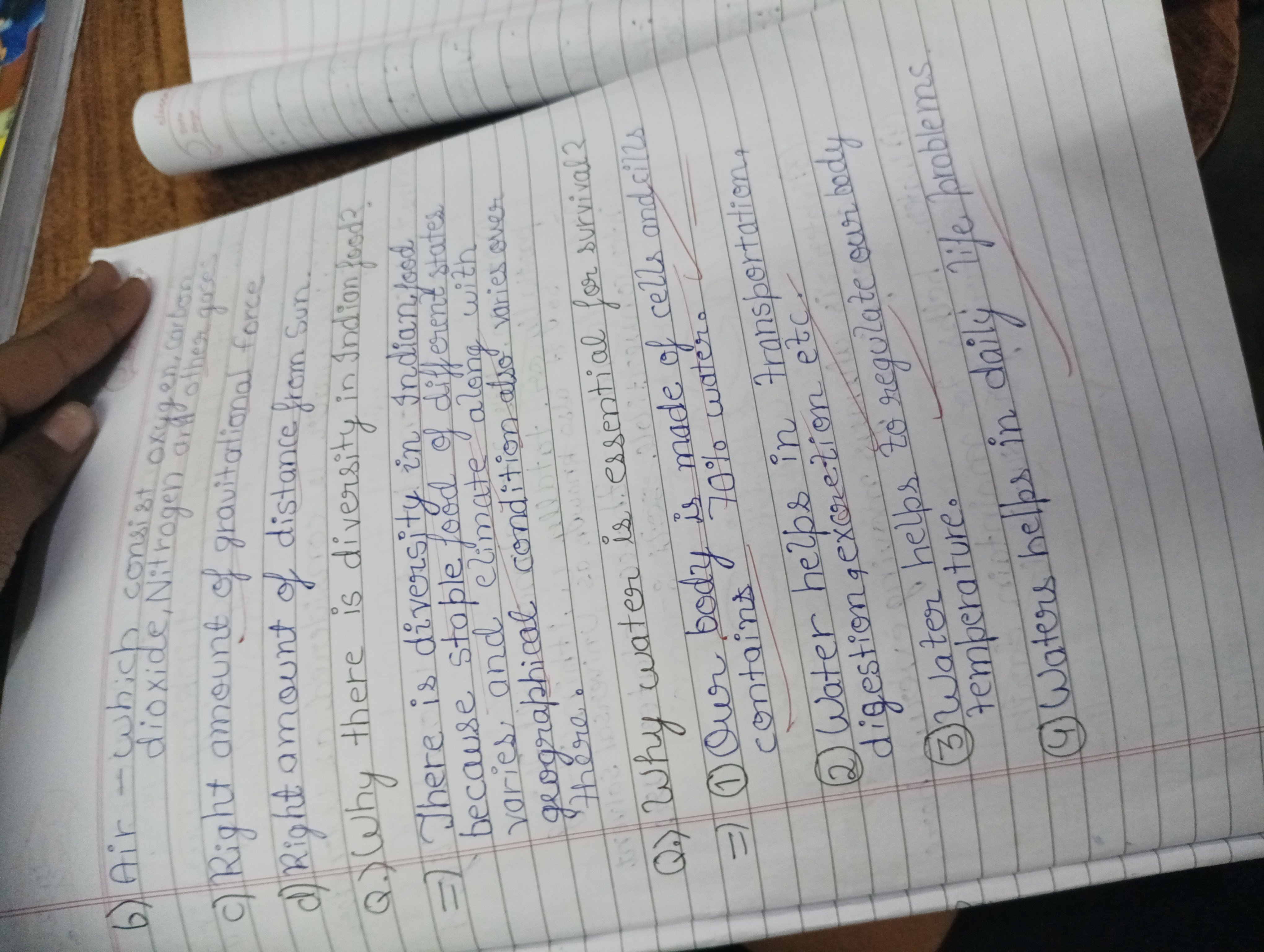
The Methodical Muncher
This neat and consistent handwriting suggests a methodical and organized individual who values clarity and precision. A few minor improvements could further enhance legibility and expressiveness.
This handwriting sample presents a tidy and consistent appearance. The letters are generally well-formed, upright, and evenly spaced, as seen in the words "gravitational force" and "geographical condition". The baseline is relatively straight, indicating a focus on order and structure. While the writing is generally legible, some letters, like the 'a' and 'n', tend to resemble each other, occasionally affecting clarity, as in the phrase "Indian food". The slant is mostly vertical, but a few letters lean slightly to the right, suggesting a balanced approach between logic and emotion.
The consistency and neatness of this handwriting suggest a methodical and organized individual. The writer likely values clarity and precision in their communication and tasks. The generally upright slant indicates a certain level of emotional control and objectivity. However, the occasional rightward slant hints at a willingness to connect with others on a personal level. The slightly simplified letter formations might point to a preference for efficiency and practicality. Overall, this handwriting paints a picture of someone who is reliable, detail-oriented, and balanced.
While this handwriting is generally legible and neat, a few tweaks could enhance its clarity and aesthetic appeal. Paying closer attention to differentiating between similar letters, such as 'a' and 'n', could significantly improve readability. Additionally, exploring different pen grips or practicing consistent letter formations could add more fluidity and expressiveness to the writing. Finally, experimenting with a slightly larger letter size and more spacing between words could make the text appear less dense and more inviting to the reader.
Legibility
Expressiveness
Consistency
Overall
Leaderboard for Sunday, 26 October 2025
| 1 | The Constitutionalist |
74
|
| 2 | The Flowing Quill |
74
|
| 3 | The Curator's Script |
72
|
| 4 | The Eloquent Educator |
71
|
| 5 | The Student's Script |
70
|
| 6 | The Dreamer's Quill |
70
|
| 7 | The Constitutionalist |
68
|
| 8 | The Flowing Quill |
68
|
| 9 | The Hopeful Heart's Script |
68
|
| 10 | The Diligent Penman |
67
|
| 11 | The Agrarian Academic |
67
|
| 12 | The Unassuming Hand |
66
|
| 13 | The Studious Student |
65
|
| 14 | The Calculating Hand |
65
|
| 15 | The Diligent Note-Taker |
64
|
| 16 | The Mathematical Muse |
64
|
| 17 | The Contemplative Soul |
64
|
| 18 | The Flowing Font |
63
|
| 19 | The Gentle Flow |
63
|
| 20 | The Looping Legend |
62
|
| 21 | The Contemplative Calligrapher |
60
|
| 22 | The Signature Stylist |
59
|
| 23 | The Democratic Dreamer |
59
|
| 24 | The Devout Note-Taker |
58
|
| 25 | The Cipher's Quill |
57
|
| 26 | The Atom Alchemist |
57
|
| 27 | The Scientific Mind |
56
|
| 28 | The Loop-de-Loop Legend |
56
|
| 29 | The Orderly Typewriter |
56
|
| 30 | The Forward Leaning Letterer |
54
|