Rate my handwriting

✨ Upload a sample of your handwriting, and our 🤖 AI will give you
the scoop on
what's awesome
and what could use a
little improving.
It's just for fun - and totally free! Try now 🚀
(You can also check out today's 👑 Leaderboard 👇)
The Collegiate Chronologer
This whiteboard handwriting indicates a structured and efficient approach to information processing, prioritizing clarity and organization. By incorporating subtle variations and flourishes, the writer could enhance the visual flow and personal touch of their writing.
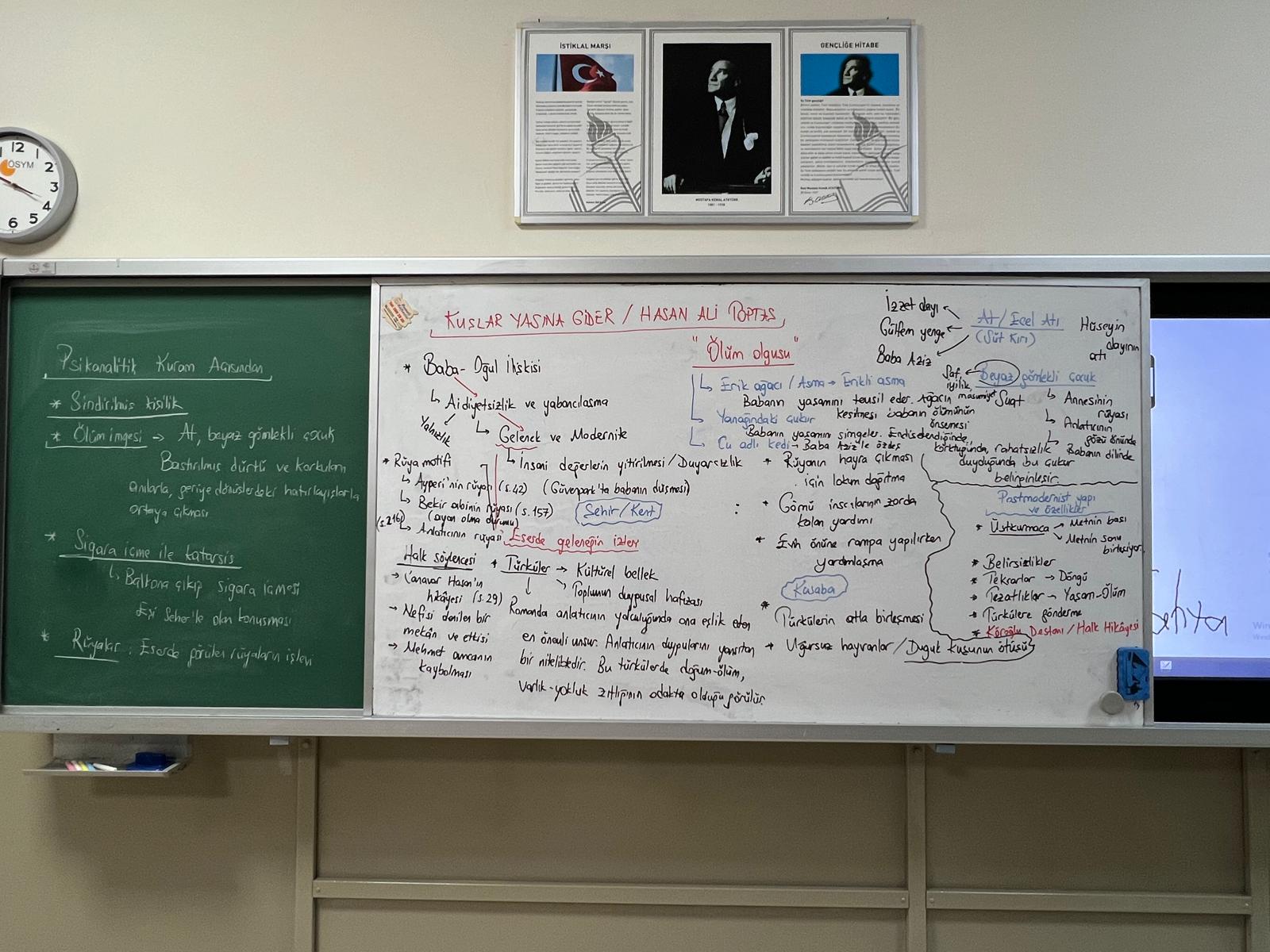
This handwriting sample, taken from a whiteboard, exhibits the traits of a practical and organized mind. The text is structured with bullet points and numbered lists, indicating a systematic approach to note-taking. The lettering is fairly consistent in size and slant, as seen in phrases like "Baba-Oğul İlişkisi" and "Ölüm olgusu". While not overly decorative, the writing is legible and functional, prioritizing clarity over aesthetics. The occasional variations in letterforms and spacing, as in the numbered list under "Ölüm olgusu", hint at a degree of adaptability and flexibility.
The writer likely values efficiency and directness. The neatness and orderliness of the notes suggest a methodical and detail-oriented personality. The use of abbreviations and symbols implies a focus on capturing key information quickly, perhaps during a lecture or discussion. The even spacing between lines and sections, particularly noticeable in the numbered list on the right, speaks to a sense of balance and control. The simplicity of the lettering further suggests a pragmatic and results-driven nature.
To enhance the visual appeal and flow of your writing, consider incorporating some slight variations in letter size and slant. Experiment with connecting letters within words more fluidly to create a more cursive and less disjointed appearance. While maintaining the overall neatness, adding small embellishments or flourishes to certain letters could add a touch of personality and visual interest without sacrificing legibility. For example, the "K" in "Kuşlar Yasına Gider" could be stylized for a more distinctive look.
Legibility
Expressiveness
Consistency
Overall
Leaderboard for Monday, 27 October 2025
| 1 | The Divine Calligrapher |
80
|
| 2 | The Humble Hand |
76
|
| 3 | The Cursive Narrator |
74
|
| 4 | The Analytical Mind |
74
|
| 5 | The Pristine Print |
71
|
| 6 | The Diligent Student |
71
|
| 7 | The Coastal Bard |
69
|
| 8 | The Optimistic Poet |
68
|
| 9 | Sunrise Musings |
68
|
| 10 | The Cursive Cartographer |
68
|
| 11 | The Cursive Narrator |
67
|
| 12 | The Diligent Note-Taker |
67
|
| 13 | The Coastal Dreamer |
67
|
| 14 | The River's Flow |
67
|
| 15 | The Coastal Chronicler |
67
|
| 16 | The Pragmatic Pen |
66
|
| 17 | The Studious Note-Taker |
66
|
| 18 | The Eloquent Pen |
66
|
| 19 | The Aesthetic Typist |
65
|
| 20 | The Scientific Hand |
65
|
| 21 | The Deliberate Draftsman |
65
|
| 22 | The Analytical Alchemist |
65
|
| 23 | The Dream Weaver |
65
|
| 24 | The Traditionalist's Script |
64
|
| 25 | The Agile Leaper |
64
|
| 26 | The Script of Devotion |
64
|
| 27 | The Studious Note-Taker |
63
|
| 28 | The Elegant Academic |
63
|
| 29 | The Typographer's Testament |
63
|
| 30 | Babylonian Beaches |
62
|