Rate my handwriting

✨ Upload a sample of your handwriting, and our 🤖 AI will give you
the scoop on
what's awesome
and what could use a
little improving.
It's just for fun - and totally free! Try now 🚀
(You can also check out today's 👑 Leaderboard 👇)
The Cartographer
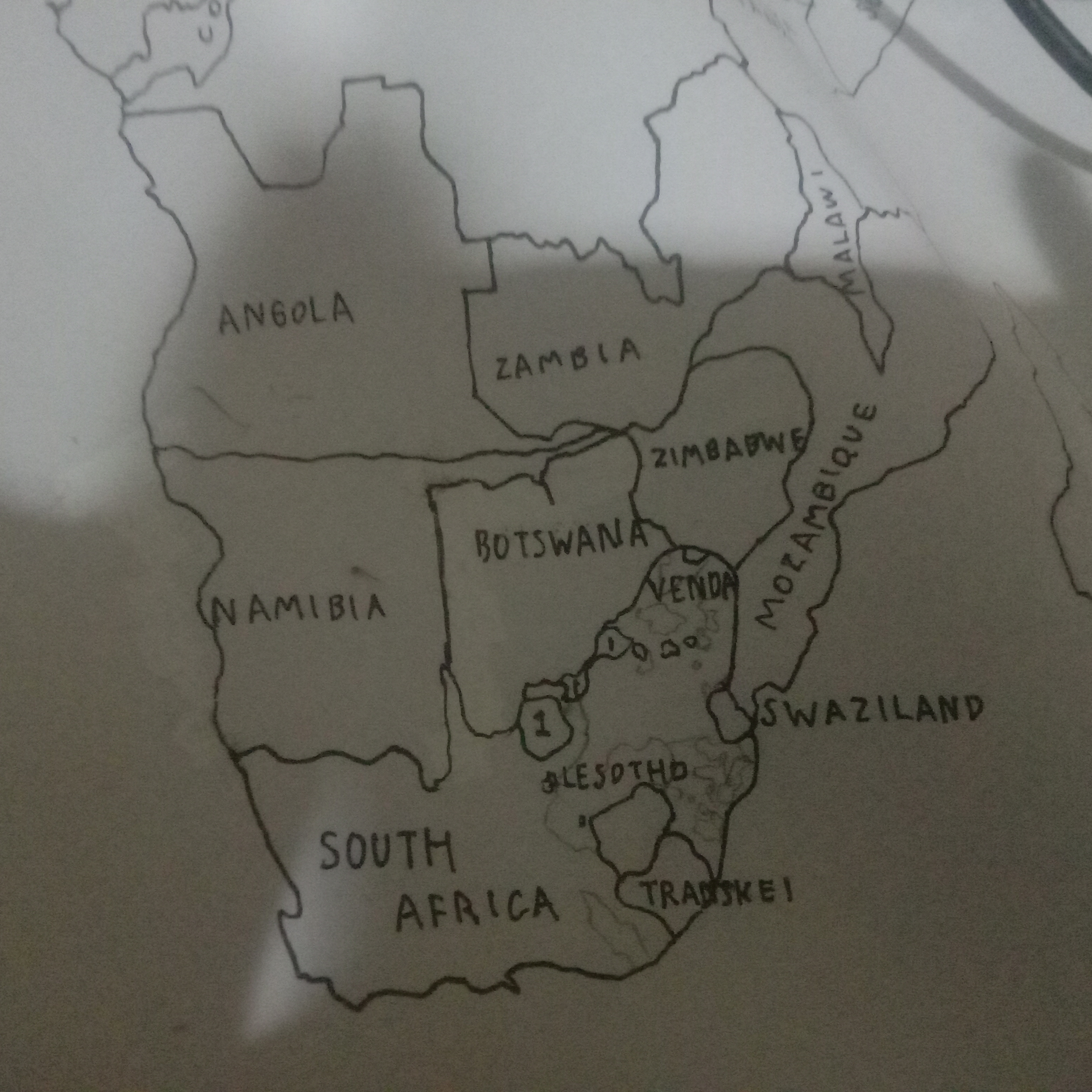
This mapmaker's hand is legible and precise, with room for greater consistency and expressiveness in the letterforms.
The handwriting in this sample is printed, which is fairly typical for map labels. The letterforms are generally consistent in size and shape, with slight variations, for example in the capital letters "S" of "SOUTH", "SWAZILAND" and "SOUTH AFRICA". There is an unusual joining stroke between the "T" and "H" of "SOUTH".
This handwriting indicates someone who values clarity and order. Printing letters rather than adopting cursive or joined-up writing implies a focus on legibility and precision, which may be especially important in a cartographic context. The relatively consistent size and spacing between letters and words suggest someone organised and methodical. However, the map is not drawn perfectly consistently: some countries are drawn with very simplified outlines, such as Angola, while others are drawn with more detail, such as the inward curve of Mozambique's western border, and the Caprivi Strip of Namibia. This might indicate an interest in particular areas, or some variation in their patience.
To improve, this hand could work on making the lettering more consistent. The roundness of the letter "O" is sometimes a full circle and sometimes an oval, while the letter "A" is sometimes wide, and sometimes quite narrow. Consistent size, spacing, and shape can improve legibility. There's not much scope to be more expressive or flamboyant when labelling a map. However, considering different font styles, especially italic, might make the writing more visually appealing. Alternatively, perhaps more of the borders could be drawn as perfectly straight lines, which might add a bit of elegance.
Legibility
Expressiveness
Consistency
Overall
Leaderboard for Thursday, 30 October 2025
| 1 | The Economist's Italic Hand |
74
|
| 2 | The Poet's Quill |
71
|
| 3 | The Flourishing Font |
69
|
| 4 | The Scientific Hand |
68
|
| 5 | The Digital Diarist |
67
|
| 6 | The Upright Student |
67
|
| 7 | The Logical Chemist |
66
|
| 8 | The Prudent Pen |
66
|
| 9 | The Agile Quill |
65
|
| 10 | The Pensive Student |
65
|
| 11 | The Literary Cartographer |
65
|
| 12 | The Pragmatic Planner |
65
|
| 13 | The Bio Notes |
64
|
| 14 | The Civic Philosopher |
63
|
| 15 | The Studious Scholar |
63
|
| 16 | The Meticulous Planner |
63
|
| 17 | The Calligrapher's Chronicle |
62
|
| 18 | The Elusive Poet |
62
|
| 19 | Le Gribouillage Scientifique |
62
|
| 20 | The Deliberate Democrat |
62
|
| 21 | The Cellular Biologist |
61
|
| 22 | Algorithmic Alchemist |
61
|
| 23 | Le Calligraphe Studieux |
61
|
| 24 | The Spirited Student |
60
|
| 25 | The Atomic Pen |
60
|
| 26 | The Fluent Intellectual |
60
|
| 27 | The Global Trotter |
59
|
| 28 | The Forthright Fount |
59
|
| 29 | The Determined Hand |
58
|
| 30 | The Energetic Student |
58
|