Rate my handwriting

✨ Upload a sample of your handwriting, and our 🤖 AI will give you
the scoop on
what's awesome
and what could use a
little improving.
It's just for fun - and totally free! Try now 🚀
(You can also check out today's 👑 Leaderboard 👇)
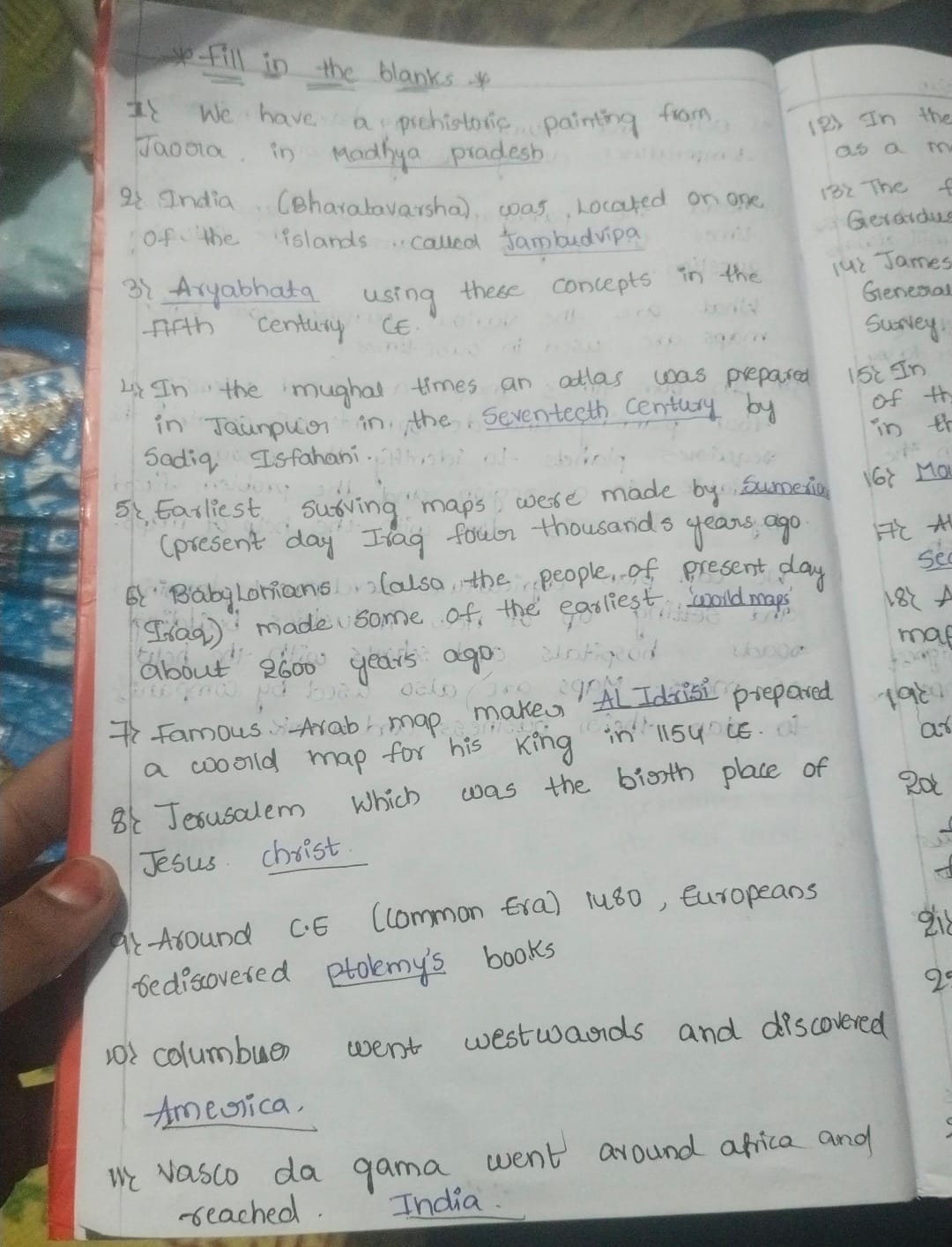
The Cartographer's Quill
This handwriting exhibits a blend of neatness and slight inconsistencies, suggesting an organized yet creative personality. Refinements in letter consistency and spacing would enhance its overall appearance.
The handwriting style is characterized by a generally neat and legible script, though with some inconsistencies. The letter formation is mostly uniform, but there are slight variations in size and spacing, particularly noticeable between words. The slant is generally consistent, leaning slightly to the right. Some letters, such as the 'y' in "Aryabhata" and the 'g' in "painting", have distinctive loops. Overall, the writing is quite controlled, but with a few flourishes that add a touch of personality.
This handwriting suggests a personality that is organized and methodical, but with a creative streak. The legibility indicates a desire to communicate clearly and be understood, while the slight inconsistencies suggest a mind that is not afraid to deviate from the norm. The individual likely possesses a thoughtful and deliberate nature, approaching tasks with care and attention to detail. They may also have a subtle sense of humor and a tendency to add personal touches to their work.
To improve the handwriting, focus on maintaining consistent letter sizing and spacing. Practicing letter drills to refine the formation of specific letters, such as 'g' and 'y', could also be beneficial. Additionally, experimenting with different pen grips and writing angles may help to find a more comfortable and consistent writing style. Pay particular attention to consistency in slant and pressure for a more polished appearance.
Legibility
Expressiveness
Consistency
Overall
Leaderboard for Wednesday, 29 October 2025
| 1 | The Calligrapher |
77
|
| 2 | The Economist's Italic Hand |
74
|
| 3 | The Flowing Stream |
74
|
| 4 | The Energetic List-Maker |
71
|
| 5 | The Elegant Scholar |
71
|
| 6 | The Poet's Quill |
71
|
| 7 | The Flourishing Font |
69
|
| 8 | The Scientific Hand |
68
|
| 9 | The Mario Manifesto |
68
|
| 10 | The Upright Student |
67
|
| 11 | The Elegant Calligrapher |
66
|
| 12 | The Logical Chemist |
66
|
| 13 | The Prudent Pen |
66
|
| 14 | The Literary Cartographer |
65
|
| 15 | The Pragmatic Planner |
65
|
| 16 | The Grid Writer |
65
|
| 17 | The Flowing Quill |
64
|
| 18 | The Bio Notes |
64
|
| 19 | The Typist's Tale |
63
|
| 20 | The Flourishing Enigma |
63
|
| 21 | The Civic Philosopher |
63
|
| 22 | The Meticulous Planner |
63
|
| 23 | Le Gribouillage Scientifique |
62
|
| 24 | The Calligrapher's Chronicle |
62
|
| 25 | Algorithmic Alchemist |
61
|
| 26 | The Cellular Biologist |
61
|
| 27 | Le Calligraphe Studieux |
61
|
| 28 | The Meticulous Dreamer |
61
|
| 29 | The Pragmatic Pen |
61
|
| 30 | The Artisan's Flourish |
60
|