Rate my handwriting

✨ Upload a sample of your handwriting, and our 🤖 AI will give you
the scoop on
what's awesome
and what could use a
little improving.
It's just for fun - and totally free! Try now 🚀
(You can also check out today's 👑 Leaderboard 👇)
The Pragmatic Penman
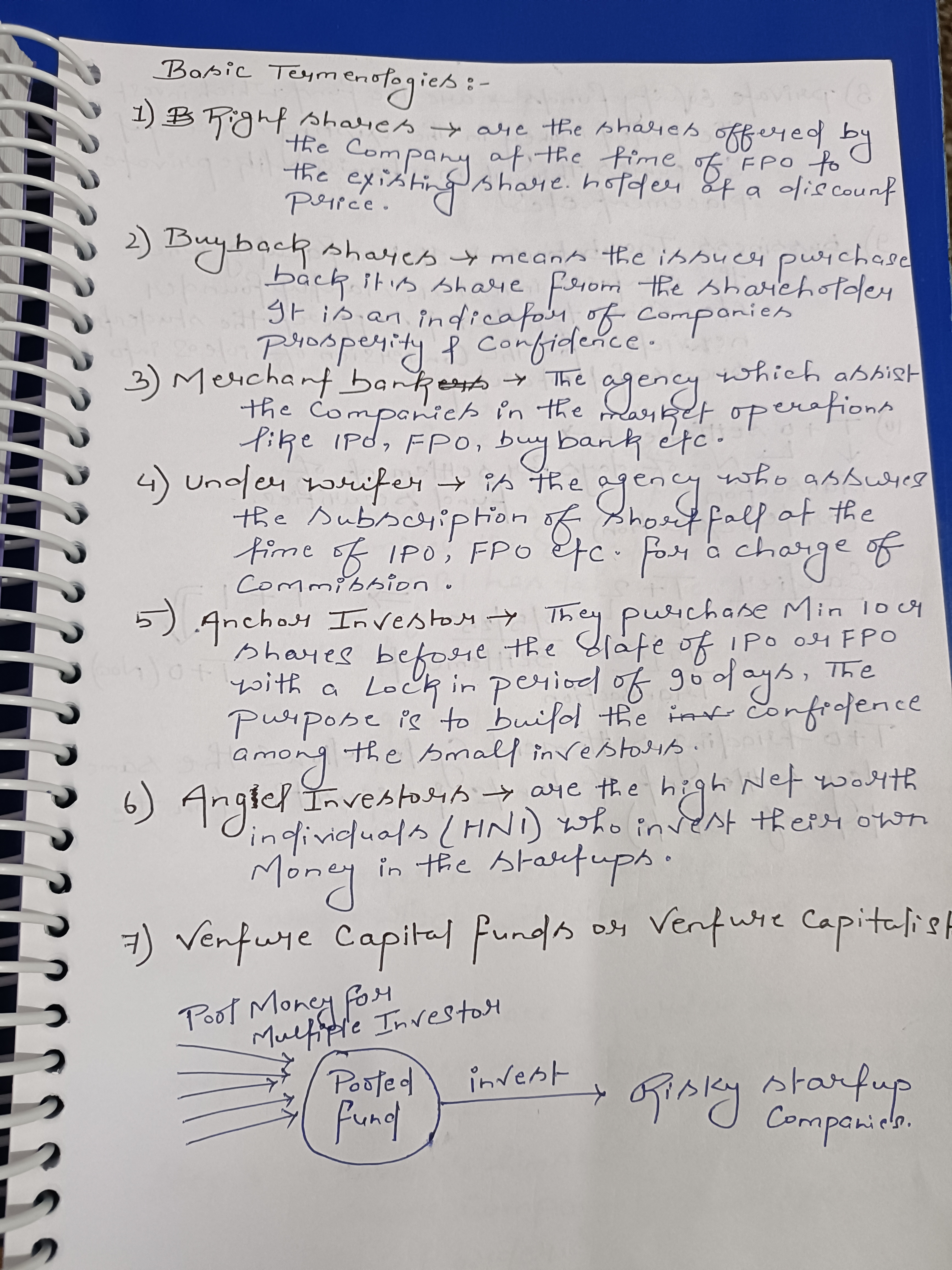
A practical and legible hand betraying a hint of impatience, with room for improvement in consistency and spacing.
This handwriting sample is primarily functional, consistent, and generally legible. The lettering is fairly uniform in size and spacing, as seen in the repeated use of the phrase "of the".
This style suggests a pragmatic and efficient personality, likely focused on conveying information clearly rather than artistic expression. The slight right slant may indicate a proactive nature. There's a hint of impatience shown by the inconsistent letter formations such as in "prosperity" and "confidence". The focus on the task overrides any great attention to detail.
While generally legible, certain areas could benefit from improvement. The 'g' in 'charge' has an unusual curl and some words, like "confidence", are squeezed, hindering clarity. Practicing consistent letter formation and ensuring adequate spacing between words would enhance legibility. Try experimenting with different pen grips for more control.
Legibility
Expressiveness
Consistency
Overall
Leaderboard for Thursday, 30 October 2025
| 1 | The Economist's Italic Hand |
74
|
| 2 | The Poet's Quill |
71
|
| 3 | The Flourishing Font |
69
|
| 4 | The Scientific Hand |
68
|
| 5 | The Upright Student |
67
|
| 6 | The Digital Diarist |
67
|
| 7 | The Logical Chemist |
66
|
| 8 | The Prudent Pen |
66
|
| 9 | The Pensive Student |
65
|
| 10 | The Literary Cartographer |
65
|
| 11 | The Agile Quill |
65
|
| 12 | The Pragmatic Planner |
65
|
| 13 | The Bio Notes |
64
|
| 14 | The Civic Philosopher |
63
|
| 15 | The Studious Scholar |
63
|
| 16 | The Meticulous Planner |
63
|
| 17 | The Elusive Poet |
62
|
| 18 | The Calligrapher's Chronicle |
62
|
| 19 | Le Gribouillage Scientifique |
62
|
| 20 | The Deliberate Democrat |
62
|
| 21 | Le Calligraphe Studieux |
61
|
| 22 | Algorithmic Alchemist |
61
|
| 23 | The Cellular Biologist |
61
|
| 24 | The Atomic Pen |
60
|
| 25 | The Spirited Student |
60
|
| 26 | The Fluent Intellectual |
60
|
| 27 | The Global Trotter |
59
|
| 28 | The Forthright Fount |
59
|
| 29 | The Determined Hand |
58
|
| 30 | The Energetic Note-Taker |
58
|