Rate my handwriting

✨ Upload a sample of your handwriting, and our 🤖 AI will give you
the scoop on
what's awesome
and what could use a
little improving.
It's just for fun - and totally free! Try now 🚀
(You can also check out today's 👑 Leaderboard 👇)
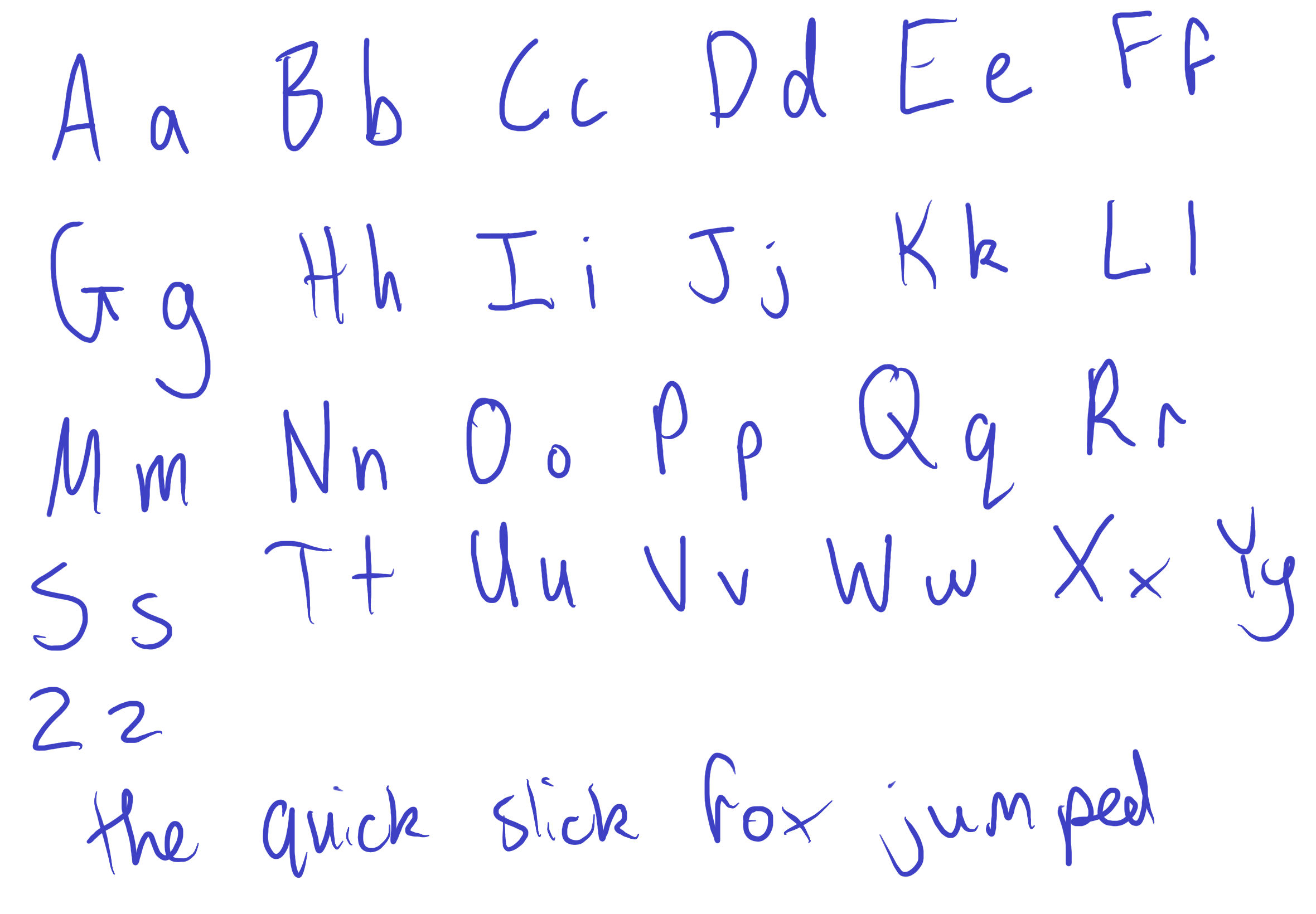
The Quick Fox
This sample reveals an adaptable and versatile individual who values both tradition and efficiency.
This handwriting sample presents a mixed bag of characteristics, some indicating practiced neatness, others hinting at hurriedness. The uppercase letters, like the "F" and "L", are generally well-formed and consistent in height, while the lowercase counterparts, like the "f" and "l", appear rushed, with some appearing significantly shorter than others. The looped ascenders in letters such as "h" and "k" suggest an individual comfortable with cursive, while the occasional disconnect between letters within a word, such as in "quick", indicate a preference for print. The sentence, "The quick slick fox jumped," offers further insight into the writer's habits, demonstrating their generally good spacing between words but inconsistency in letter size and connection.
This mixed style suggests someone adaptable and versatile. The comfortable loops imply a fondness for tradition and elegance, yet the disconnects and varying sizes indicate an ability to adjust to circumstances and prioritize speed when necessary. This writer may be both efficient and creative, balancing the desire for perfection with the practicality of getting things done. They may be imaginative, hinted at by the fluidity of certain letters, yet also grounded in practicality, evidenced by the occasional print-like simplicity.
To improve the legibility and consistency of this handwriting, the writer could focus on connecting the letters within words more consistently. Maintaining a more uniform size for both uppercase and lowercase letters would further enhance readability. Paying attention to the height of letters like "l" and "f" will help maintain a balanced appearance. Practice connecting letters with consistent strokes will further enhance the flow and neatness of the writing.
Legibility
Expressiveness
Consistency
Overall
Leaderboard for Tuesday, 28 October 2025
| 1 | The Divine Calligrapher |
80
|
| 2 | The Humble Hand |
76
|
| 3 | The Cursive Narrator |
74
|
| 4 | The Analytical Mind |
74
|
| 5 | The Pristine Print |
71
|
| 6 | The Diligent Student |
71
|
| 7 | The Coastal Bard |
69
|
| 8 | The Cursive Cartographer |
68
|
| 9 | Sunrise Musings |
68
|
| 10 | The Optimistic Poet |
68
|
| 11 | The Diligent Note-Taker |
67
|
| 12 | The River's Flow |
67
|
| 13 | The Coastal Chronicler |
67
|
| 14 | The Coastal Dreamer |
67
|
| 15 | The Cursive Narrator |
67
|
| 16 | The Pragmatic Pen |
66
|
| 17 | The Eloquent Pen |
66
|
| 18 | The Studious Note-Taker |
66
|
| 19 | The Dream Weaver |
65
|
| 20 | The Aesthetic Typist |
65
|
| 21 | The Scientific Hand |
65
|
| 22 | The Upright Pen |
65
|
| 23 | The Analytical Alchemist |
65
|
| 24 | The Deliberate Draftsman |
65
|
| 25 | The Historian's Hand |
64
|
| 26 | The Script of Devotion |
64
|
| 27 | The Agile Leaper |
64
|
| 28 | The Traditionalist's Script |
64
|
| 29 | The Elegant Academic |
63
|
| 30 | The Typographer's Testament |
63
|