Rate my handwriting

✨ Upload a sample of your handwriting, and our 🤖 AI will give you
the scoop on
what's awesome
and what could use a
little improving.
It's just for fun - and totally free! Try now 🚀
(You can also check out today's 👑 Leaderboard 👇)
The Approximator's Script
This handwriting style is generally legible and expressive, demonstrating a balance between technical precision and personal flair, but some improvements in consistency would improve the legibility further. The writer seems to be methodical, creative, and eager to engage with new ideas.
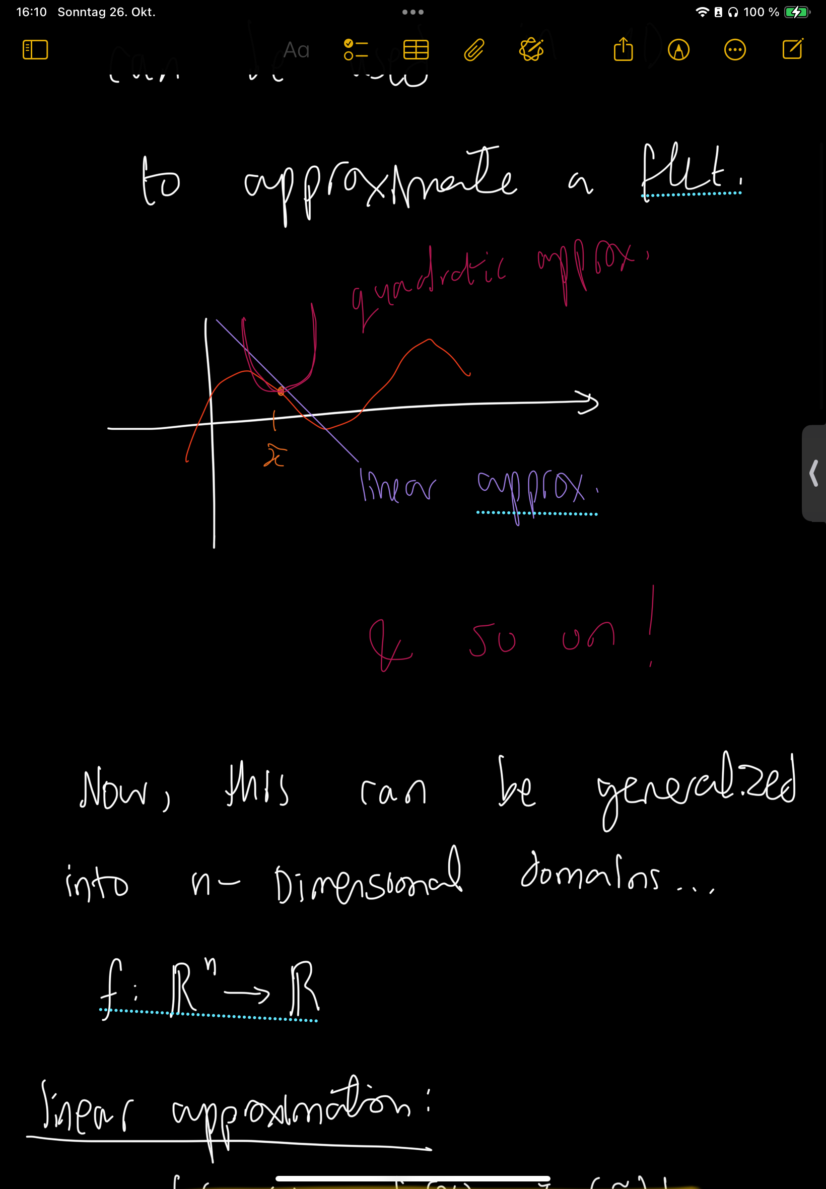
The handwriting presents a unique blend of technical precision and relaxed flair. The strokes are generally light, giving a sense of airiness to the writing. The use of both cursive and print styles within the same sample, for example in phrases like "linear approximation", adds an interesting layer of complexity. There is a noticeable forward slant to the writing, and a general lack of heavy pressure. The spacing between words and lines appears generous, contributing to overall legibility, even with the simplified letterforms. Some words are underlined, and there is use of different colors which suggests a degree of expressiveness and intention in highlighting key points.
Based on this handwriting, one might infer a personality that values clarity and efficiency, while also embracing a certain level of creativity. The writer likely possesses a methodical mind, as evidenced by the organized layout and clear articulation of concepts. The forward slant could suggest an outgoing and proactive nature, someone who is eager to engage with new ideas and experiences. The variation in letter size and the occasional flourish suggest a willingness to deviate from strict convention and a desire to express individuality. The different colors and underlines are consistent with someone who wants to ensure the audience understand the important information.
To enhance the handwriting further, consider focusing on maintaining a more consistent letter size and slant throughout. While the variation adds character, a bit more uniformity could improve overall legibility, especially when dealing with complex technical material. Experiment with different pen grips and writing postures to find what allows for the most fluid and effortless strokes. Practice specific letterforms that feel less natural, aiming for a more confident and consistent execution. Try to fill the page more effectively, rather than leaving large areas of whitespace.
Legibility
Expressiveness
Consistency
Overall
Leaderboard for Sunday, 26 October 2025
| 1 | The Flowing Quill |
74
|
| 2 | The Constitutionalist |
74
|
| 3 | The Curator's Script |
72
|
| 4 | The Eloquent Educator |
71
|
| 5 | The Dreamer's Quill |
70
|
| 6 | The Flowing Quill |
68
|
| 7 | The Constitutionalist |
68
|
| 8 | The Hopeful Heart's Script |
68
|
| 9 | The Agrarian Academic |
67
|
| 10 | The Unassuming Hand |
66
|
| 11 | The Studious Student |
65
|
| 12 | The Calculating Hand |
65
|
| 13 | The Diligent Note-Taker |
64
|
| 14 | The Mathematical Muse |
64
|
| 15 | The Contemplative Soul |
64
|
| 16 | The Flowing Font |
63
|
| 17 | The Gentle Flow |
63
|
| 18 | The Looping Legend |
62
|
| 19 | The Contemplative Calligrapher |
60
|
| 20 | The Democratic Dreamer |
59
|
| 21 | The Signature Stylist |
59
|
| 22 | The Devout Note-Taker |
58
|
| 23 | The Atom Alchemist |
57
|
| 24 | The Cipher's Quill |
57
|
| 25 | The Scientific Mind |
56
|
| 26 | The Loop-de-Loop Legend |
56
|
| 27 | The Forward Leaning Letterer |
54
|
| 28 | The Celestial Stylist |
54
|
| 29 | The Flowing River |
53
|
| 30 | The Diligent Student |
53
|