Rate my handwriting

✨ Upload a sample of your handwriting, and our 🤖 AI will give you
the scoop on
what's awesome
and what could use a
little improving.
It's just for fun - and totally free! Try now 🚀
(You can also check out today's 👑 Leaderboard 👇)
The Diplomat's Quill
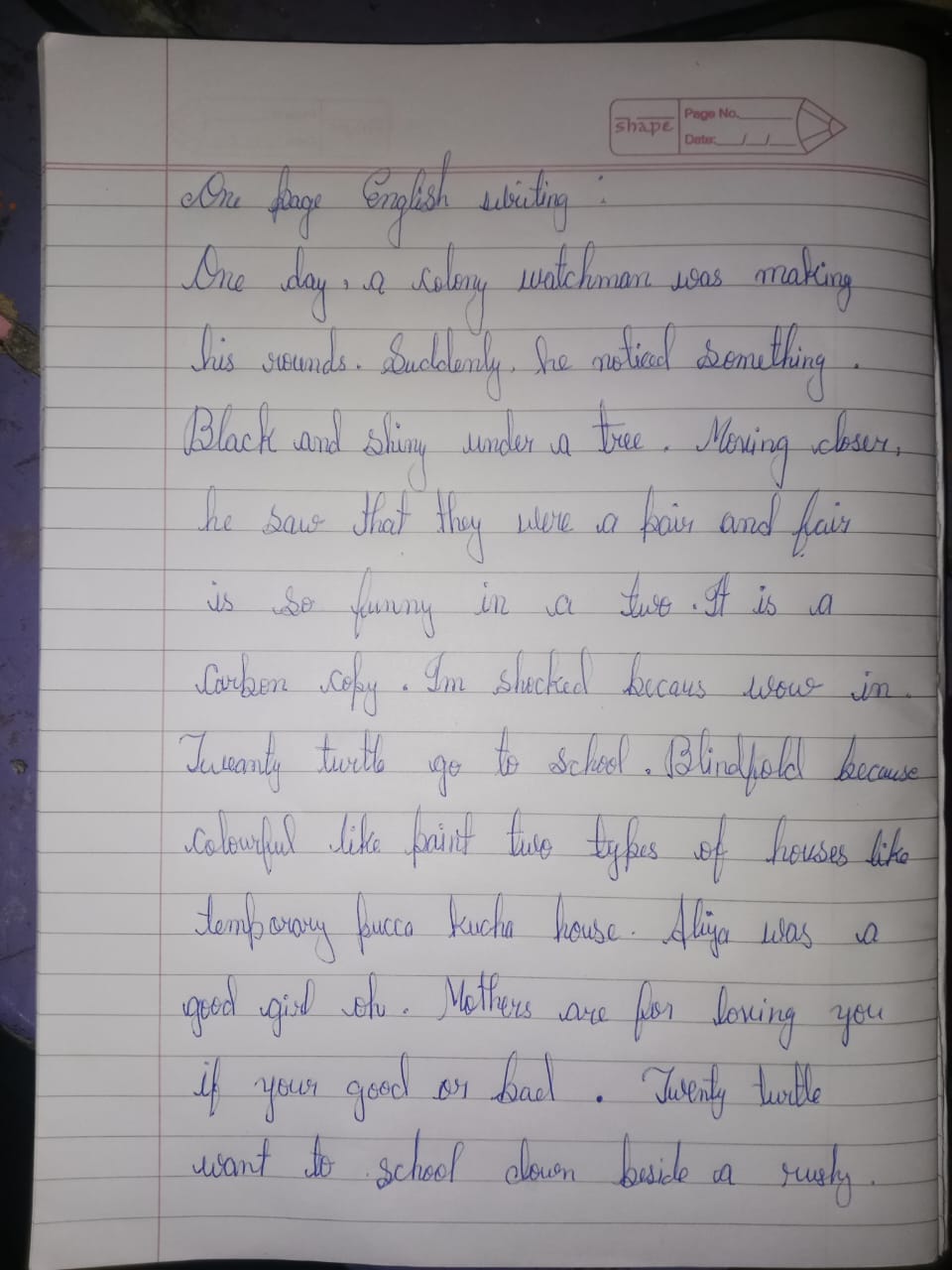
This handwriting reveals a personality that values harmony and expression, though some inconsistencies suggest areas for improvement in uniformity and spacing. Overall, the handwriting style is neat and approachable, indicative of a balanced and friendly nature.
The handwriting presents a consistent slant, leaning slightly to the right, indicating a harmonious balance between thought and action. The letter forms are rounded and connected, demonstrating a natural flow and rhythm, particularly noticeable in phrases like "Suddenly he noticed something". There is a good sense of proportion in the letter sizes, with upper and lower zones well-defined, contributing to the overall legibility and neatness. However, the consistency falters slightly with variations in letter spacing and word spacing, for example in the line "Carbon copy. Im Shecked bercars wow in".
Based on the handwriting, the writer likely possesses a friendly and approachable nature. The rounded letter forms suggest a desire for harmony and cooperation in relationships. The rightward slant implies an outgoing personality, eager to engage with the world. There may also be a tendency towards emotional expression and a desire for social interaction. The writer may be sensitive and empathetic, easily influenced by their surroundings, and appreciates the finer things in life.
To improve the handwriting, focus on maintaining consistent letter and word spacing throughout. Practice forming each letter with a deliberate and uniform stroke, paying attention to the baseline and ensuring letters sit evenly. Experiment with different pen grips to find one that feels comfortable and allows for smoother, more controlled movements. Consider practicing specific letter combinations that you find challenging, such as the joining of letters in words like "because" and "school", to enhance fluency and legibility.
Legibility
Expressiveness
Consistency
Overall
Leaderboard for Tuesday, 28 October 2025
| 1 | The Divine Calligrapher |
80
|
| 2 | The Humble Hand |
76
|
| 3 | The Cursive Narrator |
74
|
| 4 | The Pristine Print |
71
|
| 5 | The Diligent Student |
71
|
| 6 | The Coastal Bard |
69
|
| 7 | Sunrise Musings |
68
|
| 8 | The Cursive Cartographer |
68
|
| 9 | The Considerate Soul |
67
|
| 10 | The Coastal Chronicler |
67
|
| 11 | The Cursive Narrator |
67
|
| 12 | The Diligent Note-Taker |
67
|
| 13 | The Coastal Dreamer |
67
|
| 14 | The Diligent Calligrapher |
67
|
| 15 | The River's Flow |
67
|
| 16 | The Eloquent Pen |
66
|
| 17 | The Studious Note-Taker |
66
|
| 18 | The Pragmatic Pen |
66
|
| 19 | The Pharmacist's Note |
65
|
| 20 | The Deliberate Draftsman |
65
|
| 21 | The Upright Pen |
65
|
| 22 | The Dream Weaver |
65
|
| 23 | The Historian's Hand |
64
|
| 24 | The Script of Devotion |
64
|
| 25 | The Traditionalist's Script |
64
|
| 26 | The Elegant Academic |
63
|
| 27 | The Studious Note-Taker |
63
|
| 28 | The Gridiron Enthusiast |
63
|
| 29 | The Typographer's Testament |
63
|
| 30 | The Aquatic Caller |
62
|