Rate my handwriting

✨ Upload a sample of your handwriting, and our 🤖 AI will give you
the scoop on
what's awesome
and what could use a
little improving.
It's just for fun - and totally free! Try now 🚀
(You can also check out today's 👑 Leaderboard 👇)
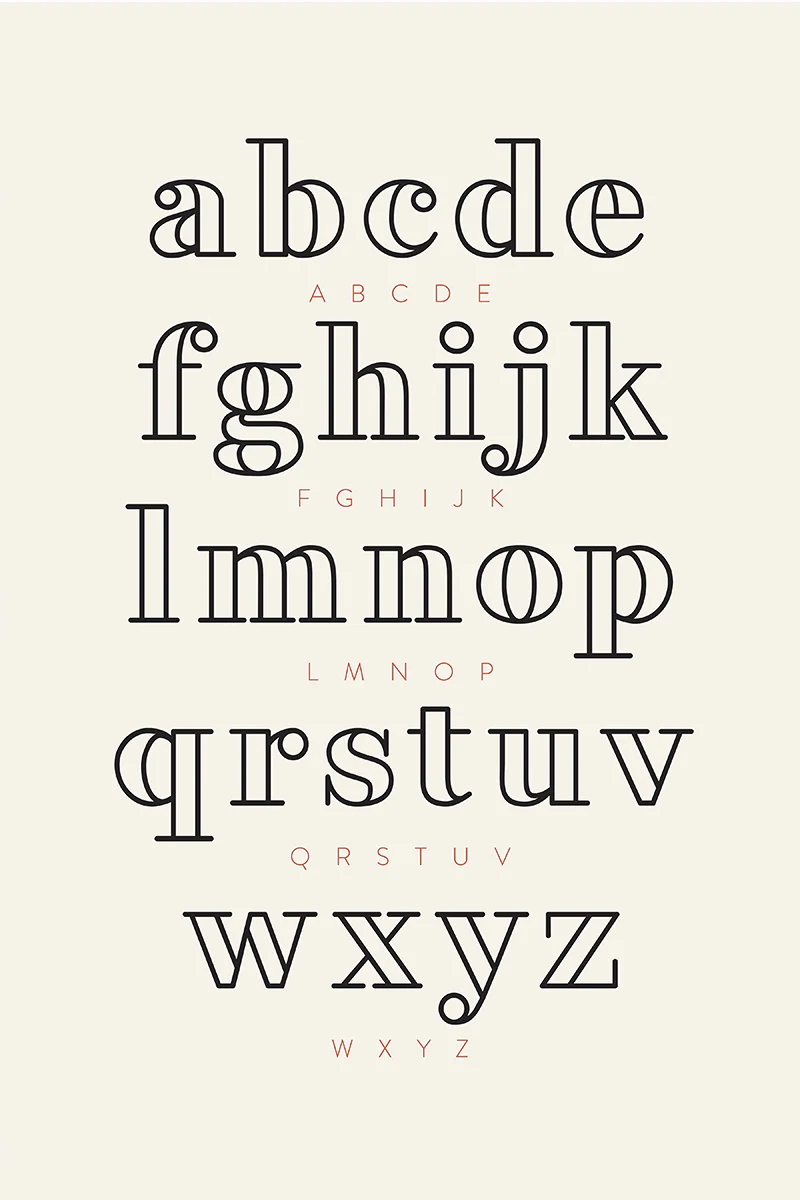
The Architect's Italic
This handwriting showcases a structured and precise style, indicating a methodical and detail-oriented individual. While legible, adding variations in stroke weight and connections could enhance its expressiveness.
This handwriting exhibits a meticulously structured and geometric style, reminiscent of architectural blueprints. Each letter is carefully formed with a dual-line stroke, emphasizing precision and clarity. The consistency in letter height and spacing creates a harmonious and balanced visual impression. There's a distinct lack of connecting strokes between letters, giving each character an isolated, independent presence. The rounded forms, such as those in the 'a', 'b', 'd', 'e', 'g', 'o', 'p', 'q', 'r', 's', 'u' and 'y', are almost perfectly circular, adding to the overall geometric aesthetic. The letters appear to be evenly spaced, which gives a clear and legible style.
The individual behind this handwriting likely possesses a strong sense of order and a penchant for detail. They are probably methodical, analytical, and appreciate structure in their environment. The precise nature of the script suggests someone who values accuracy and pays close attention to the fine points. This person probably has a clear mind and likes to take a measured approach to life.
To improve this style, you could try to introduce subtle variations in stroke weight to add depth and character. Experimenting with slight connections between certain letters could also create a more fluid and dynamic appearance. Additionally, consider varying the roundness of the circular elements to introduce a touch of organic irregularity. Remember that it's not a 'fault' of the style, just an aesthetic choice. Finally, perhaps consider using a slightly bolder stroke for increased impact.
Legibility
Expressiveness
Consistency
Overall
Leaderboard for Saturday, 08 November 2025
| 1 | Divine Inscription |
70
|
| 2 | The Eloquent Essayist |
67
|
| 3 | The Blue Lagoon Hand |
66
|
| 4 | The Scientific Mind |
66
|
| 5 | The Engineer's Italic |
64
|
| 6 | The Deliberate Hand |
63
|
| 7 | The Pragmatic Pen |
62
|
| 8 | The Loopy Leaper |
61
|
| 9 | Existential Enquiries |
60
|
| 10 | The Unbound Expressionist |
59
|
| 11 | The Pensive Penman |
53
|
| 12 | Le Calligraphe Étudiant |
53
|
| 13 | The Blue Streak |
51
|
| 14 | The Pragmatic Pen |
51
|
| 15 | The Conservationist's Cursive |
50
|